Skip to main content
Select Your Region
Americas
Europe
Middle East & Africa
Asia Pacific
Create Profile
My SAS
Get access to My SAS, trials, communities and more.
Edit Profile
SAS Sites
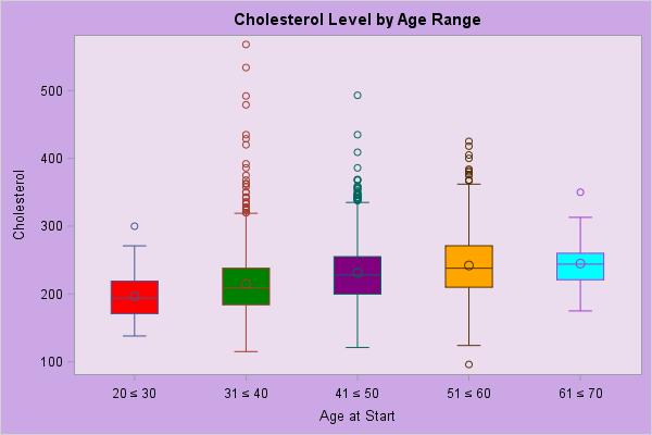
Sample 56933 - Display special symbols as axis values using PROC FORMAT with PROC SGPLOT View Code
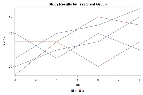
Sample 52964 - Create a spaghetti plot with the SGPLOT procedure View Code
PROC SGMAP
PROC SGPANEL
PROC SGPLOT
PROC SGRENDER
PROC SGSCATTER
PROC GBARLINE
PROC GCONTOUR
Data Visualization with a focus on SAS ODS Graphics
Find technical papers with graphic samples.
Read the programming documentation.