GCHART Procedure
- Syntax

- Overview
- Concepts
- Examples Specifying the Sum Statistic in a Block ChartGrouping and Subgrouping a Block ChartSpecifying the Sum Statistic in Bar ChartsSubgrouping a Three-Dimensional Vertical Bar ChartControlling Midpoints and Statistics in a Horizontal Bar ChartGenerating Error Bars in a Horizontal Bar ChartSpecifying the Sum Statistic for a Pie ChartSubgrouping a Donut or Pie ChartOrdering and Labeling Slices in a Pie ChartGrouping and Arranging Pie ChartsSpecifying the Sum Statistic in a Star ChartCharting a Discrete Numeric Variable in a Star ChartCreating a Detail Pie Chart
- References
Overview: GCHART Procedure
About the GCHART Procedure
The GCHART procedure
produces six types of charts: block charts, horizontal and vertical
bar charts, pie and donut charts, and star charts. These charts graphically
represent the value of a statistic calculated for one or more variables
in an input SAS data set. The charted variables can be either numeric
or character.
About Block Charts
Block charts display the relative magnitude
of data with blocks of varying height, each set in a square that represents
a category of data (midpoint). Because block charts do not use axes,
they are most useful when the relative magnitude of the blocks is
more significant than the exact magnitude of any particular block.
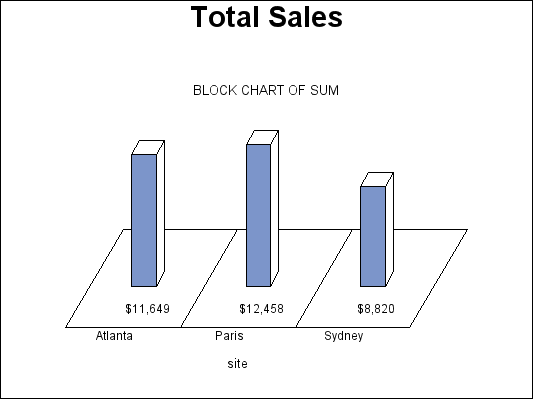
Block Chart (GCHBKSUM) shows a simple
block chart of total sales for three manufacturing sites. Each site is a midpoint and occupies one square. The
name of the site (the midpoint value) is printed below the square.
Midpoint values are, by default, arranged in ascending order from
left to right. The label below the midpoint grid names the chart variable.
Sales for the site (the
chart statistic) are represented by the height of the block; sales
amount (the formatted statistic value) is printed below the block.
The heading above the blocks describes the type of statistic, in this
case SUM.
The program for this
chart is in Specifying the Sum Statistic in a Block Chart. For more information about producing block charts, see
the BLOCK Statement.
About Bar Charts
Horizontal
and vertical bar charts display the magnitude of data with bars, each
of which represents a category of data (midpoint). The length (or
height) of the bars represents the value of the chart statistic for
the corresponding midpoint. Both horizontal and vertical bar charts
can be either two-dimensional or three-dimensional shapes, depending
on which procedure you choose.
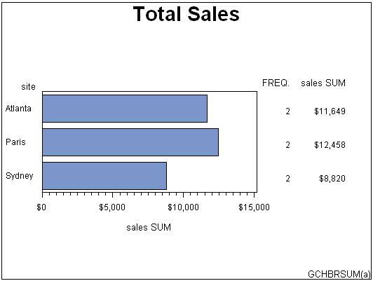
Horizontal Bar Chart (GCHBRSUM (a)) shows a simple
two-dimensional, horizontal bar chart of total sales for three manufacturing
sites. Each site is a midpoint and is displayed
as a bar. The name of the site (the midpoint value) is printed on
the midpoint axis beside the bar. Midpoint values are, by default,
arranged in ascending alphabetical or numeric order from top to bottom
of the chart and labeled with the name or label of the chart variable.
The chart statistics,
in this case total sales for each site, are represented by the length
of the bars. The response axis displays the scale of values for the
chart statistic. The table of statistics to the right of the bars
displays the statistic for each bar. Both a column in the table and
the response axis are labeled with the name of the summary variable
and the type of statistic.
The program for this
chart is Specifying the Sum Statistic in Bar Charts.
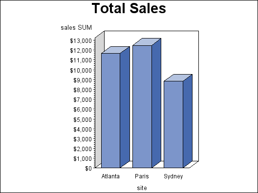
Vertical (Three-Dimensional) Bar Chart (GCHBRSUM (b)) shows the same
data presented as a three-dimensional, vertical bar chart. The two types of bar charts have essentially the same
characteristics except for where they display statistical values.
Horizontal bar charts by default display a table of statistic values
to the right of the bars. You can specify that vertical bar charts
display the statistic value above or inside of each bar.
The program for this
chart is Specifying the Sum Statistic in Bar Charts. For more information about producing horizontal and vertical
bar charts, see HBAR, HBAR3D, VBAR, and VBAR3D Statement.
About Pie, Detail Pie, and Donut Charts
Pie and donut charts represent the
relative contribution of parts to the whole. They display data as
wedge-shaped “slices” of a circle (either a “pie”
or “donut”), either in two- or three-dimensional form.
Each slice represents a category of data (midpoint). The size of
each slice (length of the arc) represents the contribution of the
corresponding midpoint to the total chart statistic. Detail pie charts
are pie charts with a second pie overlay that shows additional detail
about the data that contributes to each of the outer pie's slices.
Donut charts look like pie charts except that they have a hole in
the middle in which you can place text.
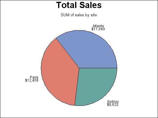
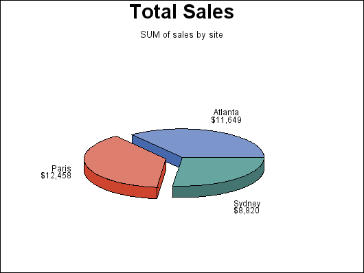
Pie Chart (GCHPISUM (a)) shows a pie
chart of total sales for three manufacturing sites. Each site is a midpoint and is displayed as a slice.
By default, the slices are ordered alphabetically, by the midpoint
name and counterclockwise beginning at the three o'clock position.
Sales for the site (the
chart statistic) are represented by the size of the slice. Both the
sales amount (the formatted value of the chart statistic) and the
name of the site (the midpoint value) are printed outside of the slice.
You can also label pie slices with the percentage of the total statistic
value that they represent. The heading above the pie describes the
type of statistic (SUM), and names the summary variable (SALES) and
the chart variable (SITE).
Three-Dimensional Pie Chart (GCHPISUM (b)) shows the three-dimensional
version of the same pie chart. This version
features the exploded slice.
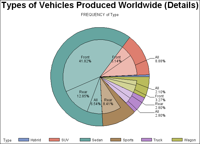
Detail Pie Chart (GCHDTPIE) shows a detail
pie chart generated from the same data.
The programs for these
charts are in Specifying the Sum Statistic for a Pie Chart and Creating a Detail Pie Chart. For more information
about producing pie or donut charts, see PIE, PIE3D, and DONUT Statement.
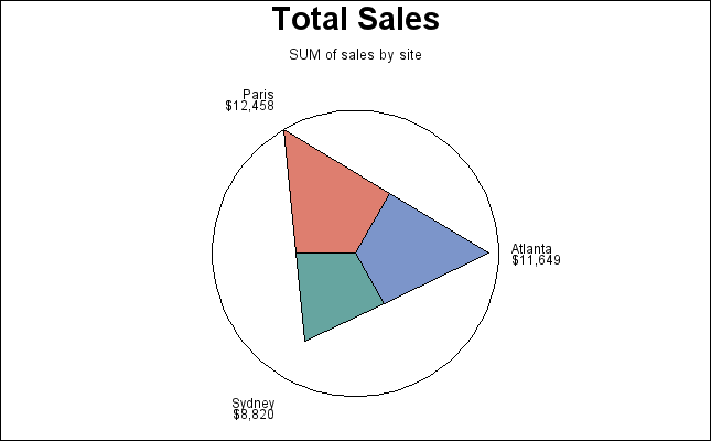
About Star Charts
Star charts display
data as lines (“spines”) radiating from the center of
a circle toward the perimeter. Each spine represents a category of
data (midpoint). The length of a spine represents the magnitude of
the chart statistic for that midpoint starting at the center of the
circle, which by default represents 0. The radius of the circle is
the length of the longest spine (greatest statistic value) in the
chart. Instead of spines, star charts can also display the chart statistic
as slices, which are enclosed areas formed by connecting the ends
of the spines.
Star Chart (GCHSTSUM) shows the total
sales for the three manufacturing sites as a star chart. Each site is a midpoint and is displayed as a spine.
By default the ends of the spines are connected and they are ordered
counterclockwise beginning at the three o'clock position.
Sales for the site (the
chart statistic) are represented by the length of the spine. Both
the sales amount (the formatted statistic value) and the name of the
site (the midpoint value) are printed outside of the star chart. You
can also label star charts with the percentage of the total statistic
value that they represent. The heading above the chart describes the
type of statistic (SUM), and names the summary variable (SALES) and
the chart variable (SITE).
The program for this
chart is Specifying the Sum Statistic in a Star Chart. For more information about producing star charts, see STAR Statement. For
an alternative way of producing similar types of charts, see GRADAR Procedure.