GCHART Procedure
- Syntax

- Overview
- Concepts
- Examples Specifying the Sum Statistic in a Block ChartGrouping and Subgrouping a Block ChartSpecifying the Sum Statistic in Bar ChartsSubgrouping a Three-Dimensional Vertical Bar ChartControlling Midpoints and Statistics in a Horizontal Bar ChartGenerating Error Bars in a Horizontal Bar ChartSpecifying the Sum Statistic for a Pie ChartSubgrouping a Donut or Pie ChartOrdering and Labeling Slices in a Pie ChartGrouping and Arranging Pie ChartsSpecifying the Sum Statistic in a Star ChartCharting a Discrete Numeric Variable in a Star ChartCreating a Detail Pie Chart
- References
Chart Terminology
The GCHART procedure
produces charts based on the values of a chart variable.
These values are represented by a set of midpoints.
The chart itself displays information about the chart variable in
the form of chart statistics.
Terms Used with Bar Charts and Terms Used with Pie and Donut Charts illustrate
these terms as well as other terms used with the GCHART procedure.
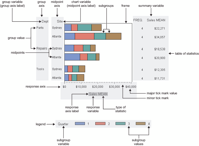
Bar charts have at least
two axes: a midpoint axis that shows the categories of data, and a
response axis that displays the scale of values for the chart statistic.
By default, the response axis is divided into evenly spaced intervals
identified with major tick marks that are labeled with the corresponding
statistic value. Minor tick marks are evenly distributed between
the major tick marks. Each axis is labeled with the chart variable
name or label. The response axis is also labeled with the statistic
type.
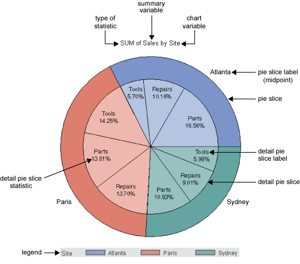
Pie charts show statistics based on values of a variable
called the chart variable. Generally, the values of the chart variable
are represented by the slices in the chart. Beside each pie slice
a number (or character string) appears that identifies the value or
range of values assigned to that slice by the GCHART procedure. This
number (or character string) is known as the midpoint for
that slice. The statistic value for each midpoint is displayed beneath
the midpoint. Each pie slice represents a different value of a given
variable (the chart variable). Because the pie chart forms a circle
of 360 degrees, each slice represents a percentage of degrees of the
circle. The number of degrees created by each slice represents the
statistic value for the midpoint.