The MI Procedure
- Overview
- Getting Started
-
Syntax

-
Details
Descriptive Statistics EM Algorithm for Data with Missing Values Statistical Assumptions for Multiple Imputation Missing Data Patterns Imputation Methods Monotone Methods for Data Sets with Monotone Missing Patterns Monotone and FCS Regression Methods Monotone and FCS Predictive Mean Matching Methods Monotone Propensity Score Method Monotone and FCS Discriminant Function Methods Monotone and FCS Logistic Regression Methods FCS Methods for Data Sets with Arbitrary Missing Patterns Checking Convergence in FCS Methods MCMC Method for Arbitrary Missing Multivariate Normal Data Producing Monotone Missingness with the MCMC Method MCMC Method Specifications Checking Convergence in MCMC Input Data Sets Output Data Sets Combining Inferences from Multiply Imputed Data Sets Multiple Imputation Efficiency Imputer’s Model Versus Analyst’s Model Parameter Simulation versus Multiple Imputation Summary of Issues in Multiple Imputation ODS Table Names ODS Graphics
-
Examples
EM Algorithm for MLE Monotone Propensity Score Method Monotone Regression Method Monotone Logistic Regression Method for CLASS Variables Monotone Discriminant Function Method for CLASS Variables FCS Method for Continuous Variables FCS Method for CLASS Variables FCS Method with Trace Plot MCMC Method Producing Monotone Missingness with MCMC Checking Convergence in MCMC Saving and Using Parameters for MCMC Transforming to Normality Multistage Imputation
- References
| Checking Convergence in MCMC |
The theoretical convergence of the MCMC method has been explored under various conditions, as described in Schafer (1997, p. 70). However, in practice, verification of convergence is not a simple matter.
The parameters used in the imputation step for each iteration can be saved in an output data set with the OUTITER= option. These include the means, standard deviations, covariances, worst linear function, and observed-data LR statistics. You can then monitor the convergence in a single chain by displaying trace plots and autocorrelations for those parameter values (Schafer 1997, p. 120). The trace and autocorrelation function plots for parameters such as variable means, covariances, and the worst linear function can be displayed by specifying the TIMEPLOT and ACFPLOT options, respectively.
You can apply the EM algorithm to a bootstrap sample to obtain overdispersed starting values for multiple chains (Gelman and Rubin 1992). This provides a conservative estimate of the number of iterations needed before each imputation.
The next four subsections describe useful statistics and plots that can be used to check the convergence of the MCMC method.
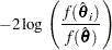
LR Statistics
You can save the observed-data likelihood ratio (LR) statistic in each iteration with the LR option in the OUTITER= data set. The statistic is based on the observed-data likelihood with parameter values used in the iteration and the observed-data maximum likelihood derived from the EM algorithm.
In each iteration, the LR statistic is given by
 |
where  is the observed-data maximum likelihood derived from the EM algorithm and
  is the observed-data likelihood for
  used in the iteration.
Similarly, you can also save the observed-data LR posterior mode statistic for each iteration with the LR_POST option. This statistic is based on the observed-data posterior density with parameter values used in each iteration and the observed-data posterior mode derived from the EM algorithm for posterior mode.
For large samples, these LR statistics tends to be approximately  distributed with degrees of freedom equal to the dimension of
  (Schafer 1997, p. 131). For example, with a large number of iterations, if the values of the LR statistic do not behave like a random sample from the described distribution, then there is evidence that the MCMC method has not converged.
Worst Linear Function of Parameters
The worst linear function (WLF) of parameters (Schafer 1997, pp. 129–131) is a scalar function of parameters  and
and  that is "worst" in the sense that its function values converge most slowly among parameters in the MCMC method. The convergence of this function is evidence that other parameters are likely to converge as well.
For linear functions of parameters  , a worst linear function of has the highest asymptotic rate of missing information. The function can be derived from the iterative values of near the posterior mode in the EM algorithm. That is, an estimated worst linear function of is
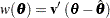 |
where  is the posterior mode and the coefficients
  are the difference between the estimated value of one step prior to convergence and the converged value .
You can display the coefficients of the worst linear function,  , by specifying the WLF option in the MCMC statement. You can save the function value from each iteration in an OUTITER= data set by specifying the WLF option within the OUTITER option. You can also display the worst linear function values from iterations in an autocorrelation plot or a trace plot by specifying WLF as an ACFPLOT or TIMEPLOT option, respectively.
Note that when the observed-data posterior is nearly normal, the WLF is one of the slowest functions to approach stationarity. When the posterior is not close to normal, other functions might take much longer than the WLF to converge, as described in Schafer (1997, p. 130).
Trace Plot
A trace plot for a parameter  is a scatter plot of successive parameter estimates
  against the iteration number
  . The plot provides a simple way to examine the convergence behavior of the estimation algorithm for . Long-term trends in the plot indicate that successive iterations are highly correlated and that the series of iterations has not converged.
You can display trace plots for worst linear function, variable means, variable variances, and covariances of variables. You can also request logarithmic transformations for positive parameters in the plots with the LOG option. When a parameter value is less than or equal to zero, the value is not displayed in the corresponding plot.
By default, the MI procedure uses solid line segments to connect data points in a trace plot. You can use the CCONNECT=, LCONNECT=, and WCONNECT= options to change the color, line type, and width of the line segments, respectively. When WCONNECT=0 is specified, the data points are not connected, and the procedure uses the plus sign (+) as the plot symbol to display the points with a height of one (percentage screen unit) in a trace plot. You can use the SYMBOL=, CSYMBOL=, and HSYMBOL= options to change the shape, color, and height of the plot symbol, respectively.
By default, the plot title "Trace Plot" is displayed in a trace plot. You can request another title by using the TITLE= option in the TIMEPLOT option. When another title is also specified in a TITLE statement, this title is displayed as the main title and the plot title is displayed as a subtitle in the plot.
You can use options in the GOPTIONS statement to change the color and height of the title. See the chapter "The SAS/GRAPH Statements" in SAS/GRAPH Software: Reference for an illustration of title options. See Example 56.11 for a usage of the trace plot.
Autocorrelation Function Plot
To examine relationships of successive parameter estimates , the autocorrelation function (ACF) can be used. For a stationary series,  , in trace data, the autocorrelation function at lag
  is
is
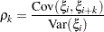 |
The sample th order autocorrelation is computed as
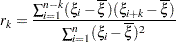 |
You can display autocorrelation function plots for the worst linear function, variable means, variable variances, and covariances of variables. You can also request logarithmic transformations for parameters in the plots with the LOG option. When a parameter has values less than or equal to zero, the corresponding plot is not created.
You specify the maximum number of lags of the series with the NLAG= option. The autocorrelations at each lag less than or equal to the specified lag are displayed in the graph. In addition, the plot also displays approximate 95% confidence limits for the autocorrelations. At lag , the confidence limits indicate a set of approximate 95% critical values for testing the hypothesis 
By default, the MI procedure uses the star (*) as the plot symbol to display the points with a height of one (percentage screen unit) in the plot, a solid line to display the reference line of zero autocorrelation, vertical line segments to connect autocorrelations to the reference line, and a pair of dashed lines to display approximately 95% confidence limits for the autocorrelations.
You can use the SYMBOL=, CSYMBOL=, and HSYMBOL= options to change the shape, color, and height of the plot symbol, respectively, and the CNEEDLES= and WNEEDLES= options to change the color and width of the needles, respectively. You can also use the LREF=, CREF=, and WREF= options to change the line type, color, and width of the reference line, respectively. Similarly, you can use the LCONF=, CCONF=, and WCONF= options to change the line type, color, and width of the confidence limits, respectively.
By default, the plot title "Autocorrelation Plot" is displayed in a autocorrelation function plot. You can request another title by using the TITLE= option within the ACFPLOT option. When another title is also specified in a TITLE statement, this title is displayed as the main title and the plot title is displayed as a subtitle in the plot.
You can use options in the GOPTIONS statement to change the color and height of the title. See the chapter "The SAS/GRAPH Statements" in SAS/GRAPH Software: Reference for a description of title options. See Example 56.8 for an illustration of the autocorrelation function plot.