|
|
Developing Custom Themes
Style Sheet and Graphics Reference for the SAS Winter Theme
The SAS Winter theme includes several different style sheets
and graphics files. As you create your own style sheets and
graphics files (as described in Steps
for Defining a New Theme), you can refer to the information
in the following tables to determine which style classes to
override and which graphics files to modify for each area
of the portal interface:
Note: The order in which style sheets are
applied is based on the value of the order attribute
of the StyleSheet elements in the theme
descriptor files. In the default installation, sasComponents.css
is applied first, followed by sasStyle.css,
followed by Portal.css. If a style exists in
all three style sheets, the style in Portal.css
overrides the others. When you create a new theme, you should create a new style sheet that overrides Portal.css.
Note: With SAS 9.1.3 Service Pack 3, sasComponents.css
imports styles from two new style sheets: sasComponentsLayout.css
and sasComponentsTheme.css. The sasComponentsTheme.css
style sheet contains attributes that you are most likely to
modify when you create a new theme.
SAS 9.1.3 Service Pack 3 and Service Pack 4 contain a number
of other changes to theme elements. If you have created a
custom theme, and you then install Service Pack 3 or Service
Pack 4, you must migrate your theme customizations. For details,
see Migrating Custom Themes
After Installing a Service Pack.
Banner
The following figure shows the classes and graphics that
are used in the banner. The table that follows the figure
provides the class names, image names, and style sheet locations.
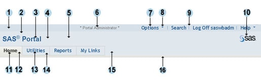
| Label Number |
Area Affected |
Class Name or Image Name |
Style Sheet Name |
 |
Background for the top of the banner, which contains
banner links (Options, Search, Log On,
Log Off, Help) |
table.linkbar |
sasStyle.css |
 |
Background color for the left middle area of the banner,
which contains the banner title |
div#banner td#bantitle |
sasStyle.css |
 |
Text for the banner title |
div#banner td#bantitle |
sasStyle.css |
 |
Background color for the portion of the banner to the
right of the banner title |
td#banbullet |
sasStyle.css |
 |
Background color for the right middle area of the banner,
which contains the logo |
td#banlogo |
sasStyle.css |
 |
Text for role identification (appears if the user is
a portal administrator or a content administrator) |
banuserwelcome |
sasStyle.css |
 |
Text for banner links (Options, Search,
Log On, Log Off, Help) |
table.Linkbar td a |
sasStyle.css |
 |
Arrows to the right of the Options and Help
links |
BannerDownArrowWhite.gif
|
N/A |
 |
Dividers between banner links |
pipetop.gif |
N/A |
 |
SAS logo (you can edit the size in the descriptor file SASThemes.xml) |
logo.gif |
N/A |
 |
Tab text for the active page |
menuLink |
sasStyle.css |
 |
Background color of the tab for the active page |
tabSelected |
sasStyle.css |
 |
Tab text for inactive pages |
menu:link
menu:visited
menu:active |
sasStyle.css |
 |
Background color of the tabs for inactive pages |
tab |
sasStyle .css |
 |
Background color of the lower banner area to the right
of the tabs |
div#banner |
sasStyle.css |
 |
Background color of the divider between the banner
and the page area |
secondaryMenuRow |
sasStyle.css |
Vertical Navigation Bar
The following figure shows the classes that are used in the
navigation bar when it is displayed vertically. The table
that follows the figure provides the class names and style
sheet locations.
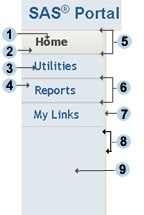
| Label Number |
Area Affected |
Class Name or Image Name |
Style Sheet Name |
|
Tab text for the active page |
menuLink |
sasStyle.css |
|
Background color of the tab for the active page |
tabSelected |
sasStyle.css |
|
Tab text for inactive pages |
menu:link
menu:visited
menu:active |
sasStyle.css |
|
Background color of the tabs for inactive pages |
tab |
sasStyle .css |
|
Top and bottom borders of the tab for active page |
primaryVertMenuSelectedOuterTable |
sasStyle.css |
|
Top and bottom borders of the tabs for inactive pages |
primaryVertMenuNonSelectedOuterTable |
sasStyle.css |
|
Background color of the 6-pixel column to the right
of the navigation bar |
secondaryMenuRow |
sasStyle.css |
|
Right and left borders of the 6-pixel column to the
right of the navigation bar |
verticalTabDivider |
Portal.css |
|
Background color of the rectangular area below the
tabs |
td.darkBlue |
Portal.css |
Options Menu and Help Menu
The following figures show the classes that are used in the
Options menu and the Help menu. The table that follows the
figures provides the class names and style sheet locations.
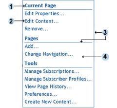 
| Label Number
|
Area Affected |
Class Name or Image Name |
Style Sheet Name |
|
Headings on the Options menu |
utilmenuHeader |
Portal.css |
|
Menu links |
utilmenudropdown:link
utilmenudropdown:hover
utilmenudropdown:active
utilmenudropdown:visited |
Portal.css |
|
Border and dividers on the Options menu |
utilmenuDivider |
Portal.css |
|
Background color of the Options menu |
body |
sasStyle.css |
|
Border of the Help menu |
utilmenuTable |
Portal.css |
|
Background color of the Help menu |
utilmenuTable |
Portal.css |
Portlet Title Bars, Backgrounds, and Borders
The following figure shows the classes and graphics that are used for
the title bars, backgrounds, and borders of portlets. The
table that follows the figure provides the class names, image
names, and style sheet locations.
| Label Number |
Area Affected |
Class Name or Image Name |
Style Sheet Name |
|
Portlet name |
portletTableHeaderLeft |
sasStyle.css |
|
Border for portlets |
portletTableBorder |
sasStyle.css |
|
Background for the portlet title bar |
portletTableHeader |
sasStyle.css |
|
Background for the portlet body |
workarea |
sasStyle.css |
|
Edit portlet properties icon |
PortletProp.gif |
N/A |
|
Edit portlet content icon |
PortletNote.gif |
N/A |
|
Remove icon |
PortletClose.gif |
N/A |
|
Minimize icon and maximize icon |
PortletMinimize.gif
PortletMaximize.gif |
N/A |
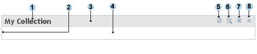
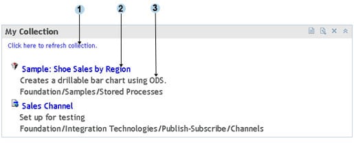
Contents of Collection Portlets
The following figure shows the classes that are used in
the body of collection portlets. The table that follows the figure
provides the class names and style sheet locations.
Contents of Bookmarks Portlet
The following figure shows the classes that are used in
the body of the Bookmarks portlet. The table that follows the
figure provides the class names and style sheet locations.
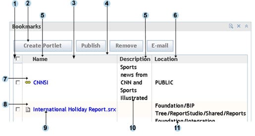
| Label Number |
Area Affected |
Class Name or Image Name |
Style Sheet Name |
|
Background of the first column heading |
centeredTableHeader |
sasStyle.css |
|
Button style |
button |
sasComponentsTheme.css
sasStyle.css |
|
Background color and borders of all column headings
except the first column heading |
searchResultsTableHeader |
sasStyle.css |
|
Border of the table |
mainTable |
sasComponentsTheme.css
sasStyle.css |
|
Heading text for all columns except the last column |
portalTableSubheading |
Portal.css |
|
Heading text for the last column |
portalTableSubheadingTrans |
Portal.css |
|
Background color of odd-numbered rows |
dataRow1_tableRow |
sasStyle.css |
|
Background color of even-numbered rows |
dataRow2_tableRow |
sasStyle.css |
|
Link text for contents of the Name column |
A (default link style) |
sasStyle.css |
|
Text for contents of the Description column |
textTableCell |
sasStyle.css |
|
Text for contents of the Location column |
textTableCellTrans |
sasStyle.css |
Contents of Navigator Portlets
The following figure shows the classes that are used in navigator
portlets such as the Tree Navigator portlet, the Reports Navigator
portlet, WebDAV navigator portlets, and the Stored Process
Navigator portlet. The table that follows the figure provides
the class names and style sheet locations.
| Label Number |
Area Affected |
Class Name or Image Name |
Style Sheet Name |
|
Search label |
rfs_SearchExpandCollapseTitle
|
sasComponentsTheme.css |
|
Contents of Location box |
rfs_ToolbarContainer
|
sasComponentsTheme.css |
|
Border and background of the Search box |
rfs_SearchExpandCollapseContainer
|
sasComponentsTheme.css |
|
Up one level icon |
up_one_level.gif
|
N/A |
|
Up one level label |
.rfs_ToolBarAction_ButtonCenter
|
sasComponentsTheme.css |
|
Background for column headings |
rfs_FileDetailViewColumnHeader
|
sasComponentsTheme.css |
|
Background of expand/collapse icon; image for expand icon
|
sas_ExpandCollapsebutton
DataViewerMax.gif
|
sasComponentsTheme.css |
|
Location and Show description
labels |
rfs_ToolbarContainer
|
sasComponentsTheme.css |
|
Text for all column headings, and link text in the Name
column |
rfs_FileDetailViewData
A:active
rfs_FileDetailViewData
A:link
rfs_FileDetailViewData
A:visited
|
sasComponentsTheme.css |
|
Background for odd-numbered rows |
rfs_DetailViewOddRow
|
sasComponentsTheme.css |
|
Text in the author, date, and keyword columns for odd-numbered
rows |
rfs_DetailViewOddRow
|
sasComponentsTheme.css |
|
Background for even-numbered rows |
rfs_DetailViewEvenRow
|
sasComponentsTheme.css |
|
Text in the author, date, and keyword columns for even-numbered rows |
rfs_DetailViewEvenRow
|
sasComponentsTheme.css |
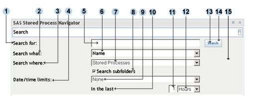
Search Dialog Box in Navigator Portlets
The following figure shows the classes that are used in the
search panel when you expand it in a navigator portlet such
as the Tree Navigator portlet, the Reports Navigator portlet,
WebDAV navigator portlets, and the Stored Process Navigator
portlet. The table that follows the figure provides the class
names and style sheet locations.
|