The REG Procedure
- Overview
-
Getting Started

-
Syntax
-
DetailsMissing ValuesInput Data SetsOutput Data SetsInteractive AnalysisModel-Selection MethodsCriteria Used in Model-Selection MethodsLimitations in Model-Selection MethodsParameter Estimates and Associated StatisticsPredicted and Residual ValuesModels of Less Than Full RankCollinearity DiagnosticsModel Fit and Diagnostic StatisticsInfluence StatisticsReweighting Observations in an AnalysisTesting for HeteroscedasticityTesting for Lack of FitMultivariate TestsAutocorrelation in Time Series DataComputations for Ridge Regression and IPC AnalysisConstruction of Q-Q and P-P PlotsComputational MethodsComputer Resources in Regression AnalysisDisplayed OutputPlot Options Superseded by ODS GraphicsODS Table NamesODS Graphics
-
Examples
- References
ODS Graphics
Statistical procedures use ODS Graphics to create graphs as part of their output. ODS Graphics is described in detail in Chapter 21: Statistical Graphics Using ODS.
Before you create graphs, ODS Graphics must be enabled (for example, by specifying the ODS GRAPHICS ON statement). For more information about enabling and disabling ODS Graphics, see the section Enabling and Disabling ODS Graphics in Chapter 21: Statistical Graphics Using ODS.
The overall appearance of graphs is controlled by ODS styles. Styles and other aspects of using ODS Graphics are discussed in the section A Primer on ODS Statistical Graphics in Chapter 21: Statistical Graphics Using ODS.
The following sections describe the ODS graphical displays produced by PROC REG.
Diagnostics Panel
The "Diagnostics Panel" provides a display that you can use to get an overall assessment of your model. See Figure 97.9 for an example.
The panel contains the following plots:
-
residuals versus the predicted values
-
externally studentized residuals (RSTUDENT) versus the predicted values
-
externally studentized residuals versus the leverage
-
normal quantile-quantile plot (Q-Q plot) of the residuals
-
dependent variable values versus the predicted values
-
Cook’s D versus observation number
-
histogram of the residuals
-
"Residual-Fit" (or RF) plot consisting of side-by-side quantile plots of the centered fit and the residuals
-
box plot of the residuals if you specify the STATS=NONE suboption
Patterns in the plots of residuals or studentized residuals versus the predicted values, or spread of the residuals being greater than the spread of the centered fit in the RF plot, are indications of an inadequate model. Patterns in the spread about the 45-degree reference line in the plot of the dependent variable values versus the predicted values are also indications of an inadequate model.
The Q-Q plot, residual histogram, and box plot of the residuals are useful for diagnosing violations of the normality and homoscedasticity assumptions. If the data in a Q-Q plot come from a normal distribution, the points will cluster tightly around the reference line. A normal density is overlaid on the residual histogram to help in detecting departures form normality.
Following Rawlings, Pantula, and Dickey (1998), reference lines are shown on the relevant plots to identify observations deemed outliers or influential. Observations whose
externally studentized residual magnitudes exceed 2 are deemed outliers. Observations whose leverage value exceeds  or whose Cook’s D value exceeds
  are deemed influential (p is the number of regressors including the intercept, and n is the number of observations used in the analysis). If you specify the LABEL suboption of the PLOTS=DIAGNOSTICS
option, then the points deemed outliers or influential are labeled on the appropriate plots.
are deemed influential (p is the number of regressors including the intercept, and n is the number of observations used in the analysis). If you specify the LABEL suboption of the PLOTS=DIAGNOSTICS
option, then the points deemed outliers or influential are labeled on the appropriate plots.
Fit statistics are shown in the lower right of the plot and can be customized or suppressed by using the STATS= suboption of the PLOTS=DIAGNOSTICS option.
Residuals by Regressor Plots
Panels of plots of the residuals versus each of the regressors in the model are produced by default. Patterns in these plots are indications of an inadequate model. To help in detecting patterns, you can use the SMOOTH= suboption of the PLOTS=RESIDUALS option to add loess fits to these residual plots. See Output 97.1.7 for an example.
Fit and Prediction Plots
A fit plot consisting of a scatter plot of the data overlaid with the regression line, as well as confidence and prediction limits, is produced for models depending on a single regressor. Fit statistics are shown to the right of the plot and can be customized or suppressed by using the STATS= suboption of the PLOTS=FIT option.
When a model contains more than one regressor, a fit plot is not appropriate. However, if all the regressors in the model are transformations of a single variable in the input data set, then you can request a scatter plot of the dependent variable overlaid with a fit line and confidence and prediction limits versus this variable. You can also plot residuals versus this variable. You request these plots, shown in a panel, with the PLOTS=PREDICTION option. See Figure 97.14 for an example.
Influence Plots
In addition to the "Cook’s D Plot" and the "RStudent By Leverage Plot," you can request plots of the DFBETAS and DFFITS statistics versus observation number by using the PLOTS=DFBETAS and PLOTS=DFFITS options. You can also obtain partial regression leverage plots by using the PLOTS=PARTIAL option. See the section Influence Statistics for examples of these plots and details about their interpretation.
Ridge and VIF Plots
When you use ridge regression, you can request plots of the variance inflation factor (VIF) values and standardized ridge estimates by ridge values for each coefficient with the PLOTS=RIDGE option. See Example 97.5 for examples.
Variable Selection Plots
When you request variable selection by using the SELECTION= option in the MODEL statement, you can request plots of fit criteria for the models examined by using the PLOTS=CRITERIA option. The fit criteria are displayed versus the step number for the FORWARD, BACKWARD, and STEPWISE selection methods and the step at which the optimal value of each criterion is obtained is indicated using a "Star" marker. For the all-subset-based selection methods (SELECTION=RSQUARE|ADJRSQ|CP), the fit criteria are displayed versus the number of observations in the model.
The criteria are shown in a panel, but you can use the UNPACK suboption of the PLOTS=CRITERIA option to obtain separate plots for each criterion. You can also use the LABEL suboption of the PLOTS=CRITERIA option to request that optimal models be labeled on the plots. Example 97.2 provides several examples.
Heat Maps
PROC REG can produce either fit and residual scatter plots for smaller data sets or heat maps for larger data sets. The global plot option MAXPOINTS= max heat-max controls which of these are produced. When the number of points exceeds the value of max but does not exceed the value of heat-max divided by the number of independent variables, heat maps are displayed instead of scatter plots for the fit and residual plots. All other graphs are suppressed when the number of points exceeds max. The default is MAXPOINTS=5000 150000. These cutoffs are ignored if you specify MAXPOINTS=NONE. The following statements create both scatter plots and heat maps with artificial data:
data x;
   do i = 1 to 25000;
      x = 2 * normal(104);
      y = x + sin(x * 2) + 3 * normal(104);
      output;
   end;
run;

ods graphics on;

proc reg data=x plots(maxpoints=30000);
   model y = x;
run; quit;

proc reg data=x;
   model y = x;
run; quit;
Scatter plots are displayed in Figure 97.54, and heat maps are displayed in Figure 97.55.
Figure 97.54: Scatter Plot
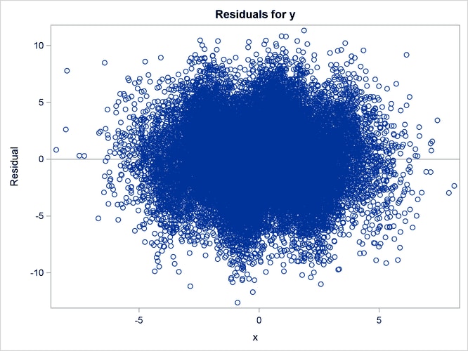
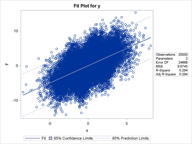
Figure 97.55: Heat Map
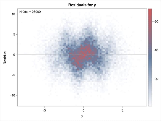
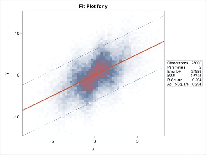
The heat maps show more clearly that the sine function is not fit well by the linear fit function.
ODS Graph Names
PROC REG assigns a name to each graph it creates using ODS. You can use these names to reference the graphs when using ODS. The names are listed in Table 97.13.
Table 97.13: ODS Graphical Displays Produced by PROC REG
|
ODS Graph Name |
Plot Description |
PLOTS Option |
|---|---|---|
|
AdjrsqPlot |
Adjusted R-square statistic for models examined doing variable selection |
ADJRSQ |
|
AICPlot |
AIC statistic for models examined doing variable selection |
AIC |
|
BICPlot |
BIC statistic for models examined doing variable selection |
BIC |
|
CooksDChart |
Cook’s D chart |
PLOTS=RESIDUALCHART(UNPACK) |
|
CooksDPlot |
Cook’s D statistic versus observation number |
COOKSD |
|
CPPlot |
|
CP |
|
DFFITSPlot |
DFFITS statistics versus observation number |
DFFITS |
|
DFBETASPanel |
Panel of DFBETAS statistics versus observation number |
DFBETAS |
|
DFBETASPlot |
DFBETAS statistics versus observation number |
DFBETAS(UNPACK) |
|
DiagnosticsPanel |
Panel of fit diagnostics |
DIAGNOSTICS |
|
FitPlot |
Regression line, confidence limits, and prediction limits overlaid on a scatter plot of the data |
FIT, MAXPOINTS= max not exceeded |
|
FitPlot |
Regression line overlaid on a heat map of the data |
FIT, MAXPOINTS= max exceeded |
|
ObservedByPredicted |
Dependent variable versus predicted values |
OBSERVEDBYPREDICTED |
|
PartialPlot |
Partial regression plot |
PARTIAL |
|
PredictionPanel |
Panel of residuals and fit versus specified variable |
PREDICTIONS |
|
PredictionPlot |
Regression line, confidence limits, and prediction limits versus specified variable |
PREDICTIONS(UNPACK) |
|
PredictionResidualPlot |
Residuals versus specified variable |
PREDICTIONS(UNPACK) |
|
QQPlot |
Normal quantile plot of residuals |
|
|
ResidualBoxPlot |
Box plot of residuals |
BOXPLOT |
|
ResidualByPredicted |
Residuals versus predicted values |
RESIDUALBYPREDICTED |
|
ResidualHistogram |
Histogram of fit residuals |
RESIDUALHISTOGRAM |
|
ResidualPlot |
Scatter plot of residuals versus regressor |
RESIDUALS, MAXPOINTS= max not exceeded |
|
ResidualPlot |
Heat map of residuals versus regressor |
RESIDUALS, MAXPOINTS= max exceeded |
|
RFPlot |
Side-by-side plots of quantiles of centered fit and residuals |
RF |
|
RidgePanel |
Plot of VIF and ridge traces |
RIDGE |
|
RidgePlot |
Plot of ridge traces |
RIDGE(UNPACK) |
|
RSquarePlot |
R-square statistic for models examined doing variable selection |
RSQUARE |
|
RStudentByLeverage |
Studentized residuals versus leverage |
RSTUDENTBYLEVERAGE |
|
RStudentByPredicted |
Studentized residuals versus predicted values |
RSTUDENTBYPREDICTED |
|
SBCPlot |
SBC statistic for models examined doing variable selection |
SBC |
|
SelectionCriterionPanel |
Panel of fit statistics for models examined doing variable selection |
CRITERIA |
|
StudResCooksDChart |
Studentized residual and Cook’s D chart |
PLOTS=RESIDUALCHART |
|
StudentResChart |
Studentized residual chart |
PLOTS=RESIDUALCHART(UNPACK) |
|
VIFPlot |
Plot of VIF traces |
RIDGE(UNPACK) |
