GTILE Procedure

Example 1: Simple GTILE with the COLORVAR= Option
| Features: |
TILE statement options TILEBY= and COLORVAR= |
| Data set: | SASHELP.SHOES |
| Sample library member: | GTLSIMPL |
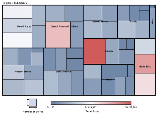
In this example, PROC
GTILE generates the following chart for the SASHELP.SHOES data set.
The size of each tile represents the number of stores. The COLORVAR=SALES
option specifies that the color of each tile represents the sales
revenue for that tile. The visualization of the data with the GTILE
procedure makes it easy to see the data extremes for sales revenue
relative to the number of stores.
Program
goptions reset=all device=java noborder;
proc gtile data=sashelp.shoes;
  tile stores tileby=(region subsidiary)
  / colorvar=sales ;
run;

quit;
Program Description
Generate the tile chart using SALES as the color variable.The chart variable STORES specifies the size of the
tiles. The TILE layout arranges the tiles. The TILEBY=(levels-list) variable list defines the tile
segments and the chart levels. The COLORVAR=SALES option specifies the variable to use to color the tiles.