GPLOT Procedure
- Syntax

- Overview
- Concepts
- Examples Generating a Simple Bubble PlotLabeling and Sizing Plot BubblesAdding a Right Vertical AxisPlotting Two VariablesConnecting Plot Data PointsGenerating an Overlay PlotFilling Areas in an Overlay PlotPlotting Three VariablesPlotting with Different Scales of ValuesCreating Plots with Drill-down Functionality for the Web
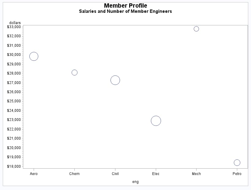
Example 1: Generating a Simple Bubble Plot
| Features: |
BUBBLE statement option: HAXIS= |
| Other features: |
GOPTIONS statement option: BORDER AXIS statement FORMAT statement |
| Sample library member: | GPLBUBL1 |
This example shows
a bubble plot in which each bubble represents a category of engineer.
The plot shows engineers on the horizontal axis and average salaries
on the vertical axis. Each bubble's vertical location is determined
by the average salary for the category. Each bubble's size is determined
by the number of engineers in the category: the more engineers, the
larger the bubble.
Program
goptions reset=all border;
data jobs;
   length eng $5;
   input eng dollars num;
   datalines;
Civil 27308 73273
Aero  29844 70192
Elec  22920 89382
Mech  32816 19601
Chem  28116 25541
Petro 18444 34833
;
title1 "Member Profile";
title2 "Salaries and Number of Member Engineers";
axis1 offset=(5,5);
proc gplot data=jobs;
   format dollars dollar9.;
   bubble dollars*eng=num / haxis=axis1;
run;
quit;
Program Description
Create the data set. The
data set JOBS contains average salary data for several categories
of engineer. It also indicates the number of engineers in each category.
data jobs;
   length eng $5;
   input eng dollars num;
   datalines;
Civil 27308 73273
Aero  29844 70192
Elec  22920 89382
Mech  32816 19601
Chem  28116 25541
Petro 18444 34833
;
Define axis characteristics. The
OFFSET= option specifies an offset for the tick marks so that bubbles
near an axis are not clipped.