GPLOT Procedure
- Syntax

- Overview
- Concepts
- Examples Generating a Simple Bubble PlotLabeling and Sizing Plot BubblesAdding a Right Vertical AxisPlotting Two VariablesConnecting Plot Data PointsGenerating an Overlay PlotFilling Areas in an Overlay PlotPlotting Three VariablesPlotting with Different Scales of ValuesCreating Plots with Drill-down Functionality for the Web
Example 8: Plotting Three Variables
| Features: |
PLOT classification variable :
|
| Other features: |
GOPTIONS statement option: BORDER AXIS statement SYMBOL statement RUN-group processing |
| Sample library member: | GPLVRBL2 |
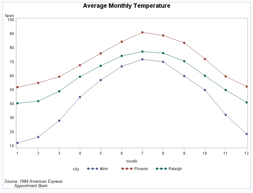
This example shows
that when your data contain a classification variable that groups
the data, you can use a plot request of the form y-variable*x-variable=third-variable to
generate a separate plot for every value of the classification variable,
which in this case is CITY. With this type of request, all plots are
drawn on the same graph and a legend is automatically produced that
identifies the values of third-variable.
The default legend uses the variable name CITY for the legend label
and the variable values for the legend value descriptions.
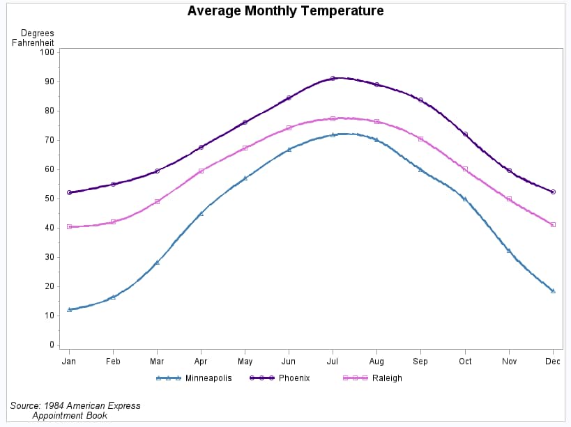
This example then modifies
the plot request. As shown in the second output display, the plot
is enhanced by using different symbol definitions and colors for each
plot line, changing axes labels, and scaling the vertical axes differently.
Program
goptions reset=all border;
proc format;
   value mmm_fmt
   1='Jan'
   2='Feb'
   3='Mar'
   4='Apr'
   5='May'
   6='Jun'
   7='Jul'
   8='Aug'
   9='Sep'
   10='Oct'
   11='Nov'
   12='Dec'
   ;
run;
data citytemp;
   input  month faren city $ @@;
   datalines;
   1      40.5    Raleigh     1      12.2    Minn
   1      52.1    Phoenix     2      42.2    Raleigh
   2      16.5    Minn        2      55.1    Phoenix
   3      49.2    Raleigh     3      28.3    Minn
   3      59.7    Phoenix     4      59.5    Raleigh
   4      45.1    Minn        4      67.7    Phoenix
   5      67.4    Raleigh     5      57.1    Minn
   5      76.3    Phoenix     6      74.4    Raleigh
   6      66.9    Minn        6      84.6    Phoenix
   7      77.5    Raleigh     7      71.9    Minn
   7      91.2    Phoenix     8      76.5    Raleigh
   8      70.2    Minn        8      89.1    Phoenix
   9      70.6    Raleigh     9      60.0    Minn
   9      83.8    Phoenix    10      60.2    Raleigh
  10      50.0    Minn       10      72.2    Phoenix
  11      50.0    Raleigh    11      32.4    Minn
  11      59.8    Phoenix    12      41.2    Raleigh
  12      18.6    Minn       12      52.5    Phoenix
;
title1 "Average Monthly Temperature";
footnote1 j=l " Source: 1984 American Express";
footnote2 j=l "         Appointment Book";
symbol1 interpol=join value=dot ;
proc gplot data= citytemp;
   plot faren*month=city / hminor=0;
run;
symbol1 interpol=spline width=2 value=triangle c=steelblue;
symbol2 interpol=spline width=2 value=circle c=indigo;
symbol3 interpol=spline width=2 value=square c=orchid;
axis1 label=none
      order = 1 to 12 by 1
      offset=(2);

axis2 label=("Degrees" justify=right  "Fahrenheit")
      order=(0 to 100 by 10);
legend1 label=none value=(tick=1 "Minneapolis");
format month mmm_fmt.;
plot faren*month=city /
        haxis=axis1 hminor=0
        vaxis=axis2 vminor=1
        legend=legend1;
run;
quit;
Program Description
Create a format for the month values. Format mmm_fmt formats the numeric month values
into three-character month names.
proc format;
   value mmm_fmt
   1='Jan'
   2='Feb'
   3='Mar'
   4='Apr'
   5='May'
   6='Jun'
   7='Jul'
   8='Aug'
   9='Sep'
   10='Oct'
   11='Nov'
   12='Dec'
   ;
run;
Create the data set. CITYTEMP
contains the average monthly temperatures of three cities: Raleigh,
Minneapolis, and Phoenix.
data citytemp;
   input  month faren city $ @@;
   datalines;
   1      40.5    Raleigh     1      12.2    Minn
   1      52.1    Phoenix     2      42.2    Raleigh
   2      16.5    Minn        2      55.1    Phoenix
   3      49.2    Raleigh     3      28.3    Minn
   3      59.7    Phoenix     4      59.5    Raleigh
   4      45.1    Minn        4      67.7    Phoenix
   5      67.4    Raleigh     5      57.1    Minn
   5      76.3    Phoenix     6      74.4    Raleigh
   6      66.9    Minn        6      84.6    Phoenix
   7      77.5    Raleigh     7      71.9    Minn
   7      91.2    Phoenix     8      76.5    Raleigh
   8      70.2    Minn        8      89.1    Phoenix
   9      70.6    Raleigh     9      60.0    Minn
   9      83.8    Phoenix    10      60.2    Raleigh
  10      50.0    Minn       10      72.2    Phoenix
  11      50.0    Raleigh    11      32.4    Minn
  11      59.8    Phoenix    12      41.2    Raleigh
  12      18.6    Minn       12      52.5    Phoenix
;
title1 "Average Monthly Temperature";
footnote1 j=l " Source: 1984 American Express";
footnote2 j=l "         Appointment Book";
Define symbol for the first plot. This statement specifies that a straight line connect
data point. Because no color is specified, the default color behavior
is used and each line is a different color.
Generate a plot of three variables that produces a legend. The plot request draws one plot on the graph for
each value of CITY and produces a legend that defines CITY values.
symbol1 interpol=spline width=2 value=triangle c=steelblue;
symbol2 interpol=spline width=2 value=circle c=indigo;
symbol3 interpol=spline width=2 value=square c=orchid;
Define new axis characteristics. AXIS1 suppresses the axis label and specifies month
abbreviations for the major tick mark labels. AXIS2 specifies a two-line
axis label and scales the axis to show major tick marks at every 10
degrees from 0 to 100 degrees.
axis1 label=none
      order = 1 to 12 by 1
      offset=(2);

axis2 label=("Degrees" justify=right  "Fahrenheit")
order=(0 to 100 by 10);Format variable month. Format
mmm_fmt, which was defined earlier, formats the numeric month values
to three-character month names.