GPLOT Procedure
- Syntax

- Overview
- Concepts
- Examples Generating a Simple Bubble PlotLabeling and Sizing Plot BubblesAdding a Right Vertical AxisPlotting Two VariablesConnecting Plot Data PointsGenerating an Overlay PlotFilling Areas in an Overlay PlotPlotting Three VariablesPlotting with Different Scales of ValuesCreating Plots with Drill-down Functionality for the Web
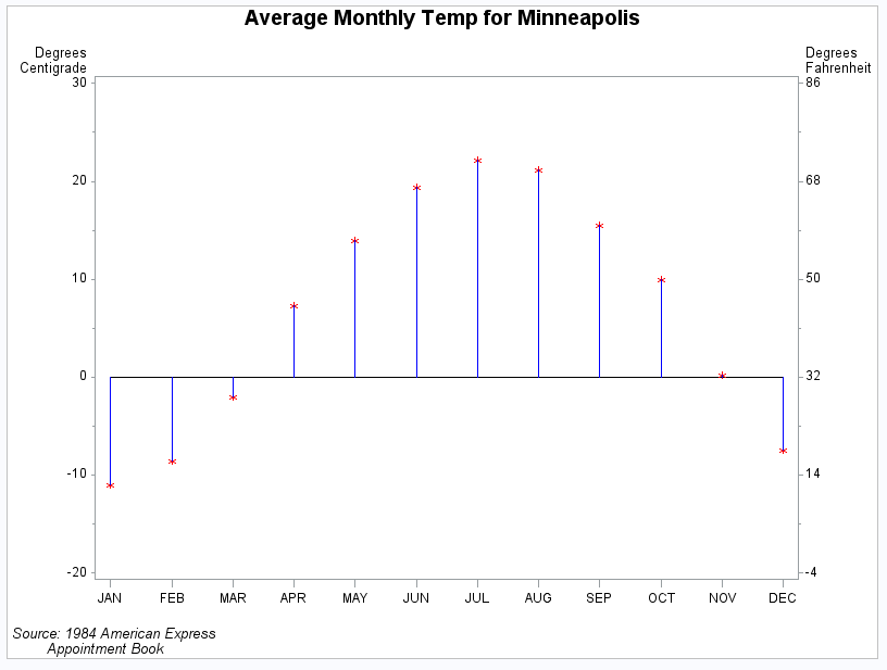
Example 9: Plotting with Different Scales of Values
| Features: |
|
| Other features: |
GOPTIONS statement option: BORDER AXIS statement SYMBOL statement |
| Sample library member: | GPLSCVL1 |
This example shows
how a PLOT2 statement generates a right axis that displays the values
of the vertical coordinates in a different scale from the scale that
is used for the left axis.
In this plot of the
average monthly temperature for Minneapolis, temperature variables
that represent degrees centigrade (displayed on the left axis) and
degrees Fahrenheit (displayed on the right axis) are plotted against
the variable MONTH. Although the procedure produces two sets of data
points, it calibrates the axes so that the data points are identical
and it displays only one plot.
This example uses SYMBOL
statements to define symbol definitions. By default, the SYMBOL1 statement
is assigned to the plot that is generated by the PLOT statement, and
SYMBOL2 is assigned to the plot generated by the PLOT2 statement.
Program
goptions reset=all border;
proc format;
   value mmm_fmt
   1='JAN'
   2='FEB'
   3='MAR'
   4='APR'
   5='MAY'
   6='JUN'
   7='JUL'
   8='AUG'
   9='SEP'
   10='OCT'
   11='NOV'
   12='DEC'
   ;
run;
data minntemp;
   input @10 month
         @23 f2;     /* fahrenheit temperature for Minneapolis */
         c2=(f2-32)/1.8; /* calculate centigrade temperature */
                         /* for Minneapolis                  */
   output;
   datalines;
01JAN83  1    1   40.5  12.2  52.1
01FEB83  2    1   42.2  16.5  55.1
01MAR83  3    2   49.2  28.3  59.7
01APR83  4    2   59.5  45.1  67.7
01MAY83  5    2   67.4  57.1  76.3
01JUN83  6    3   74.4  66.9  84.6
01JUL83  7    3   77.5  71.9  91.2
01AUG83  8    3   76.5  70.2  89.1
01SEP83  9    4   70.6  60.0  83.8
01OCT83  10   4   60.2  50.0  72.2
01NOV83  11   4   50.0  32.4  59.8
01DEC83  12   1   41.2  18.6  52.5
;
title1 "Average Monthly Temp for Minneapolis";
footnote1 j=l " Source: 1984 American Express";
footnote2 j=l "         Appointment Book";
symbol1 interpol=needle ci=blue cv=red value=star;
symbol2 interpol=none value=none;
axis1 label=none order=(1 to 12 by 1) offset=(2);

axis2 label=( "Degrees" justify=right " Centigrade")
      order=(-20 to 30 by 10);

axis3 label=( "Degrees" justify=left "Fahrenheit")
      order=(-4 to 86 by 18);
proc gplot data= minntemp;
   format month mmm_fmt.;

   plot c2*month / haxis=axis1 hminor=0
                   vaxis=axis2 vminor=1;

   plot2 f2*month / vaxis=axis3 vminor=1;

run;
quit;
Program Description
Create a format for the month values. Format mmm_fmt formats the numeric month values
into three-character month names.
proc format;
   value mmm_fmt
   1='JAN'
   2='FEB'
   3='MAR'
   4='APR'
   5='MAY'
   6='JUN'
   7='JUL'
   8='AUG'
   9='SEP'
   10='OCT'
   11='NOV'
   12='DEC'
   ;
run;
Create the data set and calculate centigrade temperatures. MINNTEMP contains average monthly temperatures for
Minneapolis.
data minntemp;
   input @10 month
         @23 f2;     /* fahrenheit temperature for Minneapolis */
         c2=(f2-32)/1.8; /* calculate centigrade temperature */
                         /* for Minneapolis                  */
   output;
   datalines;
01JAN83  1    1   40.5  12.2  52.1
01FEB83  2    1   42.2  16.5  55.1
01MAR83  3    2   49.2  28.3  59.7
01APR83  4    2   59.5  45.1  67.7
01MAY83  5    2   67.4  57.1  76.3
01JUN83  6    3   74.4  66.9  84.6
01JUL83  7    3   77.5  71.9  91.2
01AUG83  8    3   76.5  70.2  89.1
01SEP83  9    4   70.6  60.0  83.8
01OCT83  10   4   60.2  50.0  72.2
01NOV83  11   4   50.0  32.4  59.8
01DEC83  12   1   41.2  18.6  52.5
;title1 "Average Monthly Temp for Minneapolis"; footnote1 j=l " Source: 1984 American Express"; footnote2 j=l " Appointment Book";
Define symbol characteristics. INTERPOL=NEEDLE
generates a horizontal reference line at zero on the left axis and
draws vertical lines from the data points to the reference line. CI=
specifies the color of the interpolation line and CV= specifies the
color of the plot symbol.
Define symbol characteristics for PLOT2. SYMBOL2 suppresses interpolation lines and plotting
symbols. Otherwise, they would overlay the lines or symbols displayed
by SYMBOL1.
Define axis characteristics. In
the AXIS2 and AXIS3 statements, the ORDER= option controls the scaling
of the axes. Both axes represent exactly the same range of temperature,
and the distance between the major tick marks on both axes represent
an equivalent quantity of degrees (10 for centigrade and 18 for Fahrenheit).
axis1 label=none order=(1 to 12 by 1) offset=(2);

axis2 label=( "Degrees" justify=right " Centigrade")
      order=(-20 to 30 by 10);

axis3 label=( "Degrees" justify=left "Fahrenheit")
      order=(-4 to 86 by 18);
Generate a plot with a second vertical axis. The mmm_fmt format, which was defined earlier, is
applied to the MONTH variable to format the month numbers into three-character
month names. The HAXIS= option specifies the AXIS1 definition. The
VAXIS= option specifies AXIS2 and AXIS3 definitions in the PLOT and
PLOT2 statements. Axis labels and major tick mark values use the
default color. The VMINOR= option specifies the number of minor tick
marks for each axis.