The PARETO Procedure
- Overview
-
Getting Started

-
Syntax
-
Details
-
ExamplesCreating Before-and-After Pareto ChartsCreating Two-Way Comparative Pareto ChartsHighlighting the "Vital Few"Highlighting Combinations of CategoriesHighlighting Combinations of CellsOrdering Rows and Columns in a Comparative Pareto ChartMerging Columns in a Comparative Pareto ChartCreating Weighted Pareto ChartsCreating Alternative Pareto ChartsCustomizing Inset Labels and Formatting ValuesSpecifying Inset Headers and PositionsManaging a Large Number of Categories
- References
Note: See Basic Pareto Chart from Frequency Data in the SAS/QC Sample Library.
In some situations, a count (frequency) is available for each category, or you can compress a large data set by creating a frequency variable for the categories before applying the PARETO procedure.
For example, you can use the FREQ procedure to obtain the compressed data set Failure2 from the data set Failure1:
proc freq data=Failure1;
   tables Cause / noprint out=Failure2;
run;
A listing of Failure2 is shown in Figure 15.3.
The following statements produce a horizontal Pareto chart for the data in Failure2:
title 'Analysis of Integrated Circuit Failures';
proc pareto data=Failure2;
   hbar Cause / freq     = Count
                scale    = count
                last     = 'Miscellaneous'
                nlegend  = 'Total Circuits'
                odstitle = title1
                markers;
run;
The frequency variable Count is specified in the FREQ=
option. Specifying SCALE=
COUNT requests a frequency scale for the frequency axis (at the top of the chart). Specifying LAST=
'Miscellaneous' causes the Miscellaneous category to be displayed last regardless of its frequency. The NLEGEND=
option adds a sample size legend labeled "Total Circuits." Specifying ODSTITLE=
TITLE replaces the default graph title with the title that is specified in the TITLE statement. The MARKERS
option places markers at the points on the cumulative percentage curve.
The chart is displayed in Figure 15.4.
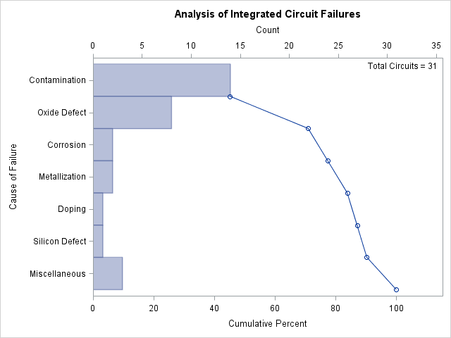
Note that in a horizontal Pareto chart categories are listed in decreasing frequency order from top to bottom on the category axis.
There are two sets of tied categories in this example: Corrosion and Metallization each occur twice, and Doping and Silicon Defect each occur once. PROC PARETO displays tied categories alphabetically in order of their formatted values. Thus, Corrosion appears before Metallization, and Doping appears before Silicon Defect in Figure 15.4. This is simply a convention, and no practical significance should be attached to the order in which tied categories are
arranged.