The PARETO Procedure
- Overview
-
Getting Started

-
Syntax
-
Details
-
ExamplesCreating Before-and-After Pareto ChartsCreating Two-Way Comparative Pareto ChartsHighlighting the "Vital Few"Highlighting Combinations of CategoriesHighlighting Combinations of CellsOrdering Rows and Columns in a Comparative Pareto ChartMerging Columns in a Comparative Pareto ChartCreating Weighted Pareto ChartsCreating Alternative Pareto ChartsCustomizing Inset Labels and Formatting ValuesSpecifying Inset Headers and PositionsManaging a Large Number of Categories
- References
Note: See Alternative Pareto Charts in the SAS/QC Sample Library.
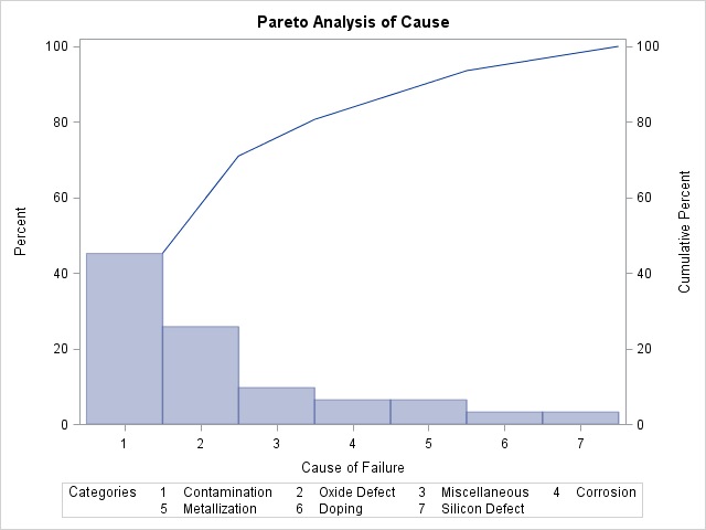
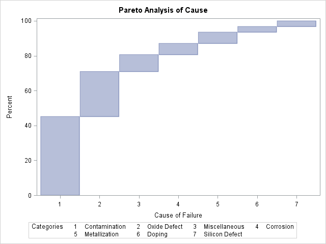
This example uses the Failure1 data set of integrated circuit fabrication failures from the section Creating a Pareto Chart from Raw Data. The following statements use the CHARTTYPE=
option to produce a standard Pareto chart, a cumulative Pareto bar chart, and a Pareto dot plot that includes acceptance
intervals for the data:
proc pareto data=Failure1;
   vbar Cause;
   vbar Cause / charttype=cumulative;
   vbar Cause / charttype=intervals;
run;
Note: ODS Graphics must be enabled for you to use the CHARTTYPE= option.
Output 15.9.1 shows the standard Pareto chart that the first VBAR statement produces.
Output 15.9.2 shows the cumulative Pareto bar chart that the second VBAR statement produces.
Output 15.9.3 shows the Pareto dot plot and acceptance intervals that the third VBAR statement produces.
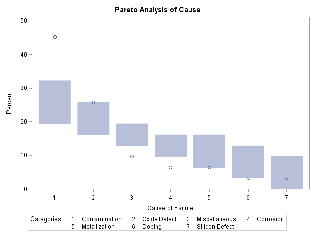
Output 15.9.3 shows that the most frequently occurring problem, Contamination, occurs more frequently than the first-ranked cause from a random sample of seven uniformly distributed causes. This result indicates that addressing contamination problems should be given a high priority.