GBARLINE Procedure

Overview: GBARLINE Procedure
About the GBARLINE Procedure
The GBARLINE procedure
produces bar-line charts. Bar-line charts are vertical bar charts
with one or more plot overlays. These charts graphically represent
the value of a statistic calculated for one or more variables in an
input SAS data set. The charted variables can be either numeric or
character.
Chart Terminology
Bar-line charts display the magnitude
of data with bars, each of which represents a category of data (midpoint).
The height of the bars represents the value of the bar statistic for
the corresponding midpoint.
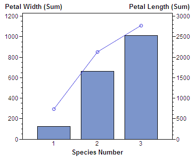
Bar-Line Chart shows the relationship
between petal width and petal length for three species of flowers. The horizontal axis is the midpoint axis and the vertical
axes are response axes. The right response axis is the PLOT statement
axis and the left vertical axis is the BAR statement axis. Each axis
is labeled with the variable name or label. Each species is a midpoint,
so each bar is labeled with the species identifier.