Interactive Summary and Bar Chart
Definition
An interactive summary
and bar chart is a graph that consists of a grid and some vertical
or horizontal columns (bars) with a slider that can be moved across
the bars.
An interactive
display enables dashboard users to interactively traverse large amounts
of detail data by sliding along a summary chart. Detail data can be
easily compared using the following two methods:
Usage Information
Note: SAS BI Dashboard 4.3 and
later provides this indicator for support of environments that have
been migrated from SAS BI Dashboard 4.2. It is not recommended that
users of SAS BI Dashboard 4.3 or later use this indicator. Instead,
use the chart with slider prompt indicator and either bar chart indicators,
and define an interaction between the two indicators to achieve the
same functionality, but with superior control by way of the display
settings.
-
For more information, see Adding Interactions between Indicators.
|
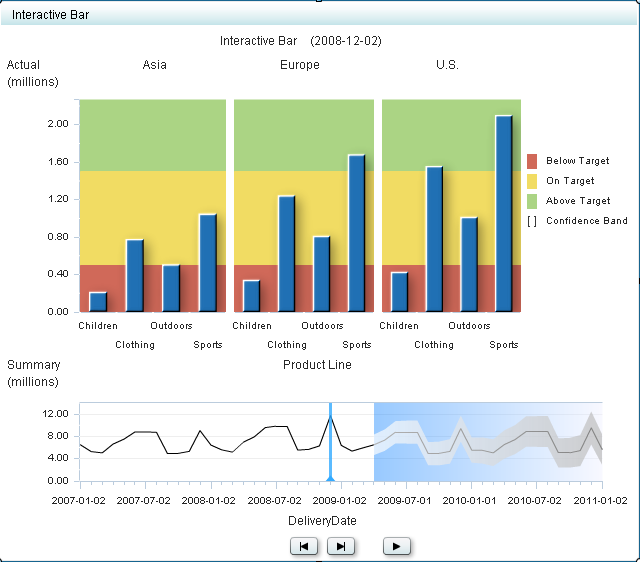
An interactive summary
and bar chart is most commonly used when data greatly varies across
time and multiple categories can be defined (to represent the different
bars). This chart can also be used with ranges by representing the
length of each bar as the progress made toward a certain range value.
Because the interactive summary and bar chart has many components,
be sure to identify what role each value or data point plays in the
chart and think about how to display the value or data point.
|
|
|
Alerts are supported. For information, see Customizing Alerts.
|
|
|
This indicator type can be used to define a link only. For
more information about defining an indicator with a hyperlink, see Adding Links to Indicators or Other Content.
|
|
Display Settings
The following display settings are used in the preceding
figure. For more information, see “Sample Data Structure”
for this indicator.
You can customize the
following display settings for this indicator:
-
(Required) From the X-axis value list, select the column in your data that you want to use for the X-axis value in the indicator. When you view your indicator data, the columns in the data set are described by the values in the Column Name column. The selections available in the X-axis value list are all of the values in the Column Name column.
Sample Data Structure
To create an interactive
summary and bar chart, you must provide two variables (X-axis value
and summarize by) and at least two measures (bar value, forecasted
value). In this example, the data from 2011 also provides values for
the optional lower and upper confidence settings.
The following data
sample is associated with the figure previously shown. Underneath
each column heading is its associated display setting.
For the best results
when using this interactive indicator, the indicator data must meet
the following requirements:
-
(Optional) To enable an interactive indicator to express forecasting data to business users, the indicator data must contain a column for forecasted values, for lower confidence values, and for upper confidence values.An interactive indicator can summarize either the detail data expressed in the detail charts or can summarize a different field of data.At the indicator level, the setup of the interactive indicator is essentially the same as for bar charts, except that the use of data for the interactive indicators is more sophisticated. The only significant difference is that the interactive indicators support the concept of dependent ranges. A dependent range takes the value of another range for the range definition. This scheme enables a data set generated by the SAS Forecast Server to be useful to the SAS BI Dashboard and the interactive indicators without the need for complicated intermediary data transformations.