Interactive Summary and Scatter Plot
Definition
An interactive summary
and scatter plot is a combination of graphical charts that shows how
individual data points change over time when a slider is moved across
a line graph that represents time. The scatter plot consists of a
set of data points that are plotted to show the relation of one value
against others. The interactive summary enables the user to see how
the data points change over time.
An interactive
display enables dashboard users to interactively traverse large amounts
of detail data by sliding along a summary chart. Detail data can be
easily compared using the following two methods:
Usage Information
Note: SAS BI Dashboard 4.3 and
later provides this indicator for support of environments that have
been migrated from SAS BI Dashboard 4.2. It is not recommended that
users of SAS BI Dashboard 4.3 or later use this indicator. Instead,
use the chart with slider prompt indicator and the scatter plot indicator,
and define an interaction between the two indicators to achieve the
same functionality, but with superior control by way of the display
settings.
-
For more information, see Adding Interactions between Indicators.
-
See Scatter Plot.
|
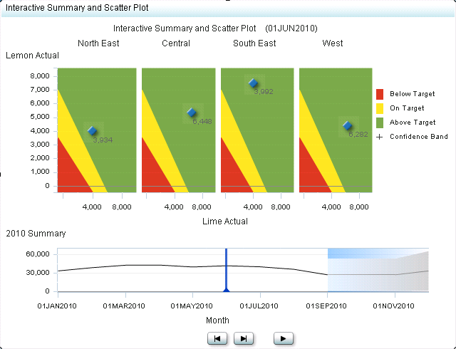
The interactive summary
and scatter plot indicator is commonly used to show sales revenue
numbers over time, compared to targets. Each plotted data point can
represent sales versus target for a certain point in time. By moving
the slider, the data points change to represent new sales versus target
values. A range can color the background of the plot to add the target
dimension.
|
|
|
Alerts are supported. For information, see Customizing Alerts.
|
|
|
This indicator type can be used to define a link only. For
more information about defining an indicator with a hyperlink, see Adding Links to Indicators or Other Content.
|
|
General Settings
Note: When setting the height and width of this indicator type,
remember that it has minimum legible dimensions of 380 x 450 pixels.
This indicator requires
that you specify two ranges: the X-axis range and the Y-axis range.
In the preceding example, the following ranges are used:
Display Settings
The following display settings are used in the preceding
figure. For more information, see “Sample Data Structure”
for this indicator.
You can customize the
following display settings for this indicator:
-
(Required) From the X-axis value list, select the column in your data that you want to use for the X-axis value in the indicator. When you view your indicator data, the columns in the data set are described by the values in the Column Name column. The selections available in the X-axis value list are all of the values in the Column Name column.
-
(Required) From the Y-axis value list, select the column in your data that you want to use for the Y-axis value in the indicator. When you view your indicator data, the columns in the data set are described by the values in the Column Name column. The selections available in the Y-axis value list are all of the values in the Column Name column.
Sample Data Structure
The following data
sample is associated with the figure previously shown. Underneath
each column heading is its associated display setting.
For the best results
when using this interactive indicator, the indicator data must meet
the following requirements:
-
(Optional) To enable an interactive indicator to express forecasting data to business users, the indicator data must contain a column for forecasted values, for lower confidence values, and for upper confidence values.An interactive indicator can summarize either the detail data expressed in the detail charts or can summarize a different field of data.At the indicator level, the setup of the interactive indicator is essentially the same as for scatter plots, except that the use of data for the interactive indicators is more sophisticated. The only significant difference is that the interactive indicators support the concept of dependent ranges. A dependent range takes the value of another range for the range definition. This scheme enables a data set generated by the SAS Forecast Server to be useful to the SAS BI Dashboard and the interactive indicators without the need for complicated intermediary data transformations.