Scatter Plot

Definition

A scatter plot is a chart that consists of a set of data points that are plotted on horizontal and vertical axes to show the relation of one value against another.
Example of a Scatter Plot Indicator
example Scatter Plot indicator
For a sample of the indicator data that was used to create this indicator, see “Sample Data Structure” for this indicator.

Usage Information

Data best suited for
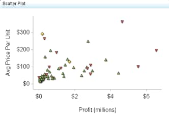
Scatter plots can be used when many data points are present and there is interest in determining whether a correlation exists between the data points. For example, to determine whether there is a correlation between the outside temperature and the number of forest fires in a given region, each forest fire could be plotted at the outside temperature at the time of the forest fire. When all data points are plotted, the user can either visually determine whether data points are related, or can use an equation to determine the correlation between data points by using best-fit procedures. Note that this determination is not automatically done by simply creating the scatter plot.
Target audience
This indicator type is appropriate for all user audiences. Most people find this indicator type familiar and easy to interpret.
Data aggregation support
This indicator type does not aggregate the indicator data.
Range support
A range is required.
Alert support
Alerts are supported. For information, see Customizing Alerts.
Link support
This indicator type can be used to define a link or as the destination of a link.For more information about defining an indicator with a hyperlink, see Adding Links to Indicators or Other Content.
Interaction support
  • Data filter support: This indicator type can be used as either a source or target indicator.
  • Interactive highlighting support: This indicator type can be used as either a source or target indicator.
For more information, see Adding Interactions between Indicators.
Filter multiple items support
Filtering multiple items is supported.For more information, see Supporting Multiple Selections in a Filtered Data Interaction.

General Settings

The General Settings section provides controls that support the following tasks:

Display Settings

The following display settings are used in the preceding figure. For more information, see “Sample Data Structure” for this indicator.
Display Setting
Selection Used for Figure
Range value
Profit %
Point label
Product Group
X-axis value
Profit
Y-axis value
Avg Price Per Unit
Show labels
This setting is selected.
X-axis title
<blank> (defaults to Profit)
Note: The Scale X axis setting adds the label (millions) to the title.
Y-axis title
<blank> (defaults to Avg Price Per Unit)
Scale X axis
This setting is selected.
Scale Y axis
This setting is selected.
You can customize the following display settings for this indicator:
  • (Required) From the Range value list, select the value to which you want to apply the defined range intervals.
  • (Required) From the Point label list, select the value that you want to use to label the data points.
  • (Required) From the X-axis value list, select the column in your data that you want to use for the X-axis value in the indicator. When you view your indicator data, the columns in the data set are described by the values in the Column Name column. The selections available in the X-axis value list are all of the values in the Column Name column.
  • (Required) From the Y-axis value list, select the column in your data that you want to use for the Y-axis value in the indicator. When you view your indicator data, the columns in the data set are described by the values in the Column Name column. The selections available in the Y-axis value list are all of the values in the Column Name column.
  • Select Show labels if you want the indicator to include the labels for each map portion or pie slice.
  • In the X-axis title field, type the title to use for the X axis in the indicator. If you do not specify a title, the value that you selected from the X-axis value list is used by default. If you do not want a title, type a space in the field. If you select Scale X axis, a measurement label is added to the title.
  • In the Y-axis title field, type the title to use for the Y axis in the indicator. If you do not specify a title, the value that you selected from the Y-axis value list is used by default. If you do not want a title, type a space in the field. If you select Scale Y axis, a measurement label is added to the title.
  • Select Scale X axis if you want to scale that axis. When you make this selection, a measurement label is added to the X-axis title if the data is numeric. For example, if the X-axis title is set to Revenue and you select Scale X axis, the X-axis title is displayed as Revenue (millions).
  • Select Scale Y axis if you want to scale that axis. When you make this selection, a measurement label is added to the Y-axis title if the data is numeric. For example, if the Y-axis title is set to Revenue and you select Scale Y axis, the Y-axis title is displayed as Revenue (millions).
  • Select Hide axes when zoomed out if you want to hide the axes when a user zooms out the view of an indicator. When the user zooms in, the axes reappear. Select this setting to avoid visual clutter when the view is zoomed out.
  • Select Hide axis tick labels if you want to hide the axis tick labels when a user zooms out the view of an indicator. When the user zooms in, the axis tick labels reappear. Select this setting to avoid visual clutter when the view is zoomed out.
  • From the Row group by list, select the value that you want to use to group rows of data. If you do not want to group the rows, select (none).
  • From the Column group by list, select the value that you want to use to group columns of data. If you do not want to group the columns, select (none).
  • From the X-axis format list, select the format that you want to apply to the data on that axis. If you do not want to specify a format, select (none). When set to (none), the indicator uses the format that is used in the data source.
  • From the Y-axis format list, select the format that you want to apply to the data on that axis. If you do not want to specify a format, select (none). When set to (none), the indicator uses the format that is used in the data source.

Sample Data Structure

To create a scatter plot, you must provide a variable (point label) and three measures (range value, X-axis value, Y-axis value).
The following data sample is associated with the figure previously shown. Underneath each column heading is its associated display setting.
Profit percentage
(Range value)
Product Group
(Point label)
Average Price Per Unit
(X-axis value)
Sales
(Y-axis value)
71.46%
Golf clothes
$111.41
$2,052, 303
56.29%
Gymnastic clothing
$47.03
$303,411
57.81%
Bathing suits
$34.59
$1,486,572