Bar Chart with Bullet

Definition

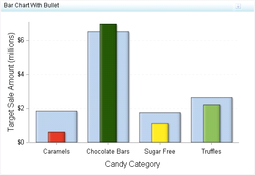
A bar chart with bullet consists of a grid and some vertical or horizontal columns (bars) with bullet lines inside each bar. The length of each bar represents a quantitative measure, and the bullet inside it compares this measure to another measure, such as a target. The bar and its bullet enables the business user to quickly see how the bullet measure compares to the value of the bar.
Example of a Bar Chart with Bullet Indicator
For a sample of the indicator data that was used to create this indicator, see “Sample Data Structure” for this indicator.

Usage Information

Data best suited for
Use bar charts with bullets when comparing a primary measure to another measure. For example, bar charts with bullets work well when comparing sales revenue to targets or the current temperature to average or high temperatures.
Not suited for
Do not use bar charts with bullets when comparing two measures that cannot be compared easily or are not related to each other.
Target audience
This indicator type is appropriate for all user audiences. Most people find this indicator type familiar and easy to interpret.
Data aggregation support
This indicator type averages the applicable indicator data.
Range support
A range is required.
Alert support
Alerts are supported. For information, see Customizing Alerts.
Link support
This indicator type can be used to define a link or as the destination of a link.For more information about defining an indicator with a hyperlink, see Adding Links to Indicators or Other Content.
Interaction support
  • Data filter support: This indicator type can be used as either a source or target indicator.
  • Interactive highlighting support: This indicator type can be used as either a source or target indicator.
For more information, see Adding Interactions between Indicators.
Filter multiple items support
Filtering multiple items is supported.For more information, see Supporting Multiple Selections in a Filtered Data Interaction.

Display Settings

The following display settings are used in the preceding figure. For more information, see “Sample Data Structure” for this indicator.
Display Setting
Selection Used for Figure
Range value
Sale Amount
X-axis value
Category
Bar value
Target Sale Amount
Bullet value
Sale Amount
X-axis title
Set to Candy Category
Y-axis title
<blank> (defaults to Target Sale Amount)
Note: The Scale Y axis setting adds the label (millions) to the title.
Scale X axis
This setting is selected.
Scale Y axis
This setting is selected.
You can customize the following display settings for this indicator:
  • (Required) From the Range value list, select the value to which you want to apply the defined range intervals.
  • (Required) From the X-axis value list, select the column in your data that you want to use for the X-axis value in the indicator. When you view your indicator data, the columns in the data set are described by the values in the Column Name column. The selections available in the X-axis value list are all of the values in the Column Name column.
    Note: This setting affects the colors of the bullet bars that are drawn in the indicator.
  • (Required) From the Bar value list, select the value that you want to use for the bars that are drawn in the indicator.
    Note: This setting affects the light blue, wide bar in the indicator. The color cannot be changed.
  • (Required) From the Bullet value list, select the value that you want to use for the bullets that are drawn in the indicator.
    Note: This setting affects the thin bar that responds to the defined range colors.
  • In the X-axis title field, type the title to use for the X axis in the indicator. If you do not specify a title, the value that you selected from the X-axis value list is used by default. If you do not want a title, type a space in the field. If you select Scale X axis, a measurement label is added to the title.
  • In the Y-axis title field, type the title to use for the Y axis in the indicator. If you do not specify a title, the value that you selected from the Bar value list is used by default. If you do not want a title, type a space in the field. If you select Scale Y axis, a measurement label is added to the title.
  • Select Scale X axis if you want to scale that axis. When you make this selection, a measurement label is added to the X-axis title if the data is numeric. For example, if the X-axis title is set to Revenue and you select Scale X axis, the X-axis title is displayed as Revenue (millions).
  • Select Scale Y axis if you want to scale that axis. When you make this selection, a measurement label is added to the Y-axis title if the data is numeric. For example, if the Y-axis title is set to Revenue and you select Scale Y axis, the Y-axis title is displayed as Revenue (millions).
  • Select Hide axis tick labels if you want to hide the axis tick labels when a user zooms out the view of an indicator. When the user zooms in, the axis tick labels reappear. Select this setting to avoid visual clutter when the view is zoomed out.
  • Select Hide axes when zoomed out if you want to hide the axes when a user zooms out the view of an indicator. When the user zooms in, the axes reappear. Select this setting to avoid visual clutter when the view is zoomed out.
  • From the Row group by list, select the value that you want to use to group rows of data. If you do not want to group the rows, select (none).
  • From the Column group by list, select the value that you want to use to group columns of data. If you do not want to group the columns, select (none).
  • From the X-axis format list, select the format that you want to apply to the data on that axis. If you do not want to specify a format, select (none). When set to (none), the indicator uses the format that is used in the data source.
  • From the Y-axis format list, select the format that you want to apply to the data on that axis. If you do not want to specify a format, select (none). When set to (none), the indicator uses the format that is used in the data source.
  • From the X-axis labels list, select the style to apply to the data labels that are used on the X axis. Depending on your labels, one style might be easier to read than others.

Sample Data Structure

To create a bar chart with bullet, you must provide one variable (X-axis value) and at least two measures (bar value and bullet value). In this example, only two measures are provided.
The following data sample is associated with the figure previously shown. Underneath each column heading is its associated display setting.
Category
(X-axis value)
Sale Amount
(Bar value)
Target Sale Amount
(Bullet value)
Caramels
$625,601
$1,862,471
Chocolate Bars
$6,988,757
$6,544,357
Sugar Free
$1,133,940
$1,770,507
Truffles
$2,230,216
$2,666,718