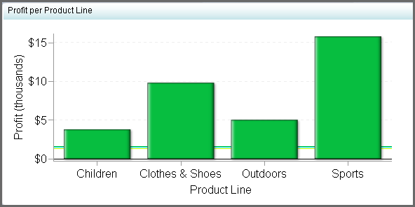
Bar Chart with Reference Lines
Definition
Usage Information
|
This indicator type is appropriate for all user audiences.
Most people find this indicator type familiar and easy to interpret.
The reference lines especially help users to easily determine which
interval the values are in and quickly get an idea of the value’s
distance from the interval thresholds.
|
|
|
Alerts are supported. For information, see Customizing Alerts.
|
|
|
This indicator type can be used to define a link or as the
destination of a link.For
more information about defining an indicator with a hyperlink, see Adding Links to Indicators or Other Content.
|
|
|
Filtering multiple items is supported.For
more information, see Supporting Multiple Selections in a Filtered Data Interaction.
|
Display Settings
The following display settings are used in the preceding
figure. For more information, see “Sample Data Structure”
for this indicator.
You can customize the
following display settings for this indicator:
-
(Required) From the X-axis value list, select the column in your data that you want to use for the X-axis value in the indicator. When you view your indicator data, the columns in the data set are described by the values in the Column Name column. The selections available in the X-axis value list are all of the values in the Column Name column.
-
In the X-axis title field, type the title to use for the X axis in the indicator. If you do not specify a title, the value that you selected from the X-axis value list is used by default. If you do not want a title, type a space in the field. If you select Scale X axis, a measurement label is added to the title.
-
In the Y-axis title field, type the title to use for the Y axis in the indicator. If you do not specify a title, the value that you selected from the Y-axis value list is used by default. If you do not want a title, type a space in the field. If you select Scale Y axis, a measurement label is added to the title.
Sample Data Structure
To create a bar chart
with reference lines, you must provide a variable (X-axis value) and
a measure (bar value). Optionally, you can specify additional variables by using
the Row group by and Column group
by lists.
The following data
sample is associated with the figure previously shown. Underneath
each column heading is its associated display setting.
Note: To prevent aggregation by
the bar chart with reference lines indicator, aggregate the data at
the indicator data level.
For the best results,
the indicator data should return only one value for each unique value
in the Category Label data column. If the
indicator data returns only one value, the bar chart with reference
lines indicator does not need to aggregate the data. The category
variable is specified by the data column selected for the Category
Label field when the data source is defined.
If the bar chart with
reference lines indicator does aggregate data, the bar chart with
reference lines does two things:
-
It displays data points at the average interval for each data series.
-
It averages the indexes of the aggregated intervals to determine the interval to display and the color of the bar.