Bubble Plot

Definition

A bubble plot is a chart that consists of a set of data points that are plotted to show the relation of one value against another. Each data point in the plot is a bubble that is sized to indicate how a third variable is affected by the correlation.
Example of a Bubble Plot Indicator
example bubble plot indicator
For a sample of the indicator data that was used to create this indicator, see “Sample Data Structure” for this indicator.

Usage Information

Data best suited for
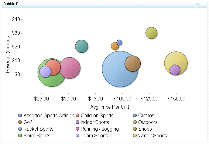
You can use the diameters of the bubbles to represent company size, the X axis to represent company growth, and the Y axis to represent current company revenue. You can use transparent bubbles when some bubbles overlap and all bubbles need to be visible. Use colored bubbles to group similar bubbles together.
Target audience
This indicator type is appropriate for all user audiences. Most people find this indicator type familiar and easy to interpret. However, it is essential to provide a clear and easy-to-read legend with a bubble plot so that the user can interpret what the different dimensions (bubble placement, size, and color) mean.
Data aggregation support
This indicator type does not aggregate the indicator data.
Range support
Ranges are not supported.
Alert support
Alerts are not supported.
Link support
This indicator type can be used to define a link or as the destination of a link.For more information about defining an indicator with a hyperlink, see Adding Links to Indicators or Other Content.
Interaction support
  • Data filter support: This indicator type can be used as either a source or target indicator.
  • Interactive highlighting support: This indicator type can be used as either a source or target indicator.
For more information, see Adding Interactions between Indicators.
Filter multiple items support
Filtering multiple items is supported.For more information, see Supporting Multiple Selections in a Filtered Data Interaction.

General Settings

Display Settings

The following display settings are used in the preceding figure. For more information, see “Sample Data Structure” for this indicator.
Display Setting
Selection Used for Figure
Group by value
Product Category
X-axis value
Avg Price per Unit
Y-axis value
Revenue
Bubble size value
Profit %
X-axis title
<blank> (defaults to Avg Price per Unit)
Y-axis title
<blank> (defaults to Revenue)
Note: The Scale Y axis setting adds the label (millions) to the title.
Scale X axis
This setting is selected.
Scale Y axis
This setting is selected.
You can customize the following display settings for this indicator:
  • (Required) From the Group by value list, select the value that you want to use to group the data that is displayed in the indicator.
  • (Required) From the X-axis value list, select the column in your data that you want to use for the X-axis value in the indicator. When you view your indicator data, the columns in the data set are described by the values in the Column Name column. The selections available in the X-axis value list are all of the values in the Column Name column.
  • (Required) From the Y-axis value list, select the column in your data that you want to use for the Y-axis value in the indicator. When you view your indicator data, the columns in the data set are described by the values in the Column Name column. The selections available in the Y-axis value list are all of the values in the Column Name column.
  • (Required) From the Bubble size value list, select the value that you want to use for the size of the bubbles that are drawn in the indicator.
  • In the X-axis title field, type the title to use for the X axis in the indicator. If you do not specify a title, the value that you selected from the X-axis value list is used by default. If you do not want a title, type a space in the field. If you select Scale X axis, a measurement label is added to the title.
  • In the Y-axis title field, type the title to use for the Y axis in the indicator. If you do not specify a title, the value that you selected from the Y-axis value list is used by default. If you do not want a title, type a space in the field. If you select Scale Y axis, a measurement label is added to the title.
  • Select Scale X axis if you want to scale that axis. When you make this selection, a measurement label is added to the X-axis title if the data is numeric. For example, if the X-axis title is set to Revenue and you select Scale X axis, the X-axis title is displayed as Revenue (millions).
  • Select Scale Y axis if you want to scale that axis. When you make this selection, a measurement label is added to the Y-axis title if the data is numeric. For example, if the Y-axis title is set to Revenue and you select Scale Y axis, the Y-axis title is displayed as Revenue (millions).
  • From the X-axis format list, select the format that you want to apply to the data on that axis. If you do not want to specify a format, select (none). When set to (none), the indicator uses the format that is used in the data source.
  • From the Y-axis format list, select the format that you want to apply to the data on that axis. If you do not want to specify a format, select (none). When set to (none), the indicator uses the format that is used in the data source.

Sample Data Structure

To create a bubble plot, you must provide a variable (group by value) and three measures (X-axis value, Y-axis value, bubble size value).
The following data sample is associated with the figure previously shown. Underneath each column heading is its associated display setting.
Product Category
(Group by value)
Average Price Per Unit
(X-axis value)
Revenue
(Y-axis value)
Profit %
(Bubble size value)
Golf
$109.38
$8,040,846
54.06%
Racket sports
$97.81
$4,072,029
60.21%
Swim sports
$34.59
$1,486,572
57.81