| Histograms and Bar Charts |
Output
For nominal variables, bars are distinguished by different colors. For interval variables, all bars have the same color.
To view or modify output options associated with your bar chart, click on the Output button of the variables dialog. This displays the options dialog shown in Figure 32.4.
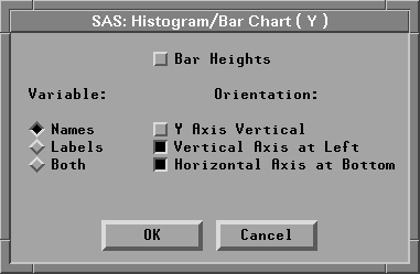
Figure 32.4: Bar Chart Output Options Dialog
You can modify other aspects of the bar chart using the bar chart pop-up menu. Click on the button at the lower left corner of the bar chart to display the pop-up menu.
![[menu]](images/bar_bareq1.gif)
Figure 32.5: Bar Chart Pop-up Menu
- Ticks...
- displays the dialog in Figure 32.6 to set tick values for the variable being charted. In histograms, you can use this menu to set bar width and offset. You can set tick values for the frequency axis by clicking on the Frequency label before selecting Ticks from the pop-up menu.
- Axes
- toggles the display of axes.
- Observations
- toggles the display of observations (bars). When this menu is toggled off, observations are displayed only if selected.
- Values
- toggles the display of values for bar heights.
- Reference Lines
- toggles the display of lines that indicate the position of major ticks on the frequency axis. This option is not available unless the axes are visible.
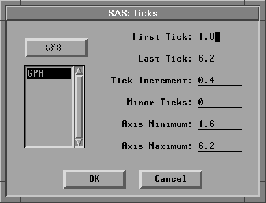
Figure 32.6: Bar Chart Ticks Dialog
You can adjust bar width and offset interactively with the Hand Tool, as described in Chapter 12, "Examining Distributions." You can also add density curves to bar charts in distribution analyses, as described in Chapter 38, "Distribution Analyses."
Related Reading |
Bar Charts, Chapter 4. |
Related Reading |
Distributions, Chapter 12, Chapter 38. |
Copyright © 2007 by SAS Institute Inc., Cary, NC, USA. All rights reserved.