The PARETO Procedure
- Overview
-
Getting Started

-
Syntax
-
Details
-
ExamplesCreating Before-and-After Pareto ChartsCreating Two-Way Comparative Pareto ChartsHighlighting the "Vital Few"Highlighting Combinations of CategoriesHighlighting Combinations of CellsOrdering Rows and Columns in a Comparative Pareto ChartMerging Columns in a Comparative Pareto ChartCreating Weighted Pareto ChartsCreating Alternative Pareto ChartsCustomizing Inset Labels and Formatting ValuesSpecifying Inset Headers and PositionsManaging a Large Number of Categories
- References
Creating a Pareto Chart from Raw Data
Note: See Basic Pareto Chart from Raw Data in the SAS/QC Sample Library.
In the fabrication of integrated circuits, common causes of failures include improper doping, corrosion, surface contamination,
silicon defects, metallization, and oxide defects. The causes of 31 failures were recorded in a SAS data set called Failure1:
data Failure1;
   length Cause $ 16;
   label  Cause = 'Cause of Failure';
   input  Cause & $;
   datalines;
Corrosion
Oxide Defect
Contamination
Oxide Defect
Oxide Defect
Miscellaneous
Oxide Defect
Contamination
Metallization
Oxide Defect
Contamination
Contamination
Oxide Defect
Contamination
Contamination
Contamination
Corrosion
Silicon Defect
Miscellaneous
Contamination
Contamination
Contamination
Miscellaneous
Contamination
Contamination
Doping
Oxide Defect
Oxide Defect
Metallization
Contamination
Contamination
;
Each of the 31 observations corresponds to a different circuit, and the value of Cause provides the cause for the failure. These are raw data in the sense that more than one observation has the same value of
Cause and that the observations are not sorted by Cause.
The following statements produce a basic Pareto chart for the failures:
ods graphics on;
proc pareto data=Failure1;
   vbar Cause;
run;
The PROC PARETO statement (referred to as the PROC statement) invokes the PARETO procedure and identifies the input data set. You specify one or more process variables to be analyzed in the VBAR statement. The ODS GRAPHICS ON statement that is specified before the PROC statement enables ODS Graphics, so the Pareto chart is created using ODS Graphics instead of traditional graphics.
The Pareto chart is shown in Figure 15.1.
Figure 15.1: Pareto Chart for Integrated Circuit Failures in the Data Set Failure1
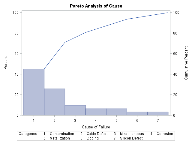
PROC PARETO has classified the values of Cause into seven distinct categories. The bars represent the percentage of failures in each category, and they are arranged in
decreasing order. Thus, the most frequently occurring category is Contamination, which accounts for 45% of the failures. The Pareto curve indicates the cumulative percentage of failures from left to right;
for example, Contamination and Oxide Defect together account for 71% of the failures.
If there is insufficient space to label the bars along the category axis, PROC PARETO numbers the bars from left to right and adds a legend to identify the categories, as in Figure 15.1. A category legend is likely to be introduced in the following cases:
-
The number of categories is large.
-
The category labels are lengthy. Category labels can be up to 64 characters.
-
You specify a large text height. In traditional graphics output, you can specify the text height in the HEIGHT= option in the HBAR or VBAR statement or in the HTEXT= option in a GOPTIONS statement.
The following statements suppress the category legend by specifying the CATLEGEND= OFF option:
proc pareto data=Failure1;
   vbar Cause / catlegend=off;
run;
A slash (/) is used to separate the process variable Cause from the options that are specified in the VBAR statement. The resulting chart is show in Figure 15.2.
Figure 15.2: Pareto Chart with Category Legend Suppressed
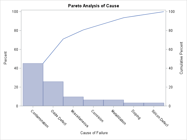
Because the category legend is turned off, PROC PARETO displays the category labels at an angle so that they do not collide.