The PARETO Procedure
- Overview
-
Getting Started

-
Syntax
-
Details
-
ExamplesCreating Before-and-After Pareto ChartsCreating Two-Way Comparative Pareto ChartsHighlighting the "Vital Few"Highlighting Combinations of CategoriesHighlighting Combinations of CellsOrdering Rows and Columns in a Comparative Pareto ChartMerging Columns in a Comparative Pareto ChartCreating Weighted Pareto ChartsCreating Alternative Pareto ChartsCustomizing Inset Labels and Formatting ValuesSpecifying Inset Headers and PositionsManaging a Large Number of Categories
- References
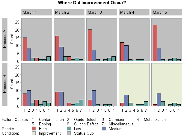
Example 15.5 Highlighting Combinations of Cells
Note: See Highlighting Tiles in a Comparative Pareto Chart in the SAS/QC Sample Library.
This example is a continuation of Example 15.4.
In some applications that involve comparative Pareto charts, it is useful to classify the cells into groups. This example shows how you can use traditional graphics to display this type of classification by coloring the cells (also called tiles) and adding a legend.
Suppose you want to enhance Output 15.4.1 by highlighting the two cells for which Process='Process B' and Day='March 4' and 'March 5' to emphasize the improvement displayed in those cells. Begin by adding a tile color variable (Tilecol) and a tile legend variable (Tileleg) to the data set Failure4 as follows:
data Failure4;
   length Tilecol $ 8 Tileleg $ 16;
   set Failure4;
   if (Process='Process B') and (Day='March 4' or Day='March 5')
   then do; Tilecol='ywh'; Tileleg = 'Improvement'; end;
   else do; Tilecol='ligr'; Tileleg = 'Status Quo'; end;
run;
The following statements specify Tilecol as a CTILES=
variable and Tileleg as a TILELEGEND=
variable. Note that the variable names are enclosed in parentheses.
ods graphics off;
title 'Where Did Improvement Occur?';
proc pareto data=Failure4;
   vbar Cause / class        = ( Process Day )
                freq         = Counts
                nrows        = 2
                ncols        = 5
                last         = 'Miscellaneous'
                scale        = count
                catleglabel  = 'Failure Causes:'
     /* options for highlighting bars: */
                bars         = ( Priority )
                barlegend    = ( Priority )
                barleglabel  = 'Priority:'
     /* options for highlighting tiles: */
                ctiles       = ( Tilecol )
                tilelegend   = ( Tileleg )
                tileleglabel = 'Condition:'
                intertile    = 1.0
                cframeside   = ligr
                cframetop    = ligr
                nocatlabel
                nocurve;
run;
The ODS GRAPHICS OFF statement before the PROC statement disables ODS Graphics, so the Pareto chart is produced using traditional graphics. The CTILES=, TILELEGEND=, CFRAMESIDE= , and CFRAMETOP= options are valid only for traditional graphics output. See the section Options for Traditional Graphics for descriptions of options specific to traditional graphics.
In the chart, shown in Output 15.5.1, the values that are displayed in the legend labeled "Condition:" are the levels of the TILELEGEND= variable.
Output 15.5.1: Highlighting Specific Tiles
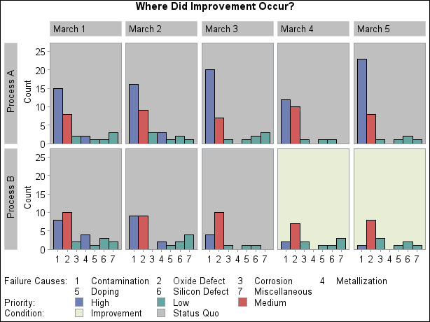
PROC PARETO sequentially assigns colors from a list defined by the ODS style to the levels of the BARS= variable. The first
color is associated with the first value of Priority, and so on. When traditional graphics is enabled, you can use the CBARS=
option to assign specific colors to Pareto categories. The following statements assign explicit color values to the variable
PriorityColor:
data Failure4;
   length PriorityColor $ 8;
   set Failure4;
   if Priority = 'High'
   then
      PriorityColor = 'CXD05B5B';
   else
   if Priority = 'Medium'
   then
      PriorityColor = 'CX6F7EB3';
   else
      PriorityColor = 'CX66A5A0';
run;
Output 15.5.2 shows the chart that is produced by replacing the BARS= option with CBARS=PriorityColor. The high-priority problems are represented by red bars, and the low-priority problems are represented by green bars.
Output 15.5.2: Assigning Specific Bar Colors