GPLOT Procedure
- Syntax

- Overview
- Concepts
- Examples Generating a Simple Bubble PlotLabeling and Sizing Plot BubblesAdding a Right Vertical AxisPlotting Two VariablesConnecting Plot Data PointsGenerating an Overlay PlotFilling Areas in an Overlay PlotPlotting Three VariablesPlotting with Different Scales of ValuesCreating Plots with Drill-down Functionality for the Web
Overview: GPLOT Procedure
About the GPLOT Procedure
The GPLOT
procedure plots the values of two or more variables on a set of coordinate
axes (X and Y). The coordinates of each point on the plot correspond
to two variable values in an observation of the input data set. The
procedure can also generate a separate plot for each value of a third
(classification) variable. It can also generate bubble plots in which
circles of varying proportions representing the values of a third
variable are drawn at the data points.
About Plots of Two Variables
Plots of two variables display the values of two variables
as data points on one horizontal axis (X) and one vertical axis (Y).
Each pair of X and Y values forms a data point.
The following figure
shows a simple scatter plot that plots the values of the variable
HEIGHT on the vertical axis and the variable WEIGHT on the horizontal
axis. By default, the PLOT statement scales the axes to include the
maximum and minimum data values and displays a symbol at each data
point. It labels each axis with the name of its variable or an associated
label and displays the value of each major tick mark.
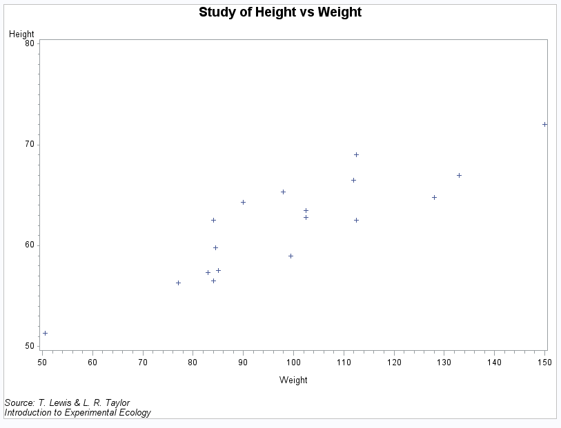
The program for this
plot is in Plotting Two Variables. For more information
about producing scatter plots, see PLOT Statement.
You can also overlay
two or more plots (multiple sets of data points) on a single set of
axes, and you can apply a variety of interpolation techniques to these
plots. See About Interpolation Methods.
About Plots with a Classification Variable
Plots
that use a classification variable produce a separate set of data
points for each unique value of the classification variable and display
all sets of data points on one set of axes.
The following figure
shows multiple line plots that compare yearly temperature trends for
three cities. The legend explains the values of the classification
variable, CITY.
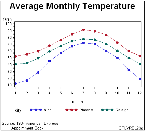
By default, plots with
a classification variable generate a legend. In the code that generates
the plot for Plotting Three Variables, a SYMBOL statement connects the data points and specifies
the plot symbol that is used for each value of the classification
variable (CITY). For more information
about how to produce plots with a classification variable, see PLOT Statement.
About Bubble Plots
Bubble plots
represent the values of three variables by drawing circles of varying
sizes at points that are plotted on the vertical and horizontal axes.
Two of the variables determine the location of the data points, while
the values of the third variable control the size of the circles.
Bubble Plot (GPLBUBL1) shows a bubble
plot in which each bubble represents a category of engineer that is
shown on the horizontal axis. The location of
each bubble in relation to the vertical axis is determined by the
average salary for the category. The size of each bubble represents
the number of engineers in the category relative to the total number
of engineers in the data.
By default, the BUBBLE
statement scales the axes to include the maximum and minimum data
values and draws a circle at each data point. It labels each axis
with the name of its variable or an associated label and displays
the value of each major tick mark.
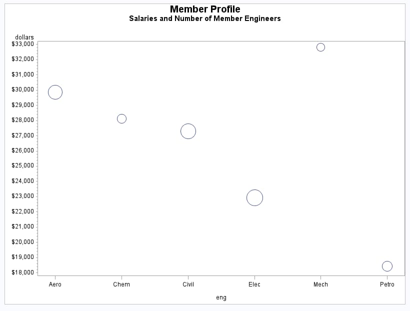
The program for this
plot is in Generating a Simple Bubble Plot. For more information
about producing bubble plots, see BUBBLE Statement.
About Plots with Two Vertical Axes
In the following figure,
the right axis displays the values of the vertical coordinates in
a different scale from the scale that is used for the left axis.
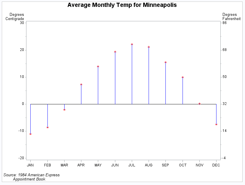
The program for this
plot is in Plotting with Different Scales of Values. For more information
about how to produce plots with a right vertical axis, see PLOT2 Statement and BUBBLE2 Statement.
About Interpolation Methods
In
addition to these graphs, you can produce other types of plots such
as box plots or high-low-close charts by specifying various interpolation
methods with the SYMBOL statement. Use the SYMBOL statement to do
the following tasks:
The SYMBOL Statement describes
all interpolation methods.