GRADAR Procedure

Overview: GRADAR Procedure
The GRADAR procedure creates radar charts, windrose
charts, and calendar charts. Note that the GRADAR procedure is not
supported by the Java device divers.
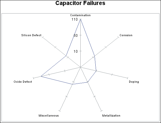
Radar Charts
Radar charts show the
relative frequency of data measures in quality control or market research
problems. The chart statistics are displayed along spokes that radiate
from the center of the chart. The charts are often stacked on top
of one another with reference circles, thus giving them the look of
a radar screen. By default, the chart vertices—the points where
the statistical values intersect the spokes—are based on the
frequencies associated with the levels of a single numeric variable.
Non-integer values of the chart variable are truncated to integers.
The measures can be displayed in decreasing order, the order in which
they appear in the input data, increasing order of internal values,
or lexicographic order of variable names. Radar charts are sometimes
also called star charts.
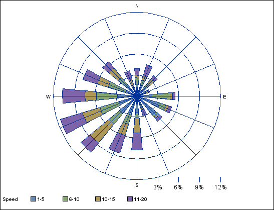
Windrose Charts
A windrose chart displays
wind direction and speed over a period of time at a specific location.
The segments in a windrose chart represent the percentage of time
that the wind blew from each direction.