| Exploring Data in Two Dimensions |
Scatter Plot Matrices
A scatter plot matrix shows relationships among several variables taken two at a time. Scatter plot matrices can reveal a wealth of information, including dependencies, clusters, and outliers.
You can explore the relationships among students' college grade point averages and standardized test scores by following these steps.
| Select SATM, SATV, and GPA in the data window. |
To select these variables, use noncontiguous selection. On most hosts, you can use the Ctrl key to make a noncontiguous selection, as described in Chapter 1, "Getting Started."
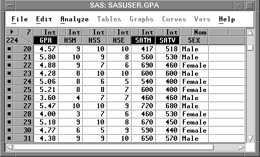
Figure 5.12: Selecting Three Variables
| Choose Analyze:Scatter Plot ( Y X ). |
This creates the scatter plot matrix shown in Figure 5.13.
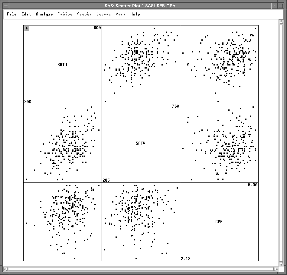
Figure 5.13: Scatter Plot Matrix
The plots are organized in a matrix of all pairwise combinations of the variables SATM, SATV, and GPA. Plots are arranged so that adjacent plots share a common axis. All plots in a row share a common Y axis, and all plots in a column share a common X axis. The diagonal cells of the matrix contain the names of the variables and their minimum and maximum values.
| Click on a marker in any scatter plot. |
The observation label is displayed and corresponding markers in all scatter plots are selected, as shown in Figure 5.14. This enables you to explore observations to see, for example, if an outlier in one scatter plot is an outlier in other scatter plots.
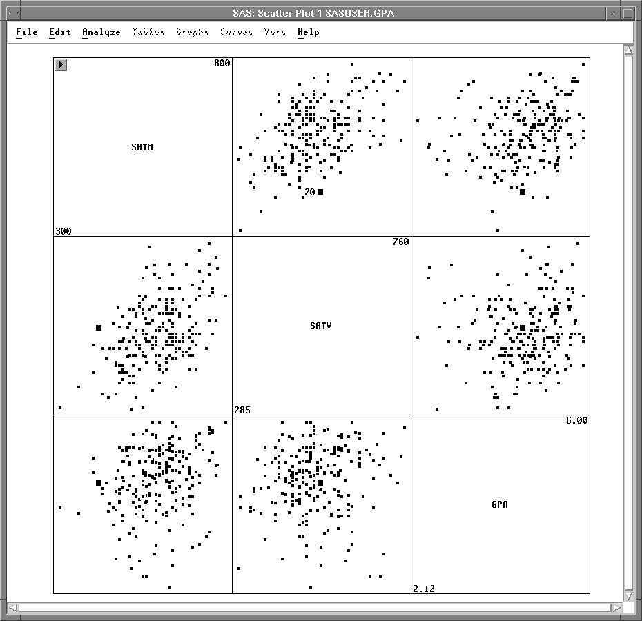
Figure 5.14: Selecting Observations in a Scatter Plot Matrix
Brushing Observations
Copyright © 2007 by SAS Institute Inc., Cary, NC, USA. All rights reserved.