| Exploring Data in Two Dimensions |
Scatter Plots
Scatter plots show the relationship between two variables. For example, you can explore the relationship between students' scores on standardized tests of math and verbal ability by following these steps.
| Open the GPA data set. |
| Select both the SATM and SATV variables. |
To select both variables, press the mouse button on SATM, move the mouse to SATV, then release the mouse button.
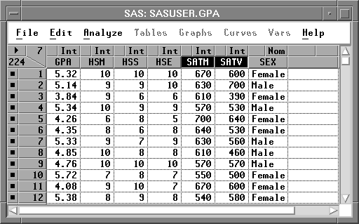
Figure 5.7: Selecting Two Variables
| Choose Analyze:Scatter Plot ( Y X ). |
![[menu]](images/two_twoeq2.gif)
Figure 5.8: Creating a Scatter Plot
This creates a scatter plot, as shown in Figure 5.9. Note that the first variable you selected, SATM, is plotted on the Y axis, while the second variable selected, SATV, is plotted on the X axis.
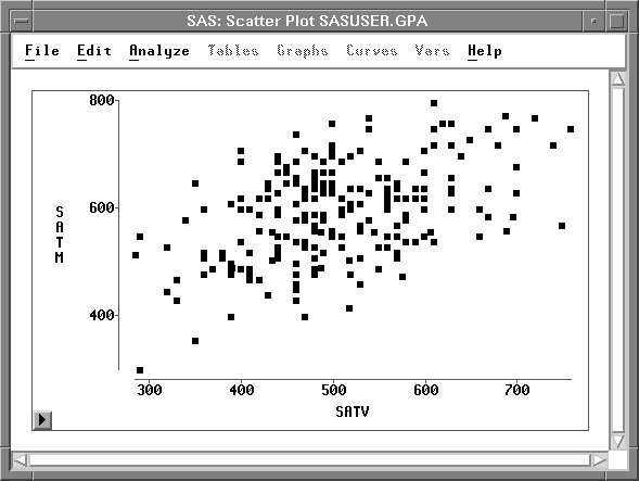
Figure 5.9: Scatter Plot
Each marker in the scatter plot represents an observation, and its position shows the values of SATM and SATV for that observation. You can click on any marker to determine which observation it represents.
| Click on a marker. |
This selects the marker and displays its observation number. For example, observation 20 is selected in Figure 5.10.
Clicking also selects the observation in the data window because windows are linked to their data. Any change to the data is automatically reflected in all windows.
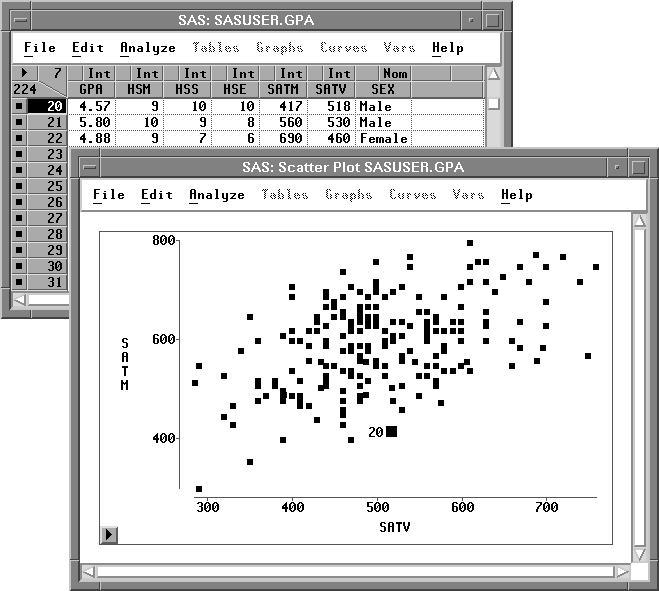
Figure 5.10: Selecting Observations in Multiple Windows
| Double-click on a marker. |
This selects the marker and displays the Examine Observation dialog. You can examine the values of all variables for the selected observation.
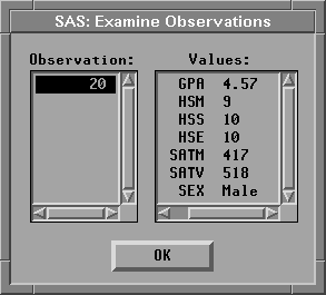
Figure 5.11: Examine Observations Dialog
Copyright © 2007 by SAS Institute Inc., Cary, NC, USA. All rights reserved.