| Exploring Data in Two Dimensions |
Mosaic Plots
This example illustrates how to create mosaic plots for the BASEBALL data cross-classified by LEAGUE and DIVISION.
| Open the BASEBALL data set. |
| Choose Analyze:Box Plot/Mosaic Plot ( Y ). |
| Assign LEAGUE the Y role and DIVISION the X role. Then click OK. |
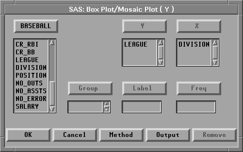
Figure 5.2: Assigning Variables for a Mosaic Plot
This creates a mosaic plot containing four boxes. The areas of the boxes in the mosaic plot are proportional to the number of observations in each category. You can see that, for these data, there are more players in the American League than in the National League and about the same number of players in the East and West Divisions.
You can find out more about specific categories by selecting the boxes.
| Click on the box at the lower left (American League East). |
This selects all the observations in the box and labels the box with its frequency and percentage. For this data, there are 85 players from the East Division of the American League, and these are 26.4% of the total.
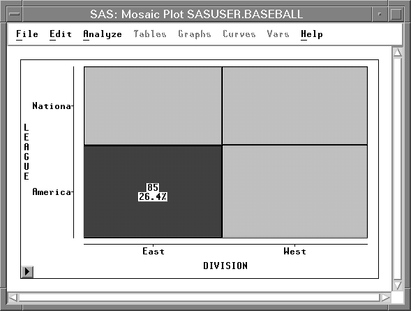
Figure 5.3: Clicking on a Box
| Double-click on the box to examine the observations. |
This selects all the observations in the box and displays the Examine Observations dialog. By clicking in the Examine Observations dialog, you can get detailed information on all the selected observations.
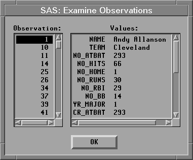
Figure 5.4: Examine Observation Dialog
You can add more information to the mosaic plot by displaying frequency counts and percentages.
| Choose Values from the pop-up menu. |
![[menu]](images/two_twoeq1.gif)
Figure 5.5: Mosaic Plot Pop-up Menu
This toggles the display of frequencies and percentages for all boxes in the mosaic plot.
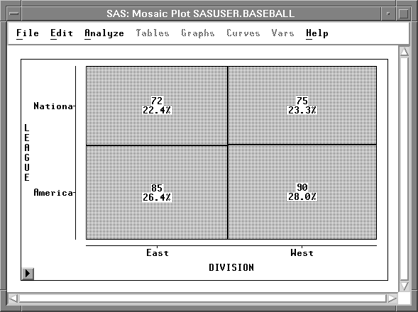
Figure 5.6: Mosaic Plot with Frequencies and Percentages
Copyright © 2007 by SAS Institute Inc., Cary, NC, USA. All rights reserved.