| Exploring Data in Three Dimensions |
Contour Plots
The contour plot provides an alternative graphical method for examining the variations of a response surface. The contour plot displays the geometric features of the response surface as a family of contours or level sets lying in the domain of the predictor variables.
If the AIR data set is not already open, open it now.
| Choose Analyze:Contour Plot ( Z Y X ). |
![[menu]](images/thr_threq1.gif)
Figure 6.16: Creating a Contour Plot
A contour plot variables dialog appears, as shown in Figure 6.17.
| Assign the Z role to the DUST variable, assign HOUR the Y role, and assign WIND the X role. |
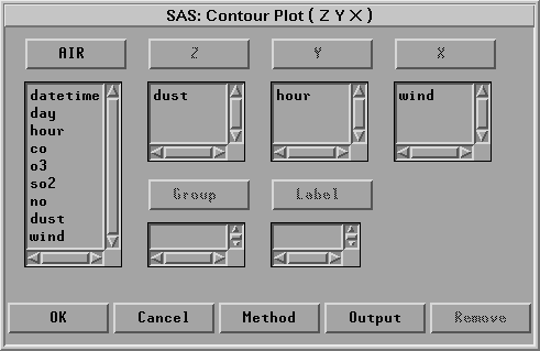
Figure 6.17: Contour Plot Variables Dialog
| Click Method to display the Method dialog. |
This dialog looks exactly like the Method dialog for the rotating plot, as shown in Figure 6.14.
| Select Fit:Thin-Plate Smoothing Spline and click OK. |
| Click OK to create a contour plot. |
| Click on the menu button in the lower left corner of the plot. Choose Observations. |
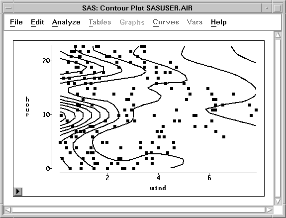
Figure 6.18: Contour Plot
By default, the contour lines of the response surface are evenly spaced in the units of the response variable. For this example, each contour represents about 1.3 units of change in the dust concentration. Note that regions where the contour lines are close together indicate regions in which small changes in the wind speed or the time of day will lead to relatively large changes in the modeled response for dust.
The response model indicates that peak dust concentrations for this data primarily occur when there are only gentle winds during the mid-morning and late afternoon. To see if this prediction qualitatively fits the AIR data set, you can examine the observations with high dust values.
| Select Edit:Observations:Find |
.
The Find Observations dialog appears.
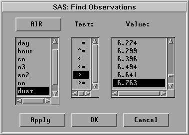
Figure 6.19: Find Observations dialog
| Select DUST in the left-hand column, the greater-than test (>) in the middle column, and the value 6.763 in the right-hand column. |
This selects all observations that have dust values greater than 6.763.
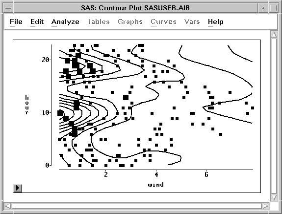
Figure 6.20: Selecting High DUST Values
All but one of the selected observations occur in the mid-morning or late afternoon on days with light winds. However, note that there are also observations in those regions that have small dust concentration values.
Consult Chapter 39, "Fit Analyses," to determine whether a model response surface provides a good quantitative fit to your data.
Related Reading |
Contour Plots, Chapter 36. |
Related Reading |
Fit Analysis, Chapter 39. |
Copyright © 2007 by SAS Institute Inc., Cary, NC, USA. All rights reserved.