| Box Plots and Mosaic Plots |
Box Plots and Mosaic Plots
Box plots are pictorial representations of the distribution of values of a variable. The central line in each box marks the median value and the edges of the box mark the first and third quartiles.
The median value of a distribution is the 50th percentile: It is the value less than and greater than 50% of the data. The first and third quartiles are the 25th and 75th percentiles. By combining these three values in a schematic diagram and plotting individual markers for extreme data values, the box plot provides a concise display of a distribution (Tukey 1977).
Mosaic plots are pictorial representations of frequency counts of a single nominal variable or cross-classified nominal variables. Because mosaic plots display the frequencies graphically, they are easier to understand than crosstabulations. You can select and brush mosaic plots to explore dependencies between variables.
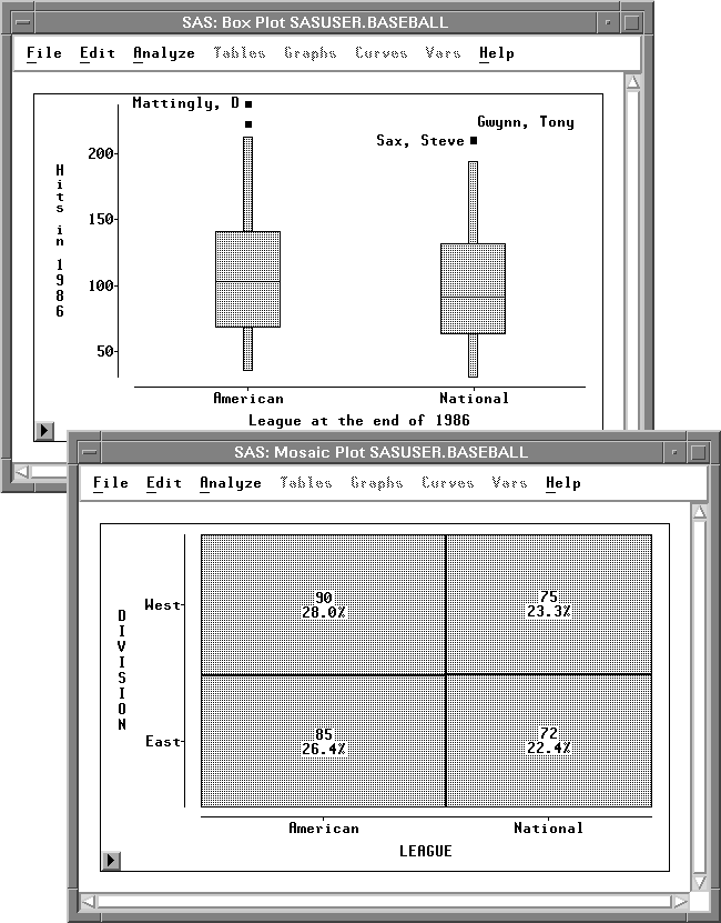
Figure 33.1: Box Plot and Mosaic Plot