| Box Plots and Mosaic Plots |
Output
To view or modify output options associated with your plot, click on the Output button of the variables dialog. This displays the output options dialog.
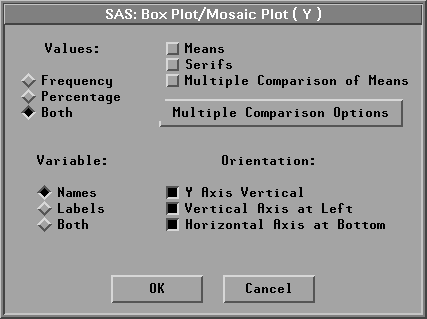
Figure 33.6: Box Plot/Mosaic Plot Output Options Dialog
| Values:Frequency | labels mosaic boxes with the frequency of observations represented in each box. |
| Values:Percentage | labels mosaic boxes with the percentage of observations represented in each box. |
| Values:Both | labels mosaic boxes with both frequency and percentage. |
| Means | displays mean diamonds on box plots. The central line in the diamond marks the mean. The size of the diamond is two standard deviations, one on either side of the mean. |
| Serifs | displays serifs at the ends of box plot whiskers. |
| Multiple Comparison of Means | displays a comparison circle (Sall 1992) for each box. The center of each circle marks the mean of each box. The color and line style of each circle indicates how the mean value of one box compares with the means of other boxes. A selected circle is highlighted and is drawn in red on color monitors. Circles corresponding to categories whose mean values are significantly different from a selected group are drawn in cyan on color monitors. Circles corresponding to categories whose mean values are not different are drawn with a dashed line and are red on color monitors. See the section "Multiple Comparison Circles" later in this chapter. |
| Multiple Comparison Options | displays the Multiple Comparison Options dialog window. |
| Variable:Names | labels the axes with variable names. |
| Variable:Labels | labels the axes with variable labels. |
| Variable:Both | labels the axes with both names and labels. |
| Orientation: Y Axis Vertical | draws the axis for the Y variable vertically. If this option is off, the Y axis is horizontal. |
| Orientation: Vertical Axis at Left | places the vertical axis at the left side of the plot. If this option is off, the vertical axis is at the right side. |
| Orientation: Horizontal Axis at Bottom | places the horizontal axis at the bottom of the plot. If this option is off, the horizontal axis is at the top. |
You can modify other aspects of box and mosaic plots with the pop-up menu.
![[menu]](images/box_boxeq2.gif)
Figure 33.7: Box Plot/Mosaic Plot Pop-up Menu
- Ticks...
- specifies tick labels on the Y axis.
- Axes
- toggles the display of axes.
- Observations
- toggles the display of observations (boxes and extreme values). When this menu is toggled off, observations are displayed only if selected.
- Means
- toggles the display of mean diamonds in box plots.
- Comparison Circles
- toggles the display of comparison circles in box plots.
- Serifs
- toggles the display of serifs at the ends of box plot whiskers.
- Values
- toggles the display of values for means, medians, quartiles, and ends of whiskers in box plots. Toggles the display of frequency and percentage counts in mosaic plots.
- Reference Lines
- toggles the display of lines that indicate the position of major ticks on the Y axis. This option is not available unless the axes are visible.
- Marker Sizes
- sets the size of markers that display extreme values in box plots.
Multiple Comparison Options
Multiple Comparison Circles
Copyright © 2007 by SAS Institute Inc., Cary, NC, USA. All rights reserved.