| Analysis of Variance |
Examining the Means
Before you can interpret the results for the significant main effects you observed in the Type III Tests table, you need to examine the means for the different levels of these effects. Box plots are an excellent tool for displaying means because means and standard deviations for each level of a variable can be placed side-by-side for easy comparison.
Follow these steps to add box plots for each level of DRUG to the Fit(Y X) window.
| Select an area for the box plot. |
Drag the cursor until you have a rectangle of suitable size.
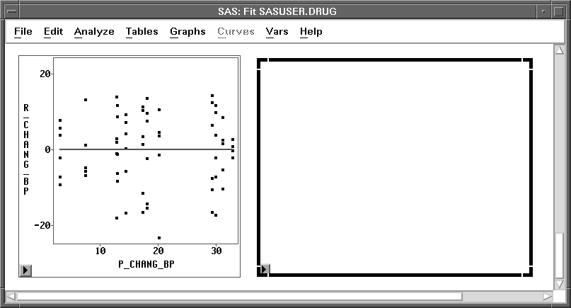
Figure 15.9: Selecting an Area
| Choose Analyze:Box Plot/Mosaic Plot ( Y ). |
| Select CHANG_BP in the list at the left, then click the Y button. |
This assigns the Y role to this variable.
| Select DRUG in the list at the left, then click the X button. |
This assigns the X role to this variable and requests a separate box plot for each level of DRUG. Your variables dialog should now appear, as shown in Figure 15.10.
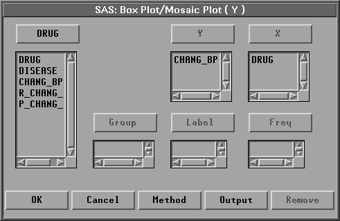
Figure 15.10: Box Plot Variables Dialog with Variable Roles Assigned
| Click the Output button. |
The output options dialog shown in Figure 15.11 appears on your display. In this dialog, you can specify options to determine the output produced by the box plot.
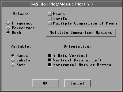
Figure 15.11: Box Plot Output Options Dialog
| Click on Means. |
Means displays mean diamonds for all boxes. The central line in the mean diamond marks the mean; the size of the mean diamond is two standard deviations, one above and one below the mean.
| Click OK in both dialogs to create the Box Plots. |
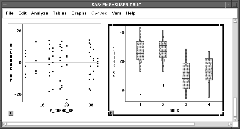
Figure 15.12: Box Plots for different DRUG Levels
Examine the box plot representing the four levels of DRUG. Recall that the central line in each mean diamond marks the mean while the height of the mean diamond shows one standard deviation on either side of the mean. The box and whiskers display percentiles for the data. (See Chapter 4, "Exploring Data in One Dimension," for a complete description of the parts of the box plot.)
Follow these steps to hide the display of box and whiskers in order to display the means and standard deviations better.
| Click on Observations in the box plot pop-up menu. |
This toggles the display of observations and thus turns off the display of the box, whiskers, and individual observations in the box plot.
![[menu]](images/aov_aoveq11.gif)
Figure 15.13: Box Plot Pop-up Menu
| Click on Values in the box plot pop-up menu. |
This toggles the display of values of the mean for each box plot.
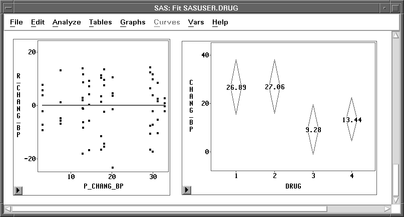
Figure 15.14: Mean Diamonds for DRUG
The largest effect noted in these plots is that drugs 1 and 2 have a higher average increase in systolic blood pressure than drugs 3 and 4 (averaged over all three levels of DISEASE). This difference resulted in the significant main effect for DRUG that was observed in the Type III Tests table.
| Repeat the preceding steps and display box plots for the levels of DISEASE. |
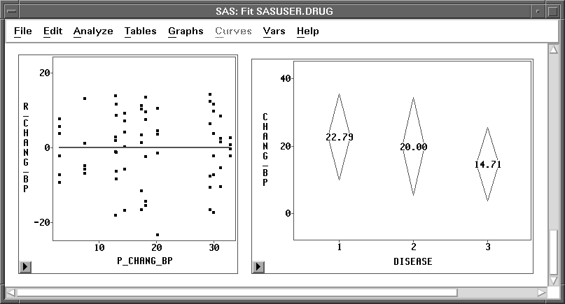
Figure 15.15: Mean Diamonds for DISEASE
The differences between the three DISEASE levels are not as pronounced as those observed for DRUG. Disease 3 is associated with a lower average increase in systolic blood pressure than the other two diseases (averaged over all four levels of DRUG). The smaller p-value observed for the DRUG main effect is more evidence that the mean differences for DISEASE are not as pronounced as those for DRUG.
This example illustrates one way to use Analyze:Fit to fit the general linear model. Turn to the next chapter to see how to fit the generalized linear model.
Related Reading |
Box Plots, Chapter 33. |
Related Reading |
Linear Models, Chapter 39. |
Copyright © 2007 by SAS Institute Inc., Cary, NC, USA. All rights reserved.