Details and Examples: PARETO Procedure
-
Details

-
ExamplesCreating Before-and-After Pareto ChartsCreating Two-Way Comparative Pareto ChartsHighlighting the Vital FewHighlighting Combinations of CategoriesHighlighting Combinations of CellsOrdering Rows and Columns in a Comparative Pareto ChartMerging Columns in a Comparative Pareto ChartCreating Weighted Pareto ChartsAlternative Pareto Charts
Example 15.8 Creating Weighted Pareto Charts
See PARETO12 in the SAS/QC Sample LibraryIn many applications, you can quantify the priority or severity of a problem with a measure such as the cost of repair or the loss to the customer expressed in man-hours. This example shows how to analyze such data with a weighted Pareto chart that incorporates the cost.
Suppose that the cost associated with each of the problems in data set Failure7 (see Example 15.6) has been determined and that the costs have been converted to a relative scale. The following statements add the cost information
to the data set:
data Failure7;
   length Analysis $ 16;
   label Analysis = 'Basis for Analysis';
   set Failure7;
   Analysis = 'Cost';
      if      Cause = 'Contamination'  then Cost = 3.0;
      else if Cause = 'Metallization'  then Cost = 8.5;
      else if Cause = 'Oxide Defect'   then Cost = 9.5;
      else if Cause = 'Corrosion'      then Cost = 2.5;
      else if Cause = 'Doping'         then Cost = 3.6;
      else if Cause = 'Silicon Defect' then Cost = 3.4;
      else                                  Cost = 1.0;
      output;
   Analysis = 'Frequency';
      Cost = 1.0;
      output;
run;
The classification variable Analysis has two levels, 'Cost' and 'Frequency'. For Analysis='Cost', the value of Cost is the relative cost, and for Analysis='Frequency', the value of Cost is one.
The following statements create a one-way comparative Pareto chart with Analysis as the classification variable, in which the cells are weighted Pareto charts with Cost as the weight variable:
ods graphics off;
goptions vsize=4.25 in htext=2.8 pct htitle=3.2 pct;
title 'Pareto Analysis By Cost and Frequency';
proc pareto data=Failure7;
   vbar Cause / class      = ( Analysis )
                freq       = Counts
                weight     = Cost
                barlabel   = value
                out        = summary
                intertile  = 1.0;
run;
The display is shown in Output 15.8.1.
Output 15.8.1: Taking Cost into Account
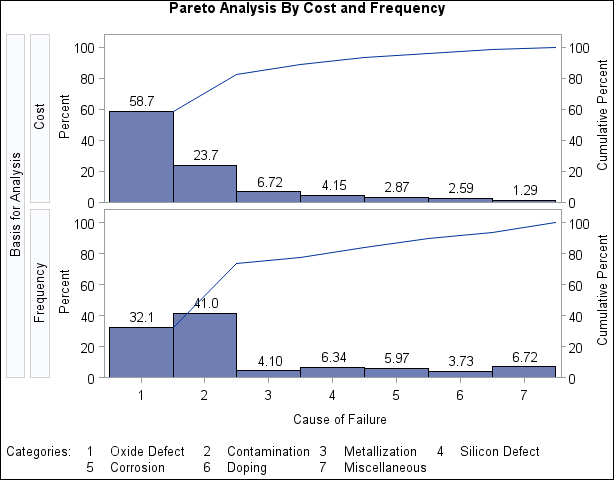
Within each cell, the height of a bar is the frequency of the category multiplied by the value of Cost, expressed as a percent of the total across all categories. Thus, for the cell in which Analysis is equal to 'Frequency', the bars simply indicate the frequencies expressed in percent units. This display shows that the
most commonly occurring problem (Contamination) is not the most expensive problem (Oxide Defect). The output data set summary is listed in Output 15.8.2.
Output 15.8.2: The Output Data Set SUMMARY
| Pareto Analysis By Cost and Frequency |
| Obs | Analysis | Cause | Cost | _COUNT_ | _WCOUNT_ | _PCT_ | _CMPCT_ |
|---|---|---|---|---|---|---|---|
| 1 | Cost | Oxide Defect | 9.5 | 86 | 817.0 | 58.6799 | 58.680 |
| 2 | Cost | Contamination | 3.0 | 110 | 330.0 | 23.7018 | 82.382 |
| 3 | Cost | Metallization | 8.5 | 11 | 93.5 | 6.7155 | 89.097 |
| 4 | Cost | Silicon Defect | 3.4 | 17 | 57.8 | 4.1514 | 93.249 |
| 5 | Cost | Corrosion | 2.5 | 16 | 40.0 | 2.8729 | 96.122 |
| 6 | Cost | Doping | 3.6 | 10 | 36.0 | 2.5856 | 98.707 |
| 7 | Cost | Miscellaneous | 1.0 | 18 | 18.0 | 1.2928 | 100.000 |
| 8 | Frequency | Oxide Defect | 1.0 | 86 | 86.0 | 32.0896 | 32.090 |
| 9 | Frequency | Contamination | 1.0 | 110 | 110.0 | 41.0448 | 73.134 |
| 10 | Frequency | Metallization | 1.0 | 11 | 11.0 | 4.1045 | 77.239 |
| 11 | Frequency | Silicon Defect | 1.0 | 17 | 17.0 | 6.3433 | 83.582 |
| 12 | Frequency | Corrosion | 1.0 | 16 | 16.0 | 5.9701 | 89.552 |
| 13 | Frequency | Doping | 1.0 | 10 | 10.0 | 3.7313 | 93.284 |
| 14 | Frequency | Miscellaneous | 1.0 | 18 | 18.0 | 6.7164 | 100.000 |