The MVPMONITOR Procedure

Creating a Multivariate Control Chart in a Phase I Situation
In a Phase I analysis you first perform a principal component analysis (PCA) of the data. Then you can use control charts
to determine whether the data that you use to build the principal component model indicate a stable multivariate process.
The MVPMONITOR procedure creates multivariate control charts from ![]() and SPE statistics computed from a principal component model that the MVPMODEL procedure produced. This example uses the model built in the section Building a Principal Component Model in Chapter 12: The MVPMODEL Procedure.
and SPE statistics computed from a principal component model that the MVPMODEL procedure produced. This example uses the model built in the section Building a Principal Component Model in Chapter 12: The MVPMODEL Procedure.
The following statements fit the model:
proc mvpmodel data=MWflightDelays ncomp=3 noprint
              out=mvpair outloadings=mvpairloadings;
   var AA CO DL F9 FL NW UA US WN;
run;
The NCOMP= option requests a principal component model that contains three principal components. The OUT= option creates a data set that contains the original data, the scores, and the ![]() and SPE statistics. The OUTLOADINGS= data set contains the variances and loadings for the principal components.
and SPE statistics. The OUTLOADINGS= data set contains the variances and loadings for the principal components.
The following statements produce the multivariate control charts:
ods graphics on;
proc mvpmonitor history=mvpair loadings=mvpairloadings;
   time flightDate;
   tsquarechart / contributions;
   spechart / contributions;
run;
The HISTORY= option specifies the input data set. The LOADINGS= option specifies the data set that contains the principal component model information. The TSQUARECHART statement requests a ![]() chart, and the SPECHART statement requests an SPE chart. The CONTRIBUTIONS options that are specified in the TSQUARECHART and SPECHART statements request contribution plots for all out-of-control
points in the charts. The TIME statement specifies that the variable
chart, and the SPECHART statement requests an SPE chart. The CONTRIBUTIONS options that are specified in the TSQUARECHART and SPECHART statements request contribution plots for all out-of-control
points in the charts. The TIME statement specifies that the variable flightDate provide the chronological ordering of the observations.
Figure 13.1 shows the ![]() chart.
chart.
Figure 13.1: Multivariate Control Chart for ![]() Statistics
Statistics
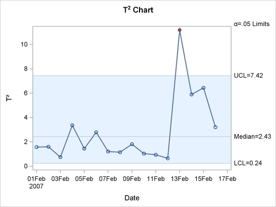
The ![]() chart shows an out-of-control point on February 13, 2007. On this day, a strong winter storm battered the midwestern United
States. To see which variables contributed to this statistic, you can use the contribution plot shown in Figure 13.2.
chart shows an out-of-control point on February 13, 2007. On this day, a strong winter storm battered the midwestern United
States. To see which variables contributed to this statistic, you can use the contribution plot shown in Figure 13.2.
Figure 13.2: Contribution Plot
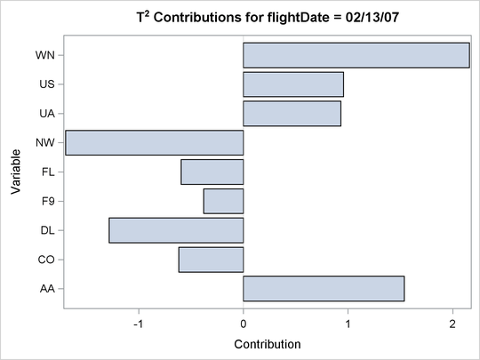
The contribution plot shows that the variables WN, AA, NW, and DL are the major contributors to the out-of-control point.
Figure 13.3 shows the SPE chart.
Figure 13.3: Multivariate Control Chart for SPE Statistics
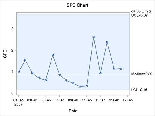
There are no out-of-control points in the SPE chart. This indicates that the unusual point displayed in the ![]() chart represents a departure from the variation described by the principal component model that lies within the model hyperplane.
chart represents a departure from the variation described by the principal component model that lies within the model hyperplane.