Getting Started: MVPMONITOR Procedure
This example illustrates the basic features of the MVPMONITOR procedure using airline flight delay data available from the U.S. Bureau of Transportation Statistics at http://www.transtats.bts.gov. The example applies multivariate process monitoring to flight delays, and it is a continuation of the example in the section Getting Started: MVPMODEL Procedure in Chapter 10, The MVPMODEL Procedure.
Suppose you want to use a principal components model to create  and SPE charts to monitor the variation in flight delays. These charts are appropriate because the data are multivariate and correlated.
The following statements create a SAS data set named MWflightDelays which provides the delays for flights that originated in the Midwestern U.S. The data set contains variables for nine airlines: AA (American Airlines), CO (Continental Airlines), DL (Delta Airlines), F9 (Frontier Airlines), FL (AirTran Airways), NW (Northwest Airlines), UA (United Airlines), US (US Airways), and WN (Southwest Airlines).
data MWflightDelays;
   format flightDate MMDDYY8.;
   label flightDate='Date';
   input flightDate :MMDDYY8. AA CO DL F9 FL NW UA US WN;
   datalines;
02/01/07 14.9  7.1  7.9  8.5 14.8  4.5  5.1 13.4  5.1
02/02/07 14.3  9.6 14.1  6.2 12.8  6.0  3.9 15.3 11.4

   ... more lines ...

02/15/07 46.6 36.3 23.9 20.8 30.4 24.3 30.3 59.9 25.6
02/16/07 31.2 20.8 15.2 20.1  9.1 12.9 22.9 36.4 16.4
;
The observations for a given date are the average flight delays in minutes for flights that depart from the Midwestern U.S. For example, on February 2, 2007, F9 (Frontier Airlines) departed 6.2 minutes late on average. A Phase I analysis is appropriate because it is not known whether the data represent stable variation in flight delays.
Creating a Multivariate Control Chart in a Phase I Situation
In a Phase I analysis, the MVPMONITOR procedure creates multivariate control charts from and SPE statistics computed from a principal components model that is produced by the MVPMODEL procedure. This example uses the model built in the section Building a Principal Components Model in
Chapter 10,
The MVPMODEL Procedure.
The following statements fit the model:
proc mvpmodel data=MWflightDelays ncomp=3 noprint
              out=mvpair outloadings=mvpairloadings;
   var AA CO DL F9 FL NW UA US WN;
run;
The NCOMP= option requests a principal components model with three principal components. The NOPRINT option suppresses all output from MVPMODEL. The OUT= option specifies the output data set for MVPMODEL, which contains the original data, the scores, and the and SPE statistics. The OUTLOADINGS= data set contains the variances and loadings for the principal components.
The following statements produce the multivariate control charts:
ods graphics on;
proc mvpmonitor history=mvpair loadings=mvpairloadings;
   time flightDate;
   tsquarechart / contributions;
   spechart;
run;
The HISTORY= option specifies the input data set. The LOADINGS= option specifies the principal components model information. The TSQUARECHART statement requests a chart, and the SPECHART statement requests an SPE chart. The CONTRIBUTIONS option in the TSQUARECHART statement requests contribution plots for all out-of-control points in the chart. The TIME statement specifies a variable that provides the chronological ordering of the observations.
Figure 11.1 shows the chart.
Statistics
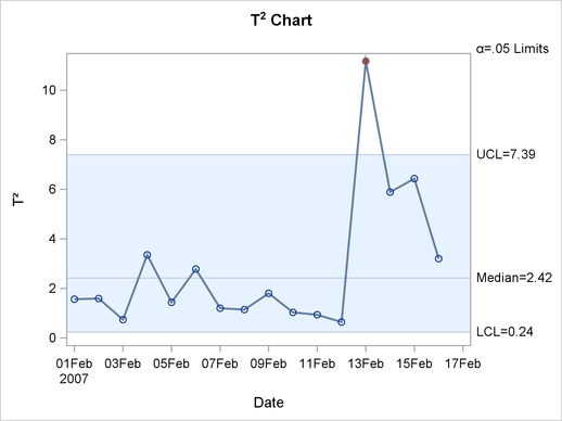
The chart shows an out-of-control point on February 13, 2007. On this day, a strong winter storm was battering the Midwestern U.S. To see which variables contributed to this statistic, you can use the contribution plot shown in Figure 11.2.
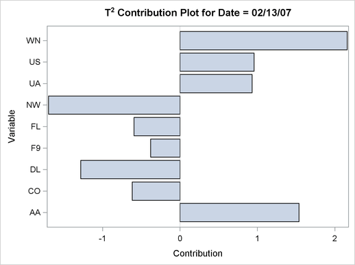
The contribution plot shows that variables WN, AA, NW, and DL are the major contributors to the out-of-control point.
Figure 11.3 shows the SPE chart.
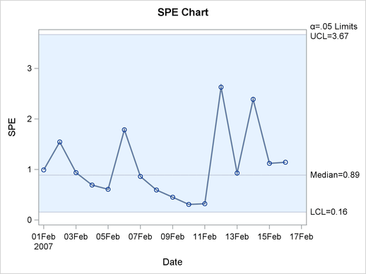
There are no out-of-control points on the SPE chart. This indicates that the unusual point displayed in the
chart represents a departure from the variation described by the principal component model that lies within the model hyperplane.
Note: This procedure is experimental.