PPPLOT Statement: CAPABILITY Procedure

Construction and Interpretation of P-P Plots
A P-P plot compares the empirical cumulative distribution function (ecdf) of a variable with a specified theoretical cumulative distribution function  . The ecdf, denoted by
  , is defined as the proportion of nonmissing observations less than or equal to
  , so that
  .
.
To construct a P-P plot, the  nonmissing values are first sorted in increasing order:

Then the  th ordered value
  is represented on the plot by the point whose -coordinate is
  and whose
  -coordinate is
  .
.
Like Q-Q plots and probability plots, P-P plots can be used to determine how well a theoretical distribution models a data distribution. If the theoretical cdf reasonably models the ecdf in all respects, including location and scale, the point pattern on the P-P plot is linear through the origin and has unit slope.
Unlike Q-Q and probability plots, P-P plots are not invariant to changes in location and scale. [See CAPPP2 in the SAS/QC Sample Library]For example, the data in the section Getting Started: PPPLOT Statement are reasonably described by a normal distribution with mean 10 and standard deviation 0.3. It is instructive to display these data on normal P-P plots with a different mean and standard deviation, as created by the following statements:
ods graphics on;
proc capability data=Sheets noprint;
   ppplot Distance / normal(mu=9.5 sigma=0.3) square;
   ppplot Distance / normal(mu=10 sigma=0.5) square;
run;
The ODS GRAPHICS ON statement specified before the PROC CAPABILITY statement enables ODS Graphics, so the P-P plots are created using ODS Graphics instead of traditional graphics. The resulting plots are shown in Figure 5.32 and Figure 5.33.
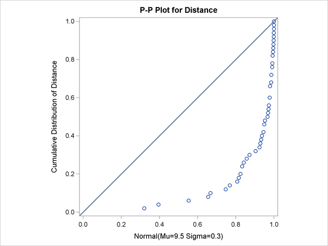
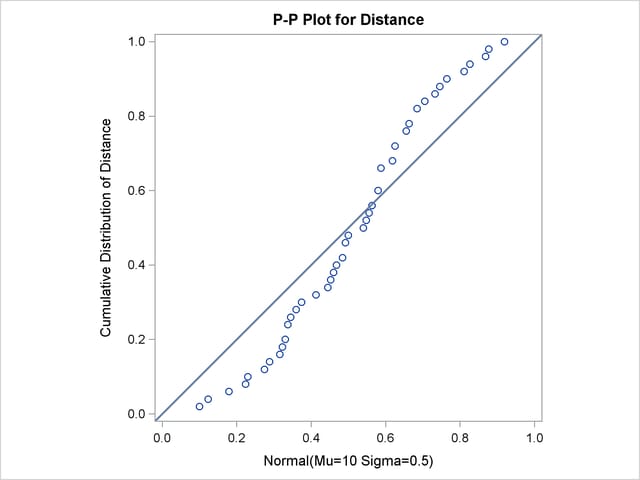
Specifying a mean of 9.5 instead of 10 results in the plot shown in Figure 5.32, while specifying a standard deviation of 0.5 instead of 0.3 results in the plot shown in Figure 5.33. Both plots clearly reveal the model misspecification.