Appearance of Grouped Data
Plots that Support Grouped Data
The GROUP= column option is used to plot data when a classification
or grouping variable is available. Plots that support the GROUP= option
include the following:
| BANDPLOT | PBSPLINEPLOT |
| BARCHART | PIECHART |
| BOXPLOT | REGRESSIONPLOT |
| BUBBLEPLOT | SCATTERPLOT |
| HIGHLOWPLOT | SCATTERPLOTMATRIX |
| LINEPARM | SERIESPLOT |
| LOESSPLOT | STEPPLOT |
| NEEDLEPLOT | VECTORPLOT |
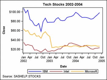
Using the Default Appearance for Grouped Data
By default, the GROUP= option automatically uses the
style elements GraphData1 to GraphDataN for the presentation of each
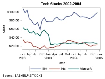
unique group value. Here is an example of a series plot that displays
grouped data.
proc template;
define statgraph group;
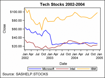
begingraph;
entrytitle "Tech Stocks 2002-2004";
entryfootnote halign=left "Source: SASHELP.STOCKS";
layout overlay;
seriesplot x=date y=close / group=stock name="series"
lineattrs=(thickness=2);
discretelegend "series";
endlayout;
endgraph;
end;
run;
proc sgrender data=sashelp.stocks template=group;
where date between "1jan02"d and "31dec04"d;
run;
Attributes such as line
color and pattern are used to display the group values. The colors
and patterns used for each group value are determined by the ODS style.
In the previous example, there are three unique values of variable
STOCK in the SASHELP.STOCKS data set: IBM, Intel, and Microsoft.
The line colors and line patterns from the GraphData1–GraphData3
style elements of the DEFAULT style are used for each of the three
group values. The ContrastColor attribute specifies the line color,
and the LineType attribute specifies the line pattern. See Graph Style Elements for GTL for information
about the GTL style elements and attributes.
The colors and
patterns are assigned to the values in the order in which they occur
in the SASHELP.STOCKS data set. In this case, GraphData1 is assigned
to IBM, GraphData2 is assigned to Intel, and GraphData3 is assigned
to Microsoft. Other attributes such as fill color, fill pattern, and
marker color that are used in other plot types are assigned in a similar
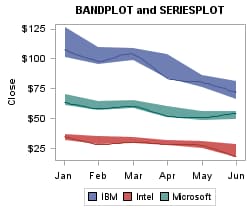
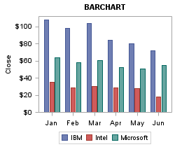
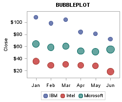
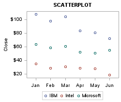
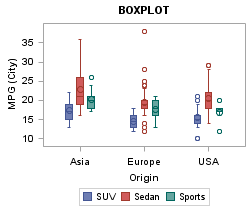
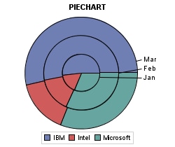
manner. Here are some additional examples of the default grouped data
appearance for other plot types.
To specify different
colors and patterns you can specify a different ODS style or you can
create a custom style. For information about creating custom styles, see Using Custom Styles to Control the Appearance of Grouped Data. For many plots and charts, you can also use attribute maps
to override certain style attributes for specific group values. For information about
attribute maps, see Using Attribute Maps to Control the Appearance of Group Values.
Using Custom Styles to Control the Appearance of Grouped Data
Each style potentially can change the style attributes
for GraphData1–GraphDataN. If you have certain preferences
for grouped data items, you can create a modified style that will
display your preferences. The following code creates a new style named
STOCKS that is based on the supplied style STYLES.LISTING. This modification
changes the properties for the GraphData1–GraphData3 style
elements. All other style elements are inherited from LISTING.
proc template;
  define style stocks;
    parent=styles.listing;
    style GraphData1 /
      ContrastColor=blue
      Color=blue
      MarkerSymbol="CircleFilled"
      Linestyle=1;
    style GraphData2 /
      ContrastColor=brown
      Color=brown
      MarkerSymbol="TriangleFilled"
      Linestyle=1;
    style GraphData3 /
      ContrastColor=orange
      Color=orange
      MarkerSymbol="SquareFilled"
      Linestyle=1;
  end;
run;
In this style definition,
the LINESTYLE is set to 1 (solid) for the first three data values.
Style syntax requires that line styles be set with their numeric value,
not their keyword counterparts in GTL such as SOLID, DASH, or DOT.
See Values for Marker Symbols and Line Patterns for the complete
set of line styles.
CONTRASTCOLOR is the
attribute applied to grouped lines and markers. COLOR is the attribute
applied to grouped filled areas, such as grouped bar charts or grouped
ellipses. MARKERSYMBOL defines the same values that can be specified
with the MARKERATTRS=( SYMBOL=keyword ) option in GTL. See Values for Marker Symbols and Line Patterns for the complete
set of marker names.
After the STOCKS style
is defined, it must be requested on the ODS destination statement.
No modification of the compiled template is necessary:
ods html style=stocks;

proc sgrender data=sashelp.stocks
              template=group;
 where date between
      "1jan02"d and "31dec04"d;
run;
One issue that you should
be aware of is that the STOCKS style only customized the appearance
of the first three group values. If there were more group values,
other unaltered style elements will be used, starting with GraphData4.
Most styles define (or inherit) GraphData1 to GraphData12 styles elements.
If you need more elements, you can add as many as you desire, starting
with one more than the highest existing element (for example, GraphData13)
and numbering them sequentially thereafter.
Using Attribute Maps to Control the Appearance of Group Values
Discrete Attribute Maps
A discrete attribute map enables you to consistently
assign attributes to specific values of a numeric or character column
in a data set. The assignment of the attributes is based on formatted
data values and is independent of the position of the data in the
data set. It is typically used to visually highlight group values
on a plot using marker symbols, fill colors, line patterns, and so
on. To create and use a discrete attribute map, you must do the following:
-
Set the group option in your plot statement to the name of the attribute variable that you created in your DISCRETEATTRVAR statement. The group option includes GROUP=, COLORGROUP=, MARKERCOLORGROUP=, and so on, depending on the plot statement. See SAS Graph Template Language: Reference for specific information about the group options and whether they accept discrete attribute variables.
The
DISCRETEATTRMAP block includes one or more VALUE statements that associate
a single value to a set of graphic attribute options, such as LINEATTRS,
MARKERATTRS, TEXTATTRS, or FILLATTRS. Any column values that are not
accounted for in the VALUE statements are assigned the default visual
properties that would normally be assigned if an attribute map was
not used. The DISCRETEATTRMAP statement also includes a NAME= option
that enables you to specify a unique name for the map. The block must
appear in the global definition area of the template between the BEGINGRAPH
statement and the first LAYOUT statement. It cannot be nested within
any other statement. An ENDDISCRETEATTRMAP statement must be used
to end the block.
The DISCRETEATTRVAR
statement creates a named association between a DISCRETEATTRMAP and
a column in your plot data set. To create the attribute variable,
do the following:
After you create the
discrete attribute map and the attribute variable, in your plot statement,
set the GROUP= option or other roles that can accept a discrete attribute
variable to the value of the ATTRVAR= option that you used in your
DISCRETEATTRVAR statement.
Note: Do
not use the attribute variable in an expression. Doing so might produce
unexpected results.
Note: The values and graphical
attributes defined in a discrete attribute map cannot be displayed
by a CONTINUOUSLEGEND statement.
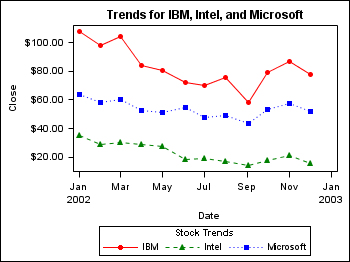
Here is an example that
creates and applies a discrete attribute map to the values in column
STOCK of the plot data set. It also creates a discrete legend.
/* Create a stock data set for the year 2002 */
proc sort data=sashelp.stocks out=stocks;
   by stock date;
   where date between '01JAN02'd and '30DEC02'd;
run;

/* Create a template for IBM, Microsoft, and Intel stocks */
proc template;
define statgraph stocks;
begingraph;
  entrytitle "Trends for IBM, Intel, and Microsoft";
  discreteattrmap name="stockname" / ignorecase=true;
    value "IBM" /
       markerattrs=GraphData1(color=red  symbol=circlefilled)
       lineattrs=GraphData1(color=red pattern=solid);
    value "Intel" /
       markerattrs=GraphData2(color=green symbol=trianglefilled)
       lineattrs=GraphData2(color=green pattern=shortdash);
    value "Microsoft" /
       markerattrs=GraphData3(color=blue symbol=squarefilled)
       lineattrs=GraphData3(color=blue pattern=dot);
  enddiscreteattrmap;
  discreteattrvar attrvar=stockmarkers var=stock
     attrmap="stockname";
  layout overlay;
     seriesplot x=date y=close /
        group=stockmarkers
        display=(markers)
        name="trends";
    discretelegend "trends" / title="Stock Trends";
  endlayout;

endgraph;
end;
run;

/* Plot the stock trends  */
ods html style=stocks;
proc sgrender data=stocks template=stocks;
run;
quit;
This example applies
different line and marker attributes to the IBM, Intel, and Microsoft
stock plot lines. In the example code, notice that the NAME="stockname"
option in the DISCRETEATTRMAP statement provides a name for the discrete
attribute map. Also notice that the ATTRVAR=stockmarkers option in
the DISCRETEATTRVAR statement provides a name for the attribute-map-to-data-set-column
association. The ATTRMAP="stockname" and the VAR=stock options in
the DISCRETEATTRVAR statement associate the attribute map stockname
with the data set column STOCK respectively to create an attribute
variable. In the SERIESPLOT statement, the GROUP=stockmarkers option
applies the attribute map to the specified group values. This satisfies
all of the requirements for using a discrete attribute map.
Range Attribute Maps
A range attribute map enables you to
map one or more colors to a range of values of a specific numeric
column in a plot data set. It is typically used to visually highlight
ranges using single colors or a color ramp.
The RANGEATTRMAP
block includes one or more RANGE statements that associate a range
of values with a single color or a color ramp. The syntax of the RANGE
statement is as follows:
RANGE low-value< < > – < < >high-value / options
The
optional exclusion operator (<) can be placed after the low-value value or before the high-value value to exclude that value from the
range endpoint. The low-value and high-value values can
be an unformatted numeric value or a range keyword. For low-value, keyword MIN, NEGMAX, or NEGMAXABS
can be used instead of numeric value. For high-value, keyword MAX or MAXABS can be used. For information about the range
keywords, see SAS Graph Template Language: Reference.
Note: If two ranges share a common
endpoint, such as 10–20 and 20–30, and no exclusion
operator ( < ) is used, the common endpoint belongs to the lower
range, which is 10–20 in this case.
The RANGEATTRMAP statement
also includes a NAME= option that enables you to specify a unique
name for the range attribute map. The RANGEATTRMAP block must appear
in the global definition area of the template between the BEGINGRAPH
statement and the first LAYOUT statement. It cannot be nested within
any other statement. An ENDRANGEATTRMAP statement is required to end
the block. The block must contain at least one RANGE statement.
The RANGEATTRVAR statement creates a named association
between a range attribute map and a numeric column in your plot data
set. To create the range attribute variable, do the following in your
RANGEATTRVAR statement:
After your create the
range attribute map and the range attribute variable, in your plot
statement, set the value of the option that maps the column values
to colors to the name that you specified with the ATTRMAP= option
in your RANGEATTRVAR statement.
Note: The values and graphical
attributes defined in a range attribute map cannot be displayed by
a DISCRETELEGEND statement.
Here is an example of
a template that creates and applies a range attribute map to the WEIGHT
column of a SCATTERPLOT statement data set in order to color the markers
in the resulting plot by weight range. It also creates a continuous
legend.
proc template;
define statgraph attrrange;
   begingraph;
      /* Create the range attribute map. */
      rangeattrmap name="scale";
         range 0-70 /
            rangecolormodel=(black); /* 0 to 70 inclusive */
         range 70<-107 /
            rangecolormodel=(blue); /* 70 exclusive to 107 inclusive */
         range 107<-125 /
            rangecolormodel=(green); /* 107 exclusive to 125 inclusive */
         range 125<-200 /
            rangecolormodel=(red); /* 125 exclusive to 200 inclusive */
      endrangeattrmap;

      /* Create the range attribute variable. */
      rangeattrvar attrvar=weightrange var=weight attrmap="scale";

      /* Create the graph. */
      entrytitle "Weight Class";
      layout overlay /
         xaxisopts=(griddisplay=on gridattrs=(color=lightgray pattern=dot))
         yaxisopts=(griddisplay=on gridattrs=(color=lightgray pattern=dot));
         scatterplot x=weight y=height / markercolorgradient=weightrange
            markerattrs=(symbol=circlefilled size=10) name='wgtclass';

         /* Add a continuous legend. */
         continuouslegend 'wgtclass';
      endlayout;
   endgraph;
end;
run;

/* Render the graph. */
ods graphics / width=4in height=3in;
proc sgrender data=sashelp.class template=attrrange;
run;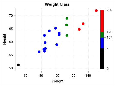
In the example code,
notice that the NAME=”scale” option in the RANGEATTRMAP
statement provides a name for the range attribute map. Also notice
that the ATTRVAR=weightrange option in the RANGEATTRVAR statement
provides a name for the attribute-map-to-data-set-column association.
The ATTRMAP=”scale” and the VAR=weight options in the
RANGEATTRVAR statement associate the attribute map scale with the
data set column WEIGHT respectively. In the SCATTERPLOT statement,
the MARKERCOLORGRADIENT=weightrange option applies the range attribute
map to the WEIGHT column variable values and colors the plot markers
according to the ranges that are specified in the range attribute
map. To add a legend that displays the marker colors for the weight
ranges, you can include a CONTINUOUSLEGEND statement. For information about
continuous legends, see Features of Continuous Legends.
Changing the Group Data Display
With many
plots, you can use the GROUPDISPLAY= option to change the way in which
group values are displayed. The following table summarizes the values
that you can use with this option and the plot statements that are
applicable for each.
GROUPDISPLAY Option Values and the Applicable Plots for Each
For
bar charts, by default, group values are stacked on each category
bar as shown in the following figure.
When GROUPDISPLAY=CLUSTER,
the group values are shown as a cluster of bars, one bar for each
group value in the category value, centered over the category value
as shown in the following figure.
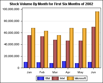
/* Create a variable for the desired year. */
%let year=2002;

/* Create a data set of the first six months of the year. */
data stocks;
   set sashelp.stocks;
   where year(date) eq &year and month(date) le 6;
   month=month(date);
run;

/* Format the numeric months into 3-character month names. */
proc format;
   value month3char
      1="Jan" 2="Feb" 3="Mar" 4="Apr" 5="May" 6="Jun";
run;

/* Create the template. */
proc template;
   define statgraph stocksgraph;
      begingraph;
	   dynamic year;
         entrytitle "Stock Volume By Month for First Six Months of " year;
         layout overlay /
            yaxisopts=(griddisplay=on display=(line ticks tickvalues))
            xaxisopts=(display=(line ticks tickvalues));
            barchart x=month y=volume /
               name="total"
               dataskin=pressed
               group=stock
               groupdisplay=cluster;
            discretelegend "total";
         endlayout;
      endgraph;
   end;
run;

/* Generate the bar chart using the bar template. */
ods graphics on / reset outputfmt=static;
ods html style=stocks;
proc sgrender data=stocks template=stocksgraph;
   dynamic year=&year;
   format month month3char.;
run;
The width
of each cluster is directly based on the number of category values
on the axis. By default, the cluster width is 85% of the midpoint
spacing. You can use the CLUSTERWIDTH= option to adjust the cluster
width.
Within each cluster,
by default, each bar occupies 100% of its available space. When a
cluster contains the maximum number of bars, no gap exits between
the adjacent bars in the cluster. You can use the BARWIDTH= option
to add space between the bars in the cluster.
For the remaining plot
types (see GROUPDISPLAY Option Values and the Applicable Plots for Each), the behavior of the GROUPDISPLAY=CLUSTER option is similar
to that of bar charts. That is, the group values are clustered at
the category value on the axis. You can also use the CLUSTERWIDTH=
option to vary the width of the clusters. For these plots, the clusters
include the following:
This is useful if you
want to overlay a grouped SERIESPLOT onto a grouped clustered BARCHART,
for example.
When GROUPDISPLAY=OVERLAY
is used, each group value for a category is positioned at the category
value on the axis. If one or more values appear in the same position,
the symbol for the last value overlays the symbol for the previous
value. Here is an example of series plots that show the group cluster
and overlay displays together for comparison on discrete category
axes.
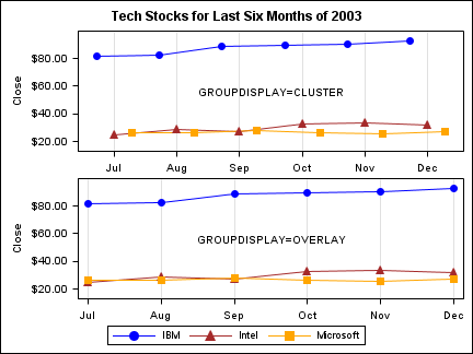
Notice in the cluster
display that the three-symbol cluster for each category is centered
on the category value, while in the overlay display, all of the symbols
are aligned on the category value. Also notice that in the overlay
display some of the symbols overwrite others that appear in the same
location. In the case of a scatter plot, the plot symbols behave in
the same manner.
Including Missing Group Values
By default, missing group values are excluded from the plot. If you
want to include a group for the missing values, use the INCLUDEMISSINGGROUP=TRUE
option in your plot statement. If you include a discrete legend, the
missing group is also added to the legend. For numeric values, the
label for the missing group in the legend is a dot or the character
that is specified by the SAS MISSING option. For character values,
the label for the missing group is a blank. You can use a FORMAT statement
to assign a more meaningful label to the missing group category. Here
is an example.
proc template;
 define statgraph survey;
   BeginGraph;
   entrytitle "Customer Survey Results";
   layout overlay / xaxisopts=(label="Store Location")
        yaxisopts=(label="Satisfaction Rating");
     barchart x=store y=rating / name="barchart" stat=mean
	   group=purchase_method groupdisplay=cluster barwidth=0.9
       includemissinggroup=true;
     discretelegend "barchart" / title="Purchase Method";
   endlayout;
EndGraph;
 end;
run;
The INCLUDEMISSINGGROUP=TRUE
option creates a separate group in the plot for any missing values
of the PURCHASE_METHOD variable. If there are no missing values for
PURCHASE_METHOD in the data, the group is not created. Here is an
example of how to use a FORMAT statement to create a label for the
missing group and how to apply the format in the PROC SGRENDER statement.
Changing the Group Data Order
When unique group values are gathered,
they are internally recorded in the order in which they appear in
the data. They are not subsequently sorted. As a result, the group
values appear in the plot in the order in which they occur in the
data. Here is an example.
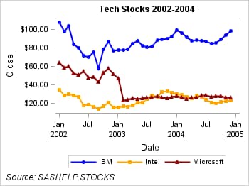
ods html style=stocks;

proc sgrender data= sashelp.stocks template=group;
 where date between
       "1jan02"d and "31dec04"d;
run;
In this example, the
groups are ordered in the order in which they appear in the SASHELP.STOCKS
data set. Assume that you want to arrange the groups in ascending
order. One way to do this is to use the SORT procedure to create a
sorted data set to use with your plot. Here is an example.
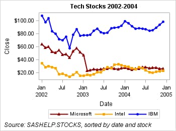
proc sort data=sashelp.stocks out=stocks;
   by descending stock;
run;

ods html style=stocks;

proc sgrender data= stocks template=group;
 where date between
       "1jan02"d and "31dec04"d;
run;
Changing the order of
the data changes the order in which the group values appear on the
plot. It also changes their association with the GraphData1–GraphDataN
style elements, which might change their appearance. This is apparent
in the previous example.
Another way to arrange
your data is to use the GROUPORDER= option. For many plots, you can
instead use the GROUPORDER= option to change the order of the groups
in your plot without having to create a sorted data set or change
the order of the data in the original data set.
The GROUPORDER=
option determines the association of the GraphData1–GraphDataN
style attributes with the groups, the default order of groups in the
legend, and the order of the groups within each category when GROUPDISPLAY=CLUSTER.
You can set GROUPORDER= to one of the values that is shown in the
following table.
Making the Appearance of Grouped Data Independent of Data Order
When the input
data source is modified, sorted, or filtered, the order of the group
values and their associations with GraphData1–GraphDataN might
change. If you do not care which line pattern, marker symbols, or
colors are associated with particular group values, this might not
be a problem. However, there might be cases in which you want the
appearance of your plots to be consistent. For example, if you create
several plots grouped by GENDER, you might want a consistent set of
visual properties for Females and Males across all of the plots, regardless
of the input data order.
Here is an example that
shows you how to make plots that are consistent regardless of the
data order. This example plots the closing stock price for IBM, Microsoft,
and Intel. In this example, we want the plot to always use the attributes
shown in the following table for each plot.
To enforce this type
of consistency, we can use a discrete attribute map to map the desired
attributes to the stock values. Here is the code for this example.
/* Define the graph template. */
proc template;
define statgraph groupindex;
   begingraph;
      /* Create an attribute map for this graph. */
      discreteattrmap name="stockname" / ignorecase=true;
         value "IBM" /
            markerattrs=GraphData1(color=blue  symbol=circlefilled)
            lineattrs=GraphData1(color=blue pattern=solid);
         value "Intel" /
            markerattrs=GraphData2(color=orange symbol=squarefilled)
            lineattrs=GraphData2(color=orange pattern=solid);
         value "Microsoft" /
            markerattrs=GraphData3(color=darkred symbol=trianglefilled)
            lineattrs=GraphData3(color=darkred pattern=solid);
      enddiscreteattrmap;

      /* Create the attribute map variable. */
      discreteattrvar attrvar=stockmarkers var=stock
         attrmap="stockname";

      /* Define the graph. */
      entrytitle "Tech Stocks 2002-2004";
      entryfootnote halign=left "Source: SASHELP.STOCKS";
      layout overlay ;
         seriesplot x=date y=close / group=stockmarkers
            name="series" lineattrs=(thickness=2) display=(markers);
         discretelegend "series";
      endlayout;
   endgraph;
end;
run;

/* Render the graph. */
proc sgrender data= sashelp.stocks template=groupindex;
 where date between "1jan02"d and "31dec04"D;
run;
To verify that the plot
attributes are consistent regardless of the data order, we can create
a temporary data set from the SASHELP.STOCKS data set and sort it
by date and stock name as shown in the following code.
/* Sort the SASHELP.STOCKS data by date and stock name. */
proc sort data=sashelp.stocks out=work.stocks;
   by date descending stock;
run;
/* Render the graph. */
proc sgrender data= stocks template=groupindex;
 where date between "1jan02"d and "31dec04"D;
run;
Notice that the colors,
line patterns, and markers remain the same for each stock even though
the data order has changed. For more information about using discrete
attribute maps, see Using Attribute Maps to Control the Appearance of Group Values.