SGSCATTER Procedure

Concepts: SGSCATTER Procedure

Statements for Creating Panels

About Creating Panels

The SGSCATTER procedure contains three statements that you can use to create a paneled graph of scatter plots:
  • PLOT
  • COMPARE
  • MATRIX
Each of the statements is specialized for creating a different type of paneled graph.

PLOT Statement

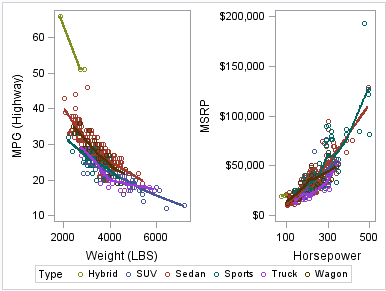
The PLOT statement is used to create a paneled graph of scatter plots where each graph cell has its own independent set of axes. Each variable pair that you specify in the PLOT statement creates an independent graph cell. You can also overlay fit plots and ellipses on each cell by using options.
For example, Example Graph from the PLOT Statement shows a graph that contains two independent cells. Each cell contains a scatter plot and a loess curve.
Example Graph from the PLOT Statement
An example of the PLOT statement
By default, the axis ranges of each cell are independent from the other cells. However, you can use the UNISCALE= option to specify that all of the cells use the same axis ranges for the X axis, the Y axis, or both axes.
Note: It is possible to create a single scatter cell with the PLOT statement, but the SGPLOT procedure is better suited to creating a single-celled graph.

COMPARE Statement

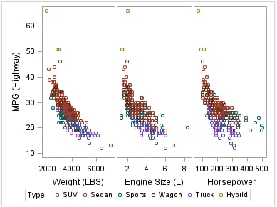
The COMPARE statement is used to create a shared axis panel, also called an MxN matrix. The list of X and Y variables are crossed to create each cell in the graph. All cells in a row share the same row axis range. All cells in a column share the same column axis range.
When using the COMPARE statement, you can add fit plots and confidence ellipses to each cell in the panel by using options.
The COMPARE statement can also be used to do simple X or Y axis sharing by specifying only one X or Y variable, as in the following example:
Example Graph from the COMPARE Statement
Example of the COMPARE statement

MATRIX Statement

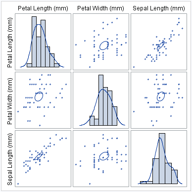
The MATRIX statement is used to create a scatter plot matrix. Each of the variables that you specify are graphed against each other to create the graph. You can use the ELLIPSE option to overlay a confidence ellipse on each cell in the panel.
The MATRIX statement also has an option called DIAGONAL= that enables you to display the distribution of your variables in the diagonal cells of the matrix. You can place histograms in the diagonal cells, and overlay those histograms with normal density curves or kernel density estimates.
For example, the following example shows a graph with histograms and normal density curves in the diagonal cells.
Example Graph from the MATRIX Statement
Example of the MATRIX statement

Legends in the SGSCATTER Procedure

The SGSCATTER procedure creates a legend automatically when you specify a GROUP= variable. You can use the NOLEGEND option to disable the legend.
For all of the graph creation statements, you can use the LEGEND= option to specify the attributes of the legend.