Line Chart with Reference Lines

Definition

A line chart shows the relationship of one variable to another, often as movements or trends in the data over a period of time. Line charts summarize source data and typically are used to chart response values against discrete categorical values.
Example of a Line Chart with Reference Lines Indicator
line chart indicator example
For a sample of the indicator data that was used to create this indicator, see “Sample Data Structure” for this indicator.

Usage Information

Data best suited for
Use line charts when the change in a variable or variables clearly needs to be displayed or when trending or rate of change information is of value. When lines are stacked, line charts can be used to compare the trend or individual values for several variables.
Target audience
This indicator type is appropriate for all user audiences. Most people find this indicator type familiar and easy to interpret.
Data aggregation support
This indicator type averages the applicable indicator data.
Range support
A range is required.
Alert support
Alerts are supported. For information, see Customizing Alerts.
Link support
This indicator type can be used to define a link or as the destination of a link.For more information about defining an indicator with a hyperlink, see Adding Links to Indicators or Other Content.
Interaction support
  • Data filter support: This indicator type can be used as either a source or target indicator.
  • Interactive highlighting support: This indicator type can be used as either a source or target indicator.
For more information, see Adding Interactions between Indicators.
Filter multiple items support
Filtering multiple items is supported.For more information, see Supporting Multiple Selections in a Filtered Data Interaction.

General Settings

Display Settings

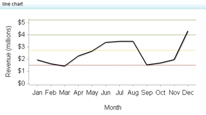
The following display settings are used in the preceding figure. For more information, see “Sample Data Structure” for this indicator.
Display Setting
Selection Used for Figure
X-axis value
Month
Primary value
Revenue
X-axis title
<blank> (defaults to Month)
Y-axis title
<blank> (defaults to Revenue)
Note: The Scale Y axis setting adds the label (millions) to the title.
Scale X axis
This setting is selected.
Scale Y axis
This setting is selected.
You can customize the following display settings for this indicator:
  • (Required) From the X-axis value list, select the column in your data that you want to use for the X-axis value in the indicator. When you view your indicator data, the columns in the data set are described by the values in the Column Name column. The selections available in the X-axis value list are all of the values in the Column Name column.
  • (Required) From the Primary value list, select the parameter to use for the primary data line in a line chart with reference lines or a primary tick mark in a KPI gauge.
  • From the Secondary value list, select the parameter to use for the secondary data line in a line chart or a secondary tick mark in a KPI gauge. If you do not want to specify a secondary value, select (none).
  • In the X-axis title field, type the title to use for the X axis in the indicator. If you do not specify a title, the value that you selected from the X-axis value list is used by default. If you do not want a title, type a space in the field. If you select Scale X axis, a measurement label is added to the title.
  • In the Y-axis title field, type the title to use for the Y axis in the indicator. If you do not specify a title, the value that you selected from the Y-axis value list is used by default. If you do not want a title, type a space in the field. If you select Scale Y axis, a measurement label is added to the title.
  • Select Scale X axis if you want to scale that axis. When you make this selection, a measurement label is added to the X-axis title if the data is numeric. For example, if the X-axis title is set to Revenue and you select Scale X axis, the X-axis title is displayed as Revenue (millions).
  • Select Scale Y axis if you want to scale that axis. When you make this selection, a measurement label is added to the Y-axis title if the data is numeric. For example, if the Y-axis title is set to Revenue and you select Scale Y axis, the Y-axis title is displayed as Revenue (millions).
  • Select Hide axis tick labels if you want to hide the axis tick labels when a user zooms out the view of an indicator. When the user zooms in, the axis tick labels reappear. Select this setting to avoid visual clutter when the view is zoomed out.
  • Select Hide axes when zoomed out if you want to hide the axes when a user zooms out the view of an indicator. When the user zooms in, the axes reappear. Select this setting to avoid visual clutter when the view is zoomed out.
  • Click Hide reference lines if you want to hide the reference lines when a user zooms out the view of an indicator. When the user zooms in, the reference lines reappear. Select this setting to avoid visual clutter when the view is zoomed out.
  • From the Row group by list, select the value that you want to use to group rows of data. If you do not want to group the rows, select (none).
  • From the Column group by list, select the value that you want to use to group columns of data. If you do not want to group the columns, select (none).
  • From the X-axis format list, select the format that you want to apply to the data on that axis. If you do not want to specify a format, select (none). When set to (none), the indicator uses the format that is used in the data source.
  • From the Y-axis format list, select the format that you want to apply to the data on that axis. If you do not want to specify a format, select (none). When set to (none), the indicator uses the format that is used in the data source.
  • From the X-axis labels list, select the style to apply to the data labels that are used on the X axis. Depending on your labels, one style might be easier to read than others.

Sample Data Structure

To create a line chart, you must provide one variable (X-axis value) and one measure (primary value).
Note: Although the sample data does not do so, you can provide an optional measure to create a reference line (secondary value).
The following data sample is associated with the figure previously shown. Underneath each column heading is its associated display setting.
Month
(X-axis value)
Revenue
(Primary value)
January
$1,956,055
February
$1,632,174
March
$1,433,003
April
$2,265,200
May
$2,669,076