Multi-Line Chart
Definition
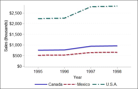
A
multi-line chart shows multiple data series, each as a line, on the
same chart. A data series shows the relationship of one variable to
another, often as movements or trends in the data over a period of
time. Line charts summarize source data and typically are used to
chart response values against discrete categorical values.
Usage Information
|
Use a multi-line chart
when it is critical to compare multiple values for two or more different
categories at a given point in time or at a given state. It is critical
that each line has a different color (which is done automatically)
so that the lines can be clearly distinguished if they overlap. The
multi-line chart is best used when the summarized values for the Y
axis are relatively close together, or if the specific value is not
as important to view compared to the relative trend.
|
|
|
This indicator type can be used to define a link or as the
destination of a link.For
more information about defining an indicator with a hyperlink, see Adding Links to Indicators or Other Content.
|
|
|
Filtering multiple items is supported.For
more information, see Supporting Multiple Selections in a Filtered Data Interaction.
|
Display Settings
The following display settings are used in the preceding
figure. For more information, see “Sample Data Structure”
for this indicator.
You can customize the
following display settings for this indicator:
-
(Required) From the X-axis value list, select the column in your data that you want to use for the X-axis value in the indicator. When you view your indicator data, the columns in the data set are described by the values in the Column Name column. The selections available in the X-axis value list are all of the values in the Column Name column.
-
(Required) From the Y-axis value list, select the column in your data that you want to use for the Y-axis value in the indicator. When you view your indicator data, the columns in the data set are described by the values in the Column Name column. The selections available in the Y-axis value list are all of the values in the Column Name column.
-
In the X-axis title field, type the title to use for the X axis in the indicator. If you do not specify a title, the value that you selected from the X-axis value list is used by default. If you do not want a title, type a space in the field. If you select Scale X axis, a measurement label is added to the title.
-
In the Y-axis title field, type the title to use for the Y axis in the indicator. If you do not specify a title, the value that you selected from the Y-axis value list is used by default. If you do not want a title, type a space in the field. If you select Scale Y axis, a measurement label is added to the title.