KPI (Key Performance Indicator)

Definition

A key performance indicator (KPI) is a measurement that shows whether an organization is progressing toward its stated goals. In SAS BI Dashboard, KPIs can be speedometers, thermometers, tachometers, sliders, dials, arrows, traffic lights, and other types of gauges.
Example of a KPI, Subtype Dynamic Radial Thermometer
KPI indicator type example
For a sample of the indicator data that was used to create this indicator, see “Sample Data Structure” for this indicator.

KPI Subtypes

When you click KPI icon to select the KPI indicator type, the Gauge list appears. From this list, you can select a gauge subtype to use.
Gauge Subtypes
Category
Gauge subtype
Icon
Dynamic
Note: Dynamic gauge subtypes are the only subtypes that respond to a user-defined range.
Dynamic bullet bar
dynamic bullet bar icon
Dynamic dial
dynamic dial icon
Dynamic radial thermometer
radial thermometer icon
Dynamic slider
dynamic slider icon
Dynamic speedometer
dynamic speedometer icon
Dynamic thermometer
dynamic thermometer icon
Dynamic traffic light
dynamic traffic light icon
Arrows and pointers
Arrow
arrow icon
Arrow (small)
arrow (small) icon
Fancy arrow
fancy arrow icon
Simple arrow
simple arrow icon
Pointer
pointer icon
Dials
Simple dial
simple dial icon
Marked dial
marked dial icon
Dynamic dial
dynamic dial icon
Dynamic radial thermometer
radial thermometer icon
Sliders
Slider
slider icon
Curved slider
curved slider icon
Dynamic slider
dynamic slider icon
Stylized slider
stylized slider icon
Vertical slider
vertical slider icon
Tachometers
Simple tachometer
simple tachometer icon
Highlighted tachometer
highlighted tachometer icon
Solid tachometer
solid tachometer icon
Reversed tachometer
reversed tachometer icon
Stylized tachometer
stylized tachometer icon
Traffic lights
Traffic light
traffic light icon
Traffic light (small)
traffic light (small) icon
Dynamic traffic light
dynamic traffic light icon
Others
Button
button icon
Cylinder
cylinder icon
Dynamic bullet bar
dynamic bullet bar icon
Dynamic speedometer
dynamic speedometer icon
Dynamic thermometer
dynamic thermometer icon
Gauge
gauge icon

Usage Information

Data best suited for
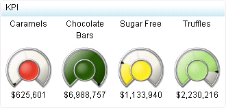
A gauge displays the status or measure of a variable or variables in relation to a target, goal, or interval. Gauges are designed to achieve this goal in a way that is familiar to the user: Many gauges can be found in real-life objects such as cars and machines. Gauges can be used to display a quantity, range, variable, or status.
Gauges are most effective when they are used to instantly alert the business user of a status, without the user having to know many details. Business users should be able to grasp information at a glance. Gauges, especially round ones, can use up quite a bit of screen real estate, so keep this in mind. They are commonly used, however, due to their familiarity and ease of use.
Not suited for
KPI gauges are not suitable for significant amounts of data. KPI gauges appear best with indicator data that produces summarized data with a limited number of data rows. If you use indicator data with significant amounts of data to drive a KPI, SAS BI Dashboard attempts to produce one KPI gauge representation for each row of data in the indicator data. For significant amounts of data, an indicator type that automatically summarizes the data is preferable. Bar charts are an example of this type of indicator.
Target audience
Some audiences might not be familiar with gauges. However, gauges are not difficult to interpret, so even if users are unfamiliar with this indicator type, they should be able to understand it. Be sure to label the value, the interval threshold values, and colors used to represent intervals (red for below target, yellow for on target, and green for above target).
Data aggregation support
This indicator type does not aggregate the indicator data.
Range support
A range is required.
Alert support
Alerts are supported. For information, see Customizing Alerts.
Link support
This indicator type can be used to define a link or as the destination of a link.For more information about defining an indicator with a hyperlink, see Adding Links to Indicators or Other Content.
Interaction support
  • Data filter support:
    • (For data filtering on local systems) This indicator type can be used as a source indicator only.
    • (For data filtering on remote servers) This indicator type can be used as either a source or a target indicator.
  • Interactive highlighting support: This indicator type can be used as a source indicator only.
    Note: The KPI does not support selection of multiple gauges.
For more information, see Adding Interactions between Indicators.
Filter multiple items support
Filtering multiple items is not supported.

Display Settings

The following display settings are used in the preceding figure. For more information, see “Sample Data Structure” for this indicator.
Display Setting
Selection Used for Figure
Range value
Sale Amount
KPI title
Category is selected.
Lines for title
2
You can customize the following display settings for this indicator:
  • (Required) From the Range value list, select the value to which you want to apply the defined range intervals.
    Note: The following KPI indicator gauge types support custom range color settings:
    • arrow
    • arrow (small)
    • button
    • cylinder
    • fancy arrow
    • pointer
    • simple arrow
    • slider
    • solid tachometer
    • traffic light (small)
  • From the Range value 2 list, select a second data point value that you want to represent in the gauge. If you do not want to use a second value, click (none).
    Note: Not all KPI ranges use this setting.
  • From the KPI title list, select the column name data to use as titles for the gauges in the KPI.
  • From the Lines for title list, select the number of lines that you want to reserve for the title of a KPI. If there is no text on the line, the line is displayed as a blank.
  • Click Hide titles when zoomed out if you want to hide the indicator titles when a user zooms out the view of an indicator. When the user zooms in, the titles reappear. Select this setting to avoid visual clutter when the view is zoomed out.
  • Click Hide values when zoomed out if you want to hide the indicator values when a user zooms out the view of an indicator. When the user zooms in, the values reappear. Select this setting to avoid visual clutter when the view is zoomed out.

Sample Data Structure

To create a KPI, you must provide a measure (range value).
The following data sample is associated with the figure previously shown. Underneath each column heading is its associated display setting.
Category
(KPI title)
Sale Amount
(Range value)
Caramels
$625,601
Chocolate Bars
$6,988,757
Sugar Free
$1,133,940
Truffles
$2,230,216