Spark Table

Definition

A spark table is a collection of data rows that can be summarized and represented with a sparkline. Each sparkline shows a trend associated with a data measurement. Spark tables can also include associated data and gauges.
Note:
  • Depending on the specified settings, a spark table indicator can display any number and combination of data columns (variable and metric), gauges, and sparkline trending graphs.
  • The spark table indicator type replaces the KPI table and bar and trend indicator types that were available in earlier versions of SAS BI Dashboard.
Example of a Spark Table Indicator with Gauges and a Sparkline Graph
example of a spark table with a sparkline graph
For a sample of the indicator data that was used to create this indicator, see “Sample Data Structure” for this indicator.

Usage Information

For an example of using this indicator, see Example: Creating a Spark Table.
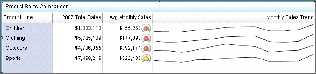
Data best suited for
Spark tables should be used when sparklines can add useful information at a glance for the user. Sparklines provide simple linear graphic representations of complex data. Spark trend lines should be used in spark tables when individual data points do not have to be displayed in line chart format. In other words, a general trend should give the business user a sense for where the data is heading, but not every data point on the spark table has to be revealed in order to get value out of the table. Use spark tables when there is ample data to form trend lines and when data can translate into a status to create ranges for small KPIs.
Target audience
Some audiences might not be familiar with sparklines. However, sparklines are designed to be easy to interpret, so even if users are unfamiliar with this indicator type, they should be able to understand it. Adding graphics to the spark table provides context for the user that might improve understanding. Audiences that might be familiar with this indicator type include business analysts, business users, executives, and financial analysts.
Data aggregation support
You can configure a spark table indicator to aggregate data, and you can select the type of aggregation to use for each column in the spark table.
Range support
Ranges are optionally supported.
Alert support
Alerts are supported only if a range is associated with the indicator. For information, see Customizing Alerts.
Link support
This indicator type can be used to define a link or as the destination of a link.For more information about defining an indicator with a hyperlink, see Adding Links to Indicators or Other Content.
Interaction support
  • Data filter support: This indicator type can be used as either a source or target indicator.
    Note: (Filtering data on a local system only) To use a spark table indicator as a target, the Spark group by and Spark X axis settings must be set to (none). This means that you cannot show a sparkline when you use a spark table indicator as a target for a filter.
  • Interactive highlighting support: This indicator type can be used as either a source or target indicator.
For more information, see Adding Interactions between Indicators.
Filter multiple items support
Filtering multiple items is supported.For more information, see Supporting Multiple Selections in a Filtered Data Interaction.

General Settings

Spark Table Columns

You can add and delete columns in the spark table.
  • To delete a column, hover over the column heading of the data column that you want to remove. The column menu appears.
    Spark table column menu appears
    Click Options menu and select Delete column. The column is removed from the spark table. This only deletes the column from the indicator. The deletion does not affect the indicator data source.
    Spark table column menu appears
  • To add a column, click the column to the left of the location that you want for the new column. Then click Add column.

Display Settings

The following display settings are used in the preceding figure. For more information, see “Sample Data Structure” for this indicator.
Display Setting
Selection Used for Figure
Spark group by
Product Line
Spark X axis
Date Order Was Delivered
You can customize the following display settings for this indicator:
  • From the Spark group by list, select the value by which to group a spark table.
    Note: Multiple rows of data are condensed into a single row.
  • From the Spark X axis list, select the value to use for a column’s gauge or the X axis for a column’s sparkline (graph).
    Note: If there are multiple sparkline data columns in the indicator source data, each data column must use the same X-axis value.
  • Click Highlight last row if you want the last row in a spark table to be highlighted. When the source data table uses the last column for summarization, highlighting the last row emphasizes the summarized values.

Column Properties

Use the Column section to specify how each column in the spark table is displayed. To view the current property settings for a column, click the column in the spark table.
Tip
Make sure that the column is highlighted. You might have to click another column heading and then click the new column again.
The following column settings for the sparkline column are used in the preceding figure.
Column Setting
Selection Used for Figure
Source data
Actual
Column title
Set to Monthly Sales Trend
Column width (%)
Set to 50
Aggregate function
Sparkline is selected.
You can customize the following properties for each column in the spark table.
  • (Required) From the Source data list, select the source data that you want displayed in this column. Depending on the Aggregate function selection, the data is used for the Y axis of a sparkline or for a gauge.
  • In the Column title field, type the title to use for the data in this column. Use a title that describes the sparkline or gauge that you have specified.
  • From the Column width (%) list, select the width to use, as a percentage, for the selected column width in the spark table.
    Tip
    • When adjusting the width of the columns in a spark table, work from left to right in the spark table.
    • Use the Column width (%) list to change the column width instead of dynamically resizing the column by dragging the column border. Dragging causes all of the data in the column (such as sparklines) to be recalculated. The recalculation can cause performance delays.
    • Column size changes made by dragging are not saved with the indicator. Only column size changes in the Column width (%) field are saved with the indicator.
  • Click Unfold when zoomed if you want to hide the column when a user zooms out and the table is viewed at 100%. When the user zooms in, the table enlarges and the affected column unfolds and is visible. Select this setting to avoid visual clutter when the view is zoomed out.
  • From the Aggregate function list, select the type of function to use for aggregating the data in the column. If you select Sparkline, the gauge settings are unavailable,
    Function
    Description
    Start
    Displays the starting data value of the source data on a gauge for each row.
    End
    Displays the ending data value of the source data on a gauge for each row.
    Total
    Displays the total of the source data on a gauge for each row.
    Average
    Displays the average of the source data on a gauge for each row.
    Minimum
    Displays the minimum data value of the source data on a gauge for each row.
    Maximum
    Displays the maximum data value of the source data on a gauge for each row.
    Sparkline
    Displays the source data as a trending graph for each row.
    Note: In order for a sparkline to appear, the Spark Group by property must be set.
  • From the Format list, select the format to apply to the data in a column.
  • In the Range field, type the filename of a previously saved range, or click Browse and navigate to the file. Select the file and click OK.
  • From the Gauge type list, select the type of gauge that you want to use in the column.
  • Click Enable ghosting if you want to remove all the colors from the KPI gauge except where the value intersects the range segment.
    Note: Select this setting to make it easier to see the correct range value with a small KPI gauge.
  • Click Hide gauge label if you do not want to display the labels for the gauges. Select this setting to avoid visual clutter when the view is zoomed out.
  • From the Range value list, select the value to which you want to apply the defined range intervals.
  • From the Range value 2 list, select a second data point value that you want to represent in the gauge. If you do not want to use a second value, click (none).
    Note: Not all gauges use this setting.

Sample Data Structure

To create a spark table with a sparkline, you must provide two variables (spark group by and spark X-axis) and a measure (source data). Depending on the selection in the Aggregate function list, the Actual column is displayed as a sparkline or a gauge.
The following data sample is associated with the figure previously shown. Underneath each column heading is its associated display setting.
Date Order Was Delivered
(Spark X axis)
Product Line
(Spark group by)
Actual
(Source data)
2007JAN
Children
127348.2
2007JAN
Clothing
390431.7025
2007JAN
Outdoors
331445.64
2007JAN
Sports
555983.2925