Simple Bar Chart

Definition

A simple bar chart consists of a grid and some vertical or horizontal columns (bars). Each column represents quantitative data.
Note: This indicator only supports vertical bars.
Example of a Simple Bar Chart Indicator
example simple bar chart indicator
For a sample of the indicator data that was used to create this indicator, see “Sample Data Structure” for this indicator.

Usage Information

Data best suited for
Bar charts are one of the most commonly used charts. They allow the user to quickly compare the value for different variables, values, or categories of data. Use a simple bar chart when values are distinct enough that differences in the bars can be detected by the human eye.
Not suited for
When values are very close together, it becomes more difficult to easily compare bars against each other.
Target audience
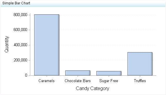
This indicator type is appropriate for all user audiences. Most people find this indicator type familiar and easy to interpret. It is popular and commonly used to compare values of different categories. All audiences should be familiar with the horizontal and vertical versions of this indicator type and find them both easy to interpret.
Data aggregation support
This indicator type sums the applicable indicator data.
Range support
Ranges are not supported.
Alert support
Alerts are not supported.
Link support
This indicator type can be used to define a link or as the destination of a link.For more information about defining an indicator with a hyperlink, see Adding Links to Indicators or Other Content.
Interaction support
  • Data filter support: This indicator type can be used as either a source or target indicator.
  • Interactive highlighting support: This indicator type can be used as either a source or target indicator.
For more information, see Adding Interactions between Indicators.
Filter multiple items support
Filtering multiple items is supported.For more information, see Supporting Multiple Selections in a Filtered Data Interaction.

General Settings

Display Settings

The following display settings are used in the preceding figure. For more information, see “Sample Data Structure” for this indicator.
Display Setting
Selection Used for Figure
X-axis value
Candy Category
Y-axis value
Quantity
X-axis title
<blank> (defaults to Candy Category)
Y-axis title
<blank> (defaults to Quantity)
Scale X axis
This setting is selected.
You can customize the following display settings for this indicator:
  • (Required) From the X-axis value list, select the column in your data that you want to use for the X-axis value in the indicator. When you view your indicator data, the columns in the data set are described by the values in the Column Name column. The selections available in the X-axis value list are all of the values in the Column Name column.
  • (Required) From the Y-axis value list, select the column in your data that you want to use for the Y-axis value in the indicator. When you view your indicator data, the columns in the data set are described by the values in the Column Name column. The selections available in the Y-axis value list are all of the values in the Column Name column.
  • In the X-axis title field, type the title to use for the X axis in the indicator. If you do not specify a title, the value that you selected from the X-axis value list is used by default. If you do not want a title, type a space in the field. If you select Scale X axis, a measurement label is added to the title.
  • In the Y-axis title field, type the title to use for the Y axis in the indicator. If you do not specify a title, the value that you selected from the Y-axis value list is used by default. If you do not want a title, type a space in the field. If you select Scale Y axis, a measurement label is added to the title.
  • Select Scale X axis if you want to scale that axis. When you make this selection, a measurement label is added to the X-axis title if the data is numeric. For example, if the X-axis title is set to Revenue and you select Scale X axis, the X-axis title is displayed as Revenue (millions).
  • Select Scale Y axis if you want to scale that axis. When you make this selection, a measurement label is added to the Y-axis title if the data is numeric. For example, if the Y-axis title is set to Revenue and you select Scale Y axis, the Y-axis title is displayed as Revenue (millions).
  • From the X-axis format list, select the format that you want to apply to the data on that axis. If you do not want to specify a format, select (none). When set to (none), the indicator uses the format that is used in the data source.
  • From the Y-axis format list, select the format that you want to apply to the data on that axis. If you do not want to specify a format, select (none). When set to (none), the indicator uses the format that is used in the data source.
  • From the X-axis labels list, select the style to apply to the data labels that are used on the X axis. Depending on your labels, one style might be easier to read than others.

Sample Data Structure

To create a simple bar chart, you must provide a variable (X-axis value) and a measure (Y-axis value).
The following data sample is associated with the figure previously shown. Underneath each column heading is its associated display setting.
Candy Category
(X-axis value)
Quantity
(Y-axis value)
Caramels
808,183
Chocolate Bars
66,451
Sugar Free
57,717
Truffles
307,045