Stacked Bar Chart
Definition
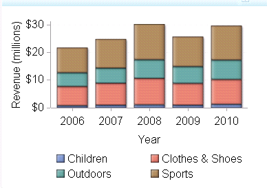
A stacked bar chart
consists of a grid and some vertical or horizontal columns (bars)
that include subgroups, or stacks, of data. Each column represents
quantitative data. Bar charts can contain horizontal or vertical bars
that are each subdivided into multiple components. Each of these components
shows its relative contribution to the entire bar and the entity as
a whole.
Usage Information
|
Use a stacked bar chart
when each bar (such as a category) can be broken down into smaller
components that add up to the entire value of the bar. An example
of this is when each bar represents sales for a year and each year
is broken down into sales for each quarter. In this example, each
bar consists of four subcomponents, each representing sales for a
specific quarter.
|
|
|
This indicator type can be used to define a link or as the
destination of a link.For
more information about defining an indicator with a hyperlink, see Adding Links to Indicators or Other Content.
|
|
|
Filtering multiple items is supported.For
more information, see Supporting Multiple Selections in a Filtered Data Interaction.
|
Display Settings
The following display settings are used in the preceding
figure. For more information, see “Sample Data Structure”
for this indicator.
You can customize the
following display settings for this indicator:
-
(Required) From the X-axis value list, select the column in your data that you want to use for the X-axis value in the indicator. When you view your indicator data, the columns in the data set are described by the values in the Column Name column. The selections available in the X-axis value list are all of the values in the Column Name column.
-
(Required) From the Y-axis value list, select the column in your data that you want to use for the Y-axis value in the indicator. When you view your indicator data, the columns in the data set are described by the values in the Column Name column. The selections available in the Y-axis value list are all of the values in the Column Name column.
-
In the X-axis title field, type the title to use for the X axis in the indicator. If you do not specify a title, the value that you selected from the X-axis value list is used by default. If you do not want a title, type a space in the field. If you select Scale X axis, a measurement label is added to the title.
-
In the Y-axis title field, type the title to use for the Y axis in the indicator. If you do not specify a title, the value that you selected from the Y-axis value list is used by default. If you do not want a title, type a space in the field. If you select Scale Y axis, a measurement label is added to the title.