The VARIOGRAM Procedure

You can use the autocorrelation analysis features of PROC VARIOGRAM to compute the autocorrelation Moran’s I and Geary’s c statistics and to obtain the Moran scatter plot. In the following statements, you ask for the Moran’s I and Geary’s c statistics under the assumption of randomization using binary weights, in addition to the Moran scatter plot:
proc variogram data=thick outv=outv plots(only)=moran;
   compute lagd=7 maxlag=10 autocorr(assum=random);
   coordinates xc=East yc=North;
   var Thick;
run;
For the autocorrelation analysis with binary weights and the Moran scatter plot, the LAGDISTANCE= option indicates that you consider as neighbors of an observation all other observations within the specified distance from it.
Figure 102.8 shows the output from the requested autocorrelation analysis. This includes the observed (computed) Moran’s I and Geary’s c coefficients, the expected value and standard deviation for each coefficient, the corresponding Z score, and the p-value in the Pr ![]() column. The low p-values suggest strong autocorrelation for both statistics types. A two-sided p-value is reported, which is the probability that the observed coefficient lies farther away from
column. The low p-values suggest strong autocorrelation for both statistics types. A two-sided p-value is reported, which is the probability that the observed coefficient lies farther away from ![]() on either side of the coefficient’s expected value—that is, lower than –Z or higher than Z. The sign of Z for both Moran’s I and Geary’s c coefficients indicates positive autocorrelation in the
on either side of the coefficient’s expected value—that is, lower than –Z or higher than Z. The sign of Z for both Moran’s I and Geary’s c coefficients indicates positive autocorrelation in the Thick data values; see the section Interpretation for more details.
Figure 102.8: Output Table for the Autocorrelation Statistics
| Spatial Correlation Analysis with PROC VARIOGRAM |
| Autocorrelation Statistics | ||||||
|---|---|---|---|---|---|---|
| Assumption | Coefficient | Observed | Expected | Std Dev | Z | Pr > |Z| |
| Randomization | Moran's I | 0.9240 | -0.0244 | 0.145 | 6.53 | <.0001 |
| Randomization | Geary's c | 0.0162 | 1.0000 | 0.175 | -5.62 | <.0001 |
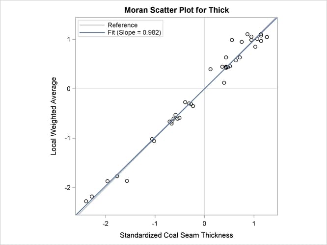
The requested Moran scatter plot is shown in Figure 102.9. The plot includes all nonmissing observations that have neighbors within the specified LAGDISTANCE= distance. The horizontal axis displays the standardized Thick values, and the vertical axis displays the corresponding weighted average of their neighbors. The plot data points are concentrated
in the upper right and lower left quadrants defined by the lines x = 0 and y = 0, and clearly around the axes’ diagonal reference line y = x of slope 1. This fact indicates strong positive spatial association in the thick data set observations. Therefore, for each observation its neighbors within the specified LAGDISTANCE= distance have overall similar Thick values to that observation. The plot also displays the linear regression slope, whose value is the Moran’s I coefficient when the binary weights are row-averaged. See the section The Moran Scatter Plot for more details about the Moran scatter plot.