Assigning Data to a Plot
About Assigning Data to a Plot
You are
prompted to assign plot data when you first create a graph from the
Graph Gallery or when you click and drag a plot to a graph. You can
later change the data after a plot has been created. For the predefined
graphs in the Graph Gallery, the designer uses data from the WORK,
SASHELP, or SASUSER library.
Assign Data to a Plot
-
Assign the SAS library and data set that you want to use for the plot. The process for assigning this information differs depending on how the Assign Data dialog box is opened, as described here:
-
In the Variables section, specify the variable values for the plot. For more information about the variables, see Summary of Plot Data.
Note: If
you are designing a classification panel, then click the Panel Variables tab and select the classification variable(s). For more information,
see Creating a Classification Panel.
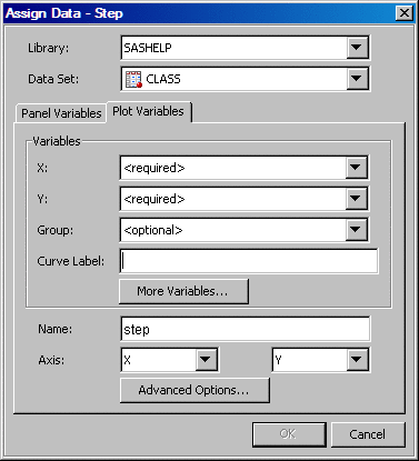
Summary of Plot Data
In the
Assign Data dialog box, you specify the variable values for the plot.
The variables that are available depend on which type of plot you
are designing.
For most of the plots,
you specify the variable for the X axis, the Y axis, or both axes.
For the contour plot, you also specify the variable for the Z axis.
Several types of plots
enable you to specify a variable for grouping the data. Scatter plots,
series plots, step plots, bar charts, and vector charts support this
option in the designer.
You can display the
data label for each observation in a scatter plot, and a curve label
for a series or a step plot.
Some plots can display
the upper and lower error (or confidence or prediction) limits for
the data. You compute these values and supply them as variables to
the plot.
This option is available
for plots such as series or step plots. The connect order specifies
how to connect the data points to form the step line. Select X Axis to connect data points as they occur minimum-to-maximum
along the X axis. Select X Values to connect
data points in the order read from the X variable. X Axis is the default.
For bar charts, you
provide a category variable and an optional response variable. If
you don't specify a response variable, then the designer displays
the frequency chart for the category variable.
For vector plots, in
addition to the X and Y variables, you can specify the vector origin.
You can specify the X data coordinate of the vector origin and the
Y data coordinate of the vector origin. If you don't specify the coordinate,
a value of 0.0 is used.
For a contour plot,
you must specify gridded data for the contour X and Y variables, with
a Z value for each (X,Y) crossing.
| Line | displays contour levels as unlabeled lines. |
| Fill | displays the area between the contour levels as filled. Each contour interval is filled with one color. |
| Gradient | displays a smooth gradient of color to represent contour levels. |
| LineFill | combines the Line and Fill types. Each contour interval is filled with one color. Displays contour levels as unlabeled lines. |
| LineGradient | combines the Line and Gradient types. Displays contour levels as unlabeled lines. |
| LabeledLine | adds labels to the Line type. Displays contour levels as labeled lines. |
| LabeledLineFill | adds labels to the LineFill type. Each contour interval is filled with one color. Displays contour levels as lines with labels showing contour level values. |
| LabeledLineGradient | adds labels to the LineGradient type. Displays contour levels as lines with labels showing contour level values. |
You can select the Fit an existing plot check box to match the variables
of an overlaid loess, regression, or PBSpline (penalized B-spline)
plot to those of another plot.
| CLM | creates confidence limits. This option is available for all three plots. The confidence level is set by the Alpha option. |
| CLI | produces confidence limits for individual predicted values for each observation. This option is available for regression and PBSpline plots. The confidence level is set by the Alpha option. |
| Alpha | specifies the confidence level to compute. The default is 0.05, which represents a 95% confidence level. |
| Degree | specifies the degree of the polynomial that is computed. A degree of one produces a linear fit, a degree of two produces a quadratic fit, and so on. For loess plots, you can specify a degree of one (default) or two. For regression and PBSpline plots, you can specify a degree of one through five. |
| Interpolation | specifies the degree of the interpolating polynomials that are used for blending local polynomial fits at the vertices. This value is used with loess plots. Possible choices are Linear (default) and Cubic. |