Sample 25018: Plot ROC curve with cutpoint labeling and optimal cutpoint analysis
 |  |  |  |  |
Plot ROC curve with cutpoint labeling and optimal cutpoint analysis
| Contents: | Purpose / History / Requirements / Usage / Details / Limitations / References |
Beginning in SAS® Viya® 2022.10, ROCOPTIONS in the PROC LOGISTIC statement includes options to thin labels and find and display optimal cutpoints.
- PURPOSE:
- Produce a plot of the Receiver Operating Characteristic (ROC) curve associated with a fitted binary-response model. Label points on the ROC curve using statistic or input variable values. Identify optimal cutpoints on the ROC curve using several optimality criteria such as correct classification, efficiency, cost, and others. Plot optimality criteria against a selected variable.
When only an ROC plot with labeled points is needed, you can often produce the desired plot in PROC LOGISTIC without this macro. Using ODS graphics, PROC LOGISTIC can plot the ROC curve of a model whether applied to the data used to fit the model or to additional data scored using the fitted model. Specify the PLOTS=ROC option in the PROC LOGISTIC statement, or specify the OUTROC= option in the MODEL and/or SCORE statements. PROC LOGISTIC can label the points in the ROC curve with their observation numbers, predicted probabilities, values from one or more variables, or with values from a single statistic (such as the misclassification rate). Use the PLOTS=ROC(ID=keyword | ID) option and ID statement. For details, see the LOGISTIC documentation.
For plotting the ROC curve with labeled points, the ROCPLOT macro provides these capabilities:
- The macro enables you to label points with any number of statistics in addition to variable values.
- Any given cutpoint can correspond to many observations in the data. When using variable levels to label points, PROC LOGISTIC uses the last value of each variable found within a set of observations having the same cutpoint value. For numeric variables, the ROCPLOT macro enables you to use any statistic available in PROC MEANS to label the points. For character variables, you can use either the first or last value in the set.
- When PROC LOGISTIC is used to label the points in an ROC plot and there is a large number of cutpoints (that is, when the INROC= data set has a large number of observations), the point labels can overlap becoming unreadable. In extreme cases, the density of labels results in a solid blob. The ROCPLOT macro enables you to thin the labels using the THINSENS=, THINY=, and the combination of the THINVAR= and MINDIST= options.
- The ROCPLOT macro provides more options to control the appearance of the plot (marker symbol, and various aspects of the plot line and label text).
- HISTORY:
-
The version of the ROCPLOT macro that you are using is displayed when you specify version (or any string) as the first argument. For example:
%rocplot(v)The ROCPLOT macro always attempts to check for a later version of itself. If it is unable to do this (such as if there is no active internet connection available), the macro will issue the following message:
NOTE: Unable to check for newer versionThe computations performed by the macro are not affected by the appearance of this message.
Version Update Notes 1.3 - Added ability to display tables of optimal cutpoints using several criteria, to identify the optimal cutpoints on the ROC plot, and to plot the criteria against a variable.
- Improved default label thinning by requiring a proportion of the maximum Youden criterion to be exceeded (THINY= option).
- Replaced LINECOLOR=, LINEPATTERN=, and LINETHICKNESS= options with LINESTYLE= option.
- Replaced MARKERSYMBOL= option with MARKER= option and default marker is now CIRCLEFILLED.
- Added MARKERSTYLE= option to control appearance of markers.
- Markers no longer require SAS 9.4 TS1M1 or later.
1.2 - Now uses PROC SGPLOT rather than PROC GPLOT to draw the graph.
- Additional computed statistics for use in labels.
- Added THINSENS= and THINVAR= options for controlling number of points labeled.
- Redefined how MINDIST= option operates.
- Added IDSTAT= option to compute statistics for numeric label variables within observations associated with the same cutpoint.
- Added OUTROCDATA= option to name the final data used for graphing.
- Added FORMAT= option specifying the format for numeric values in labels.
- Added CHARLEN= option specifying the maximum length for character values in labels.
- Replaced ROFFSET= option with OFFSETMIN= and OFFSETMAX= options to specify additional space at either end of horizontal axis.
- Renamed OUT= option to INPRED=, OUTROC= option to INROC=, PLOTCHAR= option to MARKERSYMBOL=. Replaced FONT=, SIZE=, and COLOR= options with LABELSTYLE=, LINECOLOR=, LINEPATTERN=, LINETHICKNESS=, and MARKERSYMBOL= options to control appearance of graph elements. Options from previous version are converted as best as possible to new syntax.
- Now displays markers only at labeled points by default.
- Added MARKERS= option to turn point markers on or off at labeled points (available in SAS 9.4 TS1M1 or later).
- Added SPLIT= option to specify a character to separate label values.
- Added ALTAXISLABEL= option to use true and false positive rates in axis labels.
- It is no longer necessary to use the ROCEPS= option in PROC LOGISTIC.
- Grid lines are displayed by default.
1.1 - Added automatic check for new version.
- Added GRID= option to display a grid in the plot.
- Added version option to display current macro version.
- Added special variables for sensitivity, specificity, and observation number for use as ID= variables.
- Added some white space at both ends of each axis (controlled by ROFFSET=).
- Fixed observations with missing probabilities causing "no match" message.
- Added (0,0) point to plot to complete the ROC curve.
- For low-resolution plots, added second plot without labels to make it easier to see the shape of the curve.
- Fixed multiple observations with same cutpoint values from causing "no match" message. The message should occur only if cutpoints do not match in the OUT= and OUTROC= data sets, presumably because the ROCEPS= was not used as suggested in the message.
- Removed the position option. Macro controls positioning to avoid overlaps.
- Labels are now angled to improve clarity. Labels are vertical at the right edge and almost horizontal at the left edge.
- To reduce label clutter, only top and bottom points in a vertical stack are labeled. Label of top point is above-left. Label of bottom point is below-right.
- If two points have specificity values that differ by less than the MINDIST= value, one of the points is not labeled. Points more than the MINDIST= value apart are labeled.
1.0 Initial coding. - REQUIREMENTS:
- SAS/STAT® software is needed to create the required input data sets from a modeling procedure. The ROCPLOT macro requires only Base SAS® software.
- USAGE:
- Before using the ROCPLOT macro, you must first fit a binary response model and then save the predicted probabilities of the training or scored data. Various procedures such as LOGISTIC, GAM, PROBIT, GENMOD, GLIMMIX can fit binary response models. An OUTROC= data set must also be produced using PROC LOGISTIC.
When using PROC LOGISTIC to fit the model, specify the OUTROC= option in the MODEL statement and the OUT= and P= options in the OUTPUT statement before using the ROCPLOT macro to plot the ROC curve for the training data. Before using the ROCPLOT macro to plot the ROC curve for a scored (or validation) data set, specify the OUT= and OUTROC= options in the SCORE statement.
When using another procedure to fit the model, save the predicted probabilities in a data set using the modeling procedure. Then in PROC LOGISTIC, specify the variable containing the predicted probabilities in the PRED= option of an ROC statement. Also specify the OUTROC= option in the MODEL statement with a WHERE clause. See the Examples tab for an example of plotting the ROC curve for a model fit using PROC GAM.
Follow the instructions in the Downloads tab of this sample to save the ROCPLOT macro definition. Replace the text within quotation marks in the following statement with the location of the ROCPLOT macro definition file on your system. In your SAS program or in the SAS editor window, specify this statement to define the ROCPLOT macro and make it available for use:
%inc "<location of your file containing the ROCPLOT macro>";
Following this statement, you can call the ROCPLOT macro. See the Results tab for examples.
The following parameters are required when using the ROCPLOT macro:
- inpred=data-set-name
- Name of the data set containing a variable of predicted probabilities from a fitted binary model.
- p=variable
- Name of the variable in the INPRED= data set that contains the predicted probabilities.
- inroc=data-set-name
- Name of the OUTROC= data set from PROC LOGISTIC.
- id=list
- List of variables and/or statistics to label the cutpoints. At least one variable or statistic must be specified. Separate items with spaces. Note that the cutpoint labels can become quite long if you specify many items. Use the FORMAT= and/or CHARLEN= options to restrict the length of the values within the label. You can specify any of the variables in the INPRED= data set, but such variables should not begin or end with an underscore character (_). You can also specify any of the following statistics, which are displayed using the format specified in the FORMAT= option. The appearance of the label can be controlled with the LABELSTYLE= option.
- _OBS_, the observation number
- _CUTPT_, the cutpoint (applied to the predicted probabilities to produce predicted events and nonevents)
- _SENS_, the sensitivity, or true positive rate (the proportion of observed event responses that were predicted as events)
- _SPEC_, the specificity (the proportion of observed nonevent responses that were predicted as nonevents)
- _CSPEC_, 1 - specificity, or false positive rate (the proportion of observed nonevent responses that were predicted as events)
- _FPOS_, the proportion of false positives (the proportion of predicted event responses that were observed as nonevents)
- _FNEG_, the proportion of false negatives (the proportion of predicted nonevent responses that were observed as events)
- _PPRED_, the positive predictive value (1-_FPOS_, the proportion of predicted event responses that were observed as events)
- _NPRED_, the negative predictive value (1-_FNEG_, the proportion of predicted nonevent responses that were observed as nonevents)
- _MISCLASS_, the proportion of misclassified observations (1-_CORRECT_)
- _CORRECT_, the proportion of correctly classified observations
- _DIST01_, the distance from the cutpoint to the sensitivity=0, 1-specificity=1 point (upper-left corner of the ROC plot).
- _YOUDEN_, the Youden index (the vertical distance from the uninformative diagonal to the cutpoint).
- _SESPDIFF_, the absolute difference between sensitivity and specificity.
You can also specify any of the following, which adds a character symbol in the label of the cutpoint that optimizes each criterion.
- _OPTCORR_, adds the symbol C to the label when the cutpoint has the maximum correct classification rate.
- _OPTDIST_, adds the symbol D to the label when the cutpoint has the minimum distance to the sensitivity=0, 1-specificity=0 point (upper-left corner of the ROC plot).
- _OPTY_, adds the symbol Y to the label when the cutpoint has the maximum Youden index (the vertical distance from the uninformative diagonal to the cutpoint).
- _OPTSESP_, adds the symbol = to the label when the cutpoint has the minimum absolute difference between sensitivity and specificity.
- _OPTCOST_, adds the symbol $ to the label when the cutpoint has the minimum cost.
- _OPTMCT_, adds the symbol M to the label when the cutpoint has the minimum misclassification-cost term.
- _OPTEFF_, adds the symbol E to the label when the cutpoint has the maximum efficiency.
- _OPTALL_, adds all of the above symbols to the label.
You can also specify the statistics in the OUTROC= data set from PROC LOGISTIC. The FORMAT= option does not apply to these statistics.
- _PROB_, the cutpoint (same as _CUTPT_, but unformatted)
- _SENSIT_, the sensitivity (same as _SENS_, but unformatted)
- _1MSPEC_, the specificity (same as _SPEC_, but unformatted)
- _POS_, the number of observed event responses predicted as events
- _NEG_, the number of observed nonevent responses predicted as nonevents
- _FALPOS_, the number of observed nonevent responses predicted as events
- _FALNEG_, the number of observed event responses predicted as nonevents
The following are optional parameters except as noted:
Parameters affecting cutpoint labeling
- idstat=keyword-list
- Specifies a list of statistics associated with each variable in the ID= list. The computed statistic value is used in cutpoint labels. You can specify any statistic keyword available in PROC MEANS such as mean, median, mode, range, and so on. Each statistic in the list applies to the item in the same position in the ID= option list. For ID= option items that are statistics (such as _SENS_) or optimality symbols (such as _OPTCORR_), specify a missing value (.). If you specify _OPTALL_ in the ID= option, specify seven missing values. If the IDSTAT= option is omitted, the median is computed for numeric variables and the first value is used for character variables.
- format=format
- Specifies the format for all numeric values in the labels of cutpoints. This format is not applied to statistics in the OUTROC= data set from PROC LOGISTIC (_PROB_, _SENSIT_, _1MSPEC_, _POS_, _NEG_, _FALPOS_, and _FALNEG_). The default is FORMAT=BEST5. .
- charlen=value
- Specifies the maximum length for all character values in the labels of cutpoints. Value must be an integer greater than or equal to 1. The default is CHARLEN=5.
- split=character
- Specifies the character used to separate the values in the labels of cutpoints. For example, SPLIT=/ uses the slash character to separate the label values. Do not use quotation marks (' or "). For characters that could be interpreted as part of the macro call syntax (comma, parenthesis), specify the character in %str(). For example: SPLIT=%STR(,) uses the comma as a separator. The default character is a blank space.
- thinsens=value
- As the data are read in sensitivity order, cutpoints are labeled in the ROC plot when the sensitivity value changes by more than value. Note that labeling also requires a cutpoint to have a Youden index exceeding the proportion specified in the THINY= option. Value must be between 0 and 1. The default is THINSENS=0.05. Specifying THINSENS=0 does no thinning (reduction) of labels by the sensitivity change criterion. A note is printed in the SAS Log indicating the number of points labeled by this method.
- thiny=value
- Cutpoints are labeled in the ROC plot if their Youden indexes exceed (value×100)% of the maximum observed Youden criterion for all cutpoints. The Youden index is the vertical distance from the uninformative diagonal to the cutpoint. Cutpoints below the diagonal have negative Youden indexes. Value must be between -1 and 1. The default is THINY=0.5 (50% of the maximum). Specifying THINY=-1 does no thinning (reduction) of labels by the Youden criterion. A note is printed in the SAS Log indicating the number of points labeled by this method.
- thinvar=variable
- Specifies a numeric variable to be used in determining whether additional cutpoints should be labeled in the ROC plot. The THINVAR= variable can be any numeric variable in the INPRED= data set. MINDIST= is required when THINVAR= is specified. As the data are read in the order of the THINVAR= variable, cutpoints are labeled when the value of the THINVAR= variable changes by more than the MINDIST= value. If not specified, cutpoints are labeled only as determined by the THINSENS= and THINY= options. A note is printed in the SAS Log indicating the number of cutpoints labeled by this method.
- mindist=value
- Required if THINVAR= is specified. As the data are read in the order of the THINVAR= variable, cutpoints are labeled in the ROC plot when the value of the THINVAR= variable changes by value or more. Specifying MINDIST=0 labels every cutpoint.
Parameters for displaying optimal cutpoints
- optcrit=correct | dist | youden | sespdiff | cost | mct | eff | all
- Specifies one or more criteria for finding optimal cutpoints. Separate multiple criteria with spaces. A symbol is placed on the ROC curve at each optimal cutpoint. A table of optimal cutpoints is also provided. ALL requests all seven criteria. CORRECT maximizes the correct classification rate (symbol: C). DIST minimizes the distance from the ROC curve to the "perfect" point at the upper-left corner where sensitivity=1 and 1-specificity=0 (symbol: D). YOUDEN maximizes the Youden index — the vertical distance from the uninformative diagonal to ROC curve (symbol: Y). SESPDIFF minimizes the absolute difference between sensitivity and specificity (symbol: =). COST maximizes a criterion that minimizes the cost (symbol: $). MCT minimizes the misclassification-cost term (symbol: M). EFF maximizes the efficiency (symbol: E). For the cost and MCT criteria, the COSTRATIO= option must be specified. See the Details section below. If omitted, no optimal cutpoints are presented.
- costratio=value | value-list
- Required when the cost or MCT optimality criterion is requested. Specifies one or more cost ratios used in the computation of these criteria as discussed in the Details section below. Separate multiple values with spaces.
- pevent=value | value-list
- Specifies one or more prevalence (rate of event occurrence) values used in computing the cost, MCT, and efficiency optimality criteria. If omitted, the prevalence in the observed data is used.
- optbyx=yes | panelall | paneleach | no
- OPTBYX=YES produces separate plots of the optimality criteria requested in OPTCRIT= against the variable specified in the X= option. The X= option is required if the OPTBYX= option is specified. OPTBYX=PANELALL produces a single panel containing the criterion plots. OPTBYX=PANELEACH produces separate plots for each criterion like OPTBYX=YES, but for the cost, MCT, and efficiency criteria, a panel of plots for each cost ratio and/or prevalence combination is produced. OPTBYX=NO produces no plots. The default is OPTBYX=NO.
- x=variable
- Specifies one variable against which the optimality criteria requested in OPTCRIT= are plotted. The X= option is required when the OPTBYX= option is specified. The specified variable can be any variable in the INPRED= data set.
- multoptplot=yes | panelall | no
- Applies only to the cost, MCT, and efficiency optimality criteria. MULTOPTPLOT=YES produces separate plots of these optimality criteria. For the cost and MCT criteria, each plot graphs the criterion against the cost ratios with separate lines for each prevalence. For the efficiency criterion, the efficiency is plotted against prevalence. Each point in the plot is the optimal cutpoint at each cost ratio and prevalence combination (for cost and MCT criteria) or at each prevalence value (for the efficiency criterion). MULTOPTPLOT=PANELALL produces a single panel containing the criterion plots. The optimal cutpoints in these plots are labeled by the ID= variables. No plot is produced if there is only one cost ratio and one prevalence value. MULTOPTPLOT=NO produces no plots. The default is MULTOPTPLOT=NO.
- multoptlist=yes | no
- Applies only to the cost, MCT, and efficiency optimality criteria. MULTOPTLIST=YES produces a table of optimal cutpoints for each of these optimality criteria. Each table gives the optimal cutpoints for the criterion at each cost ratio and prevalence combination (for cost and MCT criteria) or at each prevalence value (for the efficiency criterion). For each optimal cutpoint in these tables, its value on the criterion and its values on the ID= variables are given. MULTOPTLIST=NO produces no tables. The default is MULTOPTLIST=NO.
Parameters affecting plot appearance
- plottype=high | low | none
- Affects only the display of the ROC plot. PLOTTYPE=HIGH produces a high-resolution ROC plot using PROC SGPLOT. PLOTTYPE=LOW produces a pair of low-resolution, character-based graphs using PROC PLOT. The first graph plots the ROC curve without labeled points to more clearly show the shape of the curve. The second graph plots the ROC curve with labeled points. None of the following appearance options affect low-resolution plots except the ALTAXISLABEL= option. PLOTTYPE=NONE causes no ROC plot to be produced. The default is PLOTTYPE=HIGH.
- linestyle=attribute-option list
- Use this option to specify attributes (COLOR=, PATTERN=, or THICKNESS=) of the line in plots containing a single line. Plots with multiple lines are not affected. Plots of the cost, MCT, and efficiency criteria can have multiple lines when multiple cost ratios and/or prevalences are specified. Separate multiple option=value attributes with spaces. For example: LINESTYLE=COLOR=RED THICKNESS=2. For more on specifying line attributes, see the "Commonly Used Attribute Options" section of the SAS ODS Graphics: Procedures Guide.
- labelstyle=attribute-option-list
- Use this option to specify text attributes (COLOR=, FAMILY=, SIZE=, STYLE=, or WEIGHT=) of cutpoint labels. Separate multiple option=value attributes with spaces. For example: LABELSTYLE=COLOR=BLUE WEIGHT=BOLD. For more on specifying text attributes, see the "Commonly Used Attribute Options" section of the SAS ODS Graphics: Procedures Guide.
- optsymbolstyle=attribute-option-list
- Use this option to specify text attributes (COLOR=, FAMILY=, SIZE=, STYLE=, or WEIGHT=) of the character symbols marking optimal cutpoints on the ROC plot. Separate multiple option=value attributes with spaces. For example: OPTSYMBOLSTYLE=SIZE=14 WEIGHT=BOLD. To prevent symbols being drawn on the ROC curve, specify SIZE=0. For more on specifying text attributes, see the "Commonly Used Attribute Options" section of the SAS ODS Graphics: Procedures Guide.
- markerstyle=attribute-option-list
- Use this option to specify marker attributes (COLOR=, SIZE=, SYMBOL=) in plots containing a single line. Separate multiple option=value attributes with spaces. For example: MARKERSTYLE=COLOR=RED SIZE=4. Note that if you specify the SYMBOL= attribute, it overrides the value of the MARKER= option. For more on specifying marker attributes, see the "Commonly Used Attribute Options" section of the SAS ODS Graphics: Procedures Guide.
- markers=yes|no
- Specifies whether a symbol is used to mark cutpoints in all plots. The default is MARKERS=YES.
- marker=symbol-name
- Specifies the symbol used to mark labeled points in all plots. The default is MARKER=CIRCLEFILLED. See the list of available symbol names in the "Commonly Used Attribute Options" section of the SAS ODS Graphics: Procedures Guide.
- offsetmin=value
- Specifies the amount of extra space added to the left end of the horizontal (1-Specificity) axis in the ROC plot. Value should be a proportion of axis length between 0 and 1. The default is OFFSETMIN=0.1.
- offsetmax=value
- Specifies the amount of extra space added to the right end of the horizontal (1-Specificity) axis in the ROC plot. Value should be a proportion of axis length between 0 and 1. The default is OFFSETMAX=0.1.
- grid=yes | no
- Specifies whether a set of grid lines is added to the ROC plot. The default is GRID=YES.
- altaxislabel=yes|no
- Specifies whether to label the ROC plot axes as Sensitivity and 1-Specificity (ALTAXISLABEL=NO), or as True Positive Rate and False Positive Rate (ALTAXISLABEL=YES). The default is ALTAXISLABEL=NO.
Other parameters
- outrocdata=data-set-name
- Specifies the name of the data set used for plotting the ROC curve. The default is OUTROCDATA=_ROCPLOT.
- round=value
- Specifies to what position the probability values in the INPRED= and INROC= data sets are rounded. It also defines the maximum amount that a cutpoint optimality value can differ from the maximum or minimum observed value in order to be considered optimal. Increasing value increases the possibility of ties. The default is ROUND=1E-12.
- DETAILS:
- The receiver operating characteristic (ROC) curve is a diagnostic tool for assessing the ability of a binary response model to discriminate between events and nonevents. If the model discriminates perfectly, the ROC curve passes through the (0,1) point in the upper-left corner of the plot, and the area below the curve is one. If the model has no discriminating ability, the ROC curve follows a diagonal line from (0,0) to (1,1). Each point on the ROC curve provides the sensitivity (true positive) and 1-specificity (false positive) rates associated with a cutoff on the probability scale (called a cutpoint). Each cutpoint allows all observations to be classified as either predicted events or predicted nonevents.
The ROC plots and analyses available in PROC LOGISTIC and the ROCPLOT macro use the empirical ROC curve. The empirical curve has a finite set of distinct points. Each point corresponds to the predicted probability for an observation in the data set used to fit the model. Consequently, the optimal cutpoint on any criterion found the ROCPLOT macro is restricted to one of the observations. The advantage to this is that no distribution assumptions are made in the ROC analysis and curve construction. The disadvantage is that there could be multiple cutpoints for a given optimality criterion, and as stated, only observed values of the predictor can be selected as optimal. By assuming a distribution for the predictor (typically, a normal distribution), the ROC curve is then continuous and monotonic. Further, an optimal cutpoint is unique and can be associated with an unobserved value of the predictor. See Example 2 in the Results tab and the references provided there regarding this approach.
Cutpoint labeling and label thinning
When there is a large number of cutpoints (that is, when the INROC= data set has a large number of observations), the point labels can overlap and become unreadable. This can happen when the model includes continuous predictors or when there are many distinct predictor values or combinations of values. With a very large number of cutpoints, labeling all cutpoints would result in a solid blob of unreadable text. The ROCPLOT macro offers two methods for thinning (reducing) the labeling of cutpoints so that they are readable. Note that requested optimal cutpoints are labeled even when maximal thinning turns off all cutpoint labeling.
The default method has two labeling requirements. First, a cutpoint adjacent to a labeled cutpoint must have a minimum change in sensitivity (vertical separation) before it is labeled. This is controlled by the THINSENS= option, which requires a sensitivity change of 0.05 by default. THINSENS=0 turns off this requirement. Second, a cutpoint must have a Youden value greater than a specified proportion of the maximum observed Youden value. The maximum Youden index is the largest vertical distance from the uninformative diagonal to the ROC curve. This proportion is specified in the THINY= option, which requires a Youden value greater than 50% of the maximum by default. THINY=-1 turns off this requirement. The number of cutpoints labeled by this method is given in a note displayed in the SAS log. No cutpoints are labeled by this method when THINSENS=1 and THINY=1. When both requirements are turned off, the ROCPLOT macro typically labels the same cutpoints as PROC LOGISTIC when labeling is requested.
Another thinning method is available that can be used in addition to the above method (or instead of, by specifying THINSENS=1 and THINY=1). By specifying the THINVAR= and MINDIST= options, cutpoints are labeled when the value of the THINVAR= variable changes by the MINDIST= amount or more. This is in addition to any points labeled by the above method. You can request that all points be labeled by specifying any variable in the THINVAR= option and MINDIST=0. The number of additional cutpoints labeled by this method is given in a note displayed in the SAS log. When the THINVAR= option is not specified, no additional cutpoints are labeled by this method.
To increase the number of points that are labeled by default:
- Decrease the value of THINSENS= and/or THINY=, and/or
- Specify the THINVAR= and MINDIST= options. Smaller MINDIST= values causes more cutpoints to be labeled.
Some experimentation with these options might be needed to achieve the desired labeling pattern.
Duplicate labels and using statistics in labels
Note that many observations with different values of the ID= variables can be associated with the same cutpoint. To produce a single label for a cutpoint, a statistic is computed over the observations associated with the cutpoint. For a numeric ID= variable, you can specify any statistic keyword available in PROC MEANS (such as MEAN or MEDIAN). For a character ID= variable, you can specify FIRST or LAST to select the first or last value of the variable after sorting. When there are character ID= variables, the ROCPLOT macro sorts by all of the character variables in the order in which they are specified. For a given cutpoint, the first and last values found can depend on the specified order of the character variables in the ID= option.
It is also possible for two or more points on the ROC curve to have the same label. This can happen if multiple points have the same values of the ID= variables but different predicted probabilities. For example, suppose the fitted model has categorical predictors A and B, and ID=A is specified in the ROCPLOT macro. Observations with a given value of A have different predicted probabilities depending on their values for B. Since the points on the ROC curve are the distinct predicted probabilities for the observed data, there are points for each combination of A and B levels, such as A1B1, A1B2, A2B1, and A2B2. If the points are labeled using only the value of A, then the distinct points A1B1 and A1B2 are both labeled 1.
Optimal Cutpoints
For each observation in the data, a model for a binary response results in a predicted probability of the event (such as disease or death) occurring. While the predicted probability is a continuous value between 0 and 1, it is often desirable to provide a binary prediction of whether the event will occur or not. This amounts to choosing a cutpoint on the predicted probability scale. If the predicted probability exceeds the chosen cutpoint, then the event response is predicted. Otherwise, the predicted response is the nonevent.
The optimal choice of a cutpoint on the predicted probabilities can be made in many ways depending on the choice of criterion to optimize. Seven optimality criteria are available in the ROCPLOT macro. Specify the desired criteria in the OPTCRIT= option.
When a binary prediction is made there are four possible outcomes: correct prediction of an event (TP), correct prediction of a nonevent (TN), incorrect prediction of an event when the true response is a nonevent (FP), and incorrect prediction of a nonevent when the true response is an event (FN). Also, the prevalence, p, of the event can be taken into account if it might differ from what is observed in the data. If it is possible to assign cost or benefit values to these outcomes, then a cutpoint can be chosen that minimizes the cost at a given event prevalence. The following cost criterion, when maximized, minimizes the cost (Metz, 1978):
Sensitivity - m×(1-Specificity) ,
where m = costratio×(1-p)/p, costratio = (cFP-cTN)/(cFN-cTP), and cFP, cTN, cFN, and cTP are the above outcome costs. This criterion is requested by specifying OPTCRIT=COST and one or more cost ratio values in the COSTRATIO= option. One or more prevalence values might also be specified in the PEVENT= option, or the observed prevalence is used if not. "$" is added to the label of the cutpoint that optimizes the cost criterion when _OPTCOST_ is specified in the ID= option.
Another cost- and prevalence-based criterion is the misclassification-cost term (MCT):
(cFN/cFP)×p×(1-Sensitivity)+(1-p)×(1-Specificity))
Note that when computing MCT, the cTN and cTP components of the specified cost ratio(s) are assumed to be zero. Specifying OPTCRIT=MCT requests the MCT criterion, and adding _OPTMCT_ in the ID= option adds "M" to the MCT-optimal cutpoint label.
A criterion that involves the prevalence but not costs is the efficiency:
p×Sensitivity + (1-p)×Specificity
Efficiency is a weighted average of Sensitivity and Specificity. Specifying OPTCRIT=EFF requests the efficiency criterion, and adding _OPTEFF_ in the ID= option adds "E" to the label of the cutpoint with maximum efficiency.
When the prevalence observed in the data is used, the efficiency is equivalent to the correct classification rate. Specifying OPTCRIT=CORRECT requests the correct classification criterion, and adding _OPTCORR_ in the ID= option adds "C" to the label of the cutpoint with the maximum correct classification rate.
Some criteria do not depend on the cost ratio or the prevalence. These criteria weight sensitivity and specificity equally. They effectively assume the false positive to false negative cost ratio is 1 and the event prevalence is 0.5.
- Youden index = Sensitivity + Specificity - 1
The Youden index is the height of the cutpoint above the diagonal line that represents an uninformative model. When the cost ratio equals 1 and the prevalence equals 0.5, the cost criterion reduces to the Youden index. When prevalence equals 0.5, the cutpoint that maximizes the Youden index also maximizes the efficiency. Specifying OPTCRIT=YOUDEN requests the Youden criterion, and adding _OPTY_ in the ID= option adds "Y" to the label of the cutpoint with the maximum Youden index.
- Distance to (0,1) = √(1-Sensitivity)²+(1-Specificity)²
This is the distance from the "perfect" point at the upper-left corner of the ROC plot where 1-Specificity=0 and Sensitivity=1, . Specifying OPTCRIT=DIST requests the distance criterion, and adding _OPTDIST_ in the ID= option adds "D" to the label of the cutpoint closest to the (0,1) point of the ROC graph.
- Sensitivity, Specificity equality = abs(Sensitivity - Specificity)
Specifying OPTCRIT=SESPDIFF requests this criterion, and adding _OPTSESP_ in the ID= option adds "=" to the label of the cutpoint with minimum absolute difference between sensitivity and specificity.
You can ensure that the cutpoint(s) optimal for a given criterion are labeled in the ROC plot by specifying the corresponding criterion variable in the ID= option. For example, adding _OPTY_ in the ID= option will ensure that the cutpoint(s) with maximum Youden index are labeled and that their labels include the symbol, Y. By default, specifying the criterion in the OPTCRIT= option also places the symbol directly on the cutpoint in the ROC curve.
For the cost and MCT criteria, there is an optimal cutpoint for each combination of cost ratio and prevalence. These cutpoints are presented in the "Cost-Based Optimal Cutpoints" and "MCT-Based Optimal Cutpoints" tables. Similarly for the efficiency criterion, which has an optimal cutpoint at each prevalence, these cutpoints are presented in the "Efficiency-Based Optimal Cutpoints" table. Note that if multiple cutpoints are tied for the optimal criterion value at each cost ratio and/or prevalence, all such cutpoints are presented. For these criteria the single cutpoint (or multiple if tied) that optimizes the criterion over all cost ratios and/or prevalences is presented in the "Optimal Cutpoints" table that appears after the ROC plot. For the other criteria, the single cutpoint (or multiple if tied) that optimizes the criterion also appears in this table.
Each of the criteria requested in the OPTCRIT= option can be plotted against a variable in the INPRED= data set by specifying the OPTBYX=YES, OPTBYX=PANELALL, or OPTBYX=PANELEACH option. Specify the variable to plot the criteria against in the X= option.
Additionally for each of the cost, MCT and efficiency criteria, all of the optimal cutpoints for the specified cost ratio and/or prevalences can be plotted by specifying the MULTOPTPLOT=YES or MULTOPTPLOT=PANELALL option. Lists of all optimal cutpoints for these criteria are provided by specifying MULTOPTLIST=YES.
The OUTROCDATA= data set
The OUTROCDATA= data set contains all the information needed to produce the ROC plot. The _THINID variable in this data set contains the labels for the points that are labeled in the plot. The _ID variable contains labels for all points. To create only this data set and prevent production of the ROC plot, specify the PLOTTYPE=NONE option.
- LIMITATIONS:
- The ROCPLOT macro cannot handle input data resulting from the use of BY processing in the model fitting procedure. FOOTNOTE statements specified before calling the ROCPLOT macro are ignored.
- REFERENCES:
- DeLong, E.R., DeLong, D.M., and Clarke-Pearson, D.L. (1988), "Comparing the areas under two or more correlated receiver operating characteristic curves: A nonparametric approach," Biometrics, 44, 837-845.
Greiner, M., Pfeiffer D., Smith R.D. (2000), "Principles and practical application of the receiver-operating characteristic analysis for diagnostic tests," Preventive Veterinary Medicine, 45, 23-41.
Hanley, J.A., and McNeil, B.J. (1982), "The meaning and use of the area under a receiver operating characteristic (ROC) curve," Radiology, 143, 29-36.
Hanley, J.A., and McNeil, B.J. (1983), "A method of comparing the areas under receiver operating characteristic curves derived from the same cases," Radiology, 148, 839-843.
Metz, C.E. (1978), "Basic principles of ROC analysis," Seminars in Nuclear Medicine, 8(4), 283-298.
Zweig, M.H., and Campbell, G. (1993), "Receiver-operating characteristic (ROC) plots: A fundamental evaluation tool in clinical medicine," Clinical Chemistry, 39(4), 561-577.
These sample files and code examples are provided by SAS Institute Inc. "as is" without warranty of any kind, either express or implied, including but not limited to the implied warranties of merchantability and fitness for a particular purpose. Recipients acknowledge and agree that SAS Institute shall not be liable for any damages whatsoever arising out of their use of this material. In addition, SAS Institute will provide no support for the materials contained herein.
These sample files and code examples are provided by SAS Institute Inc. "as is" without warranty of any kind, either express or implied, including but not limited to the implied warranties of merchantability and fitness for a particular purpose. Recipients acknowledge and agree that SAS Institute shall not be liable for any damages whatsoever arising out of their use of this material. In addition, SAS Institute will provide no support for the materials contained herein.
- EXAMPLE 1: Label cutpoints and optimize criteria
-
This example appears in the LOGISTIC documentation. The probability of disease is modeled as a function of Age. The following statements fit the binary logistic model and save the predicted probabilities (variable PHAT) in data set OUT and the ROC information in data set ROC1.
      data Data1;
         input Disease N Age;
         datalines;
        0 14 25
        0 20 35
        0 19 45
        7 18 55
        6 12 65
       17 17 75
      ;

      proc logistic data=data1;
         model Disease/N = Age / outroc=roc1;
         output out=out p=phat;
         run;
PROC LOGISTIC can plot the ROC curve and label points using Age or using a statistic like the misclassification rate, but it cannot label points using both. The following call of the ROCPLOT macro plots the ROC curve and labels the cutpoints on the curve using the corresponding value of Age, cutpoint value, and indicator symbols for several optimality criteria. Before calling the macro, the %INC statement defines the macro and makes it available for use. It is needed only once in a SAS session. By including _OPTCORR_, _OPTDIST_, _OPTY_, and _OPTSESP_ in the ID= option, a symbol is added to the label of the cutpoints that optimize the correct classification rate, the distance to the (0,1) point, the Youden index, and the absolute difference between sensitivity and specificity. These optimality criteria do not require specification of a cost ratio or event prevalence rate.
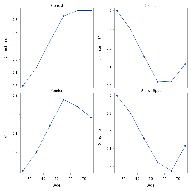
Additional plots of the optimality criteria are produced by specifying the OPTCRIT=, OPTBYX=, and X= options. The same four optimality criteria as above are specified in the OPTCRIT= option making them available for plotting. The X=Age option requests plots of these optimality criteria against Age. The OPTBYX=PANELALL option requests a single panel of the four plots.
By default, a symbol is placed on the ROC curve for each criterion specified in the OPTCRIT= option. When the same cutpoint optimizes multiple criteria, multiple symbols are overlaid and are difficult to distinguish. In such cases, it is desirable to include the symbols in the cutpoint labels as requested above, and omit the symbols on the ROC curve. Specifying SIZE=0 in the OPTSYMBOLSTYLE= option effectively turns off the symbols on the ROC curve.
      %inc "<location of your file containing the ROCPLOT macro>";

      title  "ROC plot for Disease = Age";
      title2 " ";
      %rocplot( inroc = roc1, inpred = out, p = phat,
                id = age _cutpt_ _optcorr_ _optdist_ _opty_ _optsesp_,
                optcrit = correct dist youden sespdiff, optsymbolstyle = size=0,
                optbyx = panelall, x = Age)
Note that the cutpoints at Age 65 and 75 (0.716 and 0.952) give the highest correct classification rate (87%). The cutpoint at Age 65 also minimizes the difference between the sensitivity and specificity (0.148). The cutpoint at Age 55 (0.242) minimizes the distance to the "perfect" point at the upper-left of the plot (0.243) and maximizes the height above the uninformative diagonal (0.757).
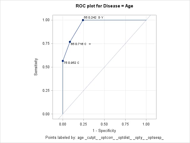
Optimal Cutpoints
Criterion Symbol Cutpoint Label Value Correct C 0.71637 65 0.716 C = 0.87000 Correct C 0.95223 75 0.952 C 0.87000 Dist To 0,1 D 0.24244 55 0.242 D Y 0.24286 Sens-Spec = 0.71637 65 0.716 C = 0.14762 Youden Y 0.24244 55 0.242 D Y 0.75714
Optimal Criteria By Age
- EXAMPLE 2: Confidence intervals for optimal cutpoints
-
When the model involves a single predictor and the cutpoint that is optimal under a given criterion is unique among the observations in your data, then the following shows how to obtain a confidence interval for the optimal cutpoint on the scale of the predictor. In Example 1, for example, you might want to know the range of Age values that can be expected to yield the cutpoint that is optimal on the correct classification criterion. But under that criterion, note that there are two cutpoints that produce the maximum (see the discussion in the Details section). As a result, there is no single value of Age, and no single interval, that produces the highest correct classification rate. Similarly, if the model involves multiple predictors, then even if an observation's cutpoint is uniquely optimal under a given criterion, it is a function of more than just a single predictor so a confidence interval around one of the predictors is not helpful.
One way to obtain a confidence interval for optimal cutpoints on the scale of the predictor is with the INVERSECL(PROB=) option in PROC PROBIT. Another approach is to use bootstrap resampling of the ROC curve to obtain distributions of the chosen criterion and the predictor value that yields the optimal value. Both of these are discussed and illustrated in SAS KB0045235. Alternatively, if the predictor can be assumed to be normally distributed (or be transformed to be so), then better optimal cutpoint estimates might be obtained by using that assumption to produce a smooth and monotonic ROC curve.
The following references make use of distributional assumptions to produce the ROC curve or estimate an optimal cutpoint and confidence interval.
Gönen, M. (2007), Analyzing Receiver Operating Characteristic Curves with SAS. Cary, NC: SAS Institute Inc.
Lai C., Tian L., Schisterman E.F., "Exact confidence interval estimation for the Youden index and its corresponding optimal cut-point", Comput. Stat. Data Anal. 2012 May 1; 56(5): 1103-1114.
- EXAMPLE 3: Evaluating several optimality criteria
-
Greiner et. al. (2000) present and analyze a set of antibody data from 25 infected (INF=1) and 75 uninfected (INF=0) cattle. A diagnostic test (EC) was used as a predictor of infection. An ROC analysis is done to assess the diagnostic and find an optimal cutpoint for determining when the infection is present. The following statements create the data set of results from the cattle.
      data elisac;
         input ec inf @@;
         datalines;
      0.000  0      0.159  0      0.020  0      0.254  1
      0.067  0      0.001  0      0.229  0      0.364  1
      0.000  0      0.164  0      0.031  0      0.490  1
      0.075  0      0.002  0      0.233  0      0.509  1
      0.000  0      0.169  0      0.036  0      0.650  1
      0.081  0      0.002  0      0.233  0      0.702  1
      0.000  0      0.180  0      0.039  0      0.716  1
      0.087  0      0.003  0      0.248  0      0.743  1
      0.000  0      0.183  0      0.043  0      0.752  1
      0.095  0      0.003  0      0.294  0      0.879  1
      0.000  0      0.184  0      0.043  0      0.899  1
      0.112  0      0.005  0      0.318  0      0.927  1
      0.000  0      0.192  0      0.047  0      0.937  1
      0.119  0      0.009  0      0.341  0      1.057  1
      0.001  0      0.194  0      0.048  0      1.064  1
      0.119  0      0.009  0      0.401  0      1.081  1
      0.001  0      0.210  0      0.048  0      1.116  1
      0.129  0      0.010  0      0.431  0      1.263  1
      0.001  0      0.216  0      0.051  0      1.346  1
      0.140  0      0.011  0      0.482  0      1.402  1
      0.001  0      0.216  0      0.055  0      1.665  1
      0.140  0      0.016  0      0.696  0      1.698  1
      0.001  0      0.222  0      0.056  0      1.799  1
      0.144  0      0.018  0      0.058  0      1.801  1
      0.001  0      0.222  0      0.067  0      1.934  1
      ;
These statements fit the logistic model and save the data sets of predicted values and ROC information for the ROCPLOT macro.
      proc logistic data=elisac;
         model inf(event="1")=ec / outroc=ecroc;
         output out=ecpred p=ecp;
         run;
The following ROCPLOT macro call provides a plot of the ROC curve. The OPTCRIT= option finds the cutpoint that minimizes the difference between sensitivity and specificity. The ID= option displays the EC, sensitivity, and specificity values on the labeled cutpoints and places a symbol (=) on the cutpoint that is optimal under this criterion. The OPTSYMBOLSTYLE= option specifies that this symbol be 18 pixels in size, red, and use a bold font.
      %rocplot(inroc = ecroc, inpred = ecpred, p = ecp, id = ec _sens_ _spec_,
               optcrit = sespdiff, optsymbolstyle = size=18 color=red weight=bold)
The "Optimal Cutpoints" table shows that the optimal cutpoint occurs at EC=0.364, with sensitivity and specificity values of 0.96 and 0.947 for a difference of 0.013.
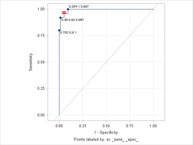
Optimal Cutpoints
Criterion Symbol Cutpoint Label Value Sens-Spec = 0.17995 0.364 0.96 0.947 0.013333
Points labeled by: ec _sens_ _spec_
The following ROCPLOT macro call finds the optimal cutpoints on all of the optimality criteria. The prevalence of infection in the sample data is 0.25 but results at a prevalence of 0.05 are also desired. The PEVENT= option requests both prevalences. The COSTRATIO= option specifies two ratios (0.5 and 1) of false positive to false negative costs. The ID= option labels cutpoints with levels of the predictor, EC, and includes symbols indicating the criteria the cutpoints optimize. The OPTSYMBOLSTYLE= option specifies a size of zero to prevent criteria symbols from appearing directly on the ROC curve. Plots of all criteria against EC are requested by the OPTBYX= and X= options. OPTBYX=PANELEACH produces separate criterion plots with a panel of plots at each cost ratio and/or prevalence for cost, MCT, and efficiency. The MULTOPTPLOT= requests a panel summarizing the three prevalence-dependent criteria (cost, MCT, and efficiency). The MULTOPTLIST= option requests tables of the optima at each cost and/or prevalence for these criteria.
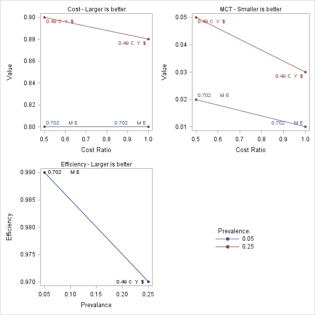
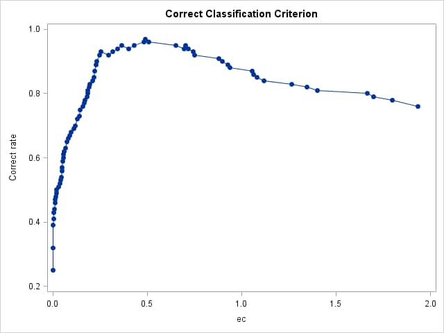
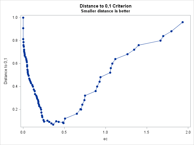
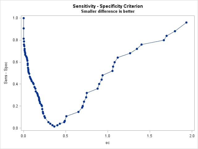
      %rocplot(inroc = ecroc, inpred = ecpred, p = ecp,
               id = ec _optall_, optsymbolstyle = size=0,
               optcrit = all, costratio = 0.5 1, pevent=.25 .05,
               optbyx = paneleach, x = ec,
               multoptplot = panelall, multoptlist = yes)
Three cutpoints are tied for the maximum Youden index (0.907) at EC values of 0.254, 0.364, and 0.49. The distance to the "perfect" point in the upper-left corner of the plot is minimum (0.067) at EC=0.364 The "MCT-Based Optimal Cutpoints" and "Cost-Based Optimal Cutpoints" tables show that the cost and MCT criteria are minimized at EC=0.49 when prevalence=0.25 and at EC=0.702 when prevalence=0.05 irrespective of cost ratio. The "Efficiency-Based Optimal Cutpoints" table shows that the efficiency is maximized at the same EC values as cost and MCT. The "Optimal Cutpoints" table shows that across both prevalences and both cost ratios, EC=0.702 optimizes MCT and efficiency while EC=.49 optimizes cost and the correct classification rate.
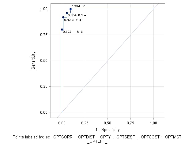
Optimal Cutpoints
Criterion Symbol Cutpoint Label Value Correct C 0.48272 0.49 C Y $ 0.97000 Cost $ 0.48272 0.49 C Y $ 0.90000 Dist To 0,1 D 0.17995 0.364 D Y = 0.06667 Efficiency E 0.91422 0.702 M E 0.99000 MCT M 0.91422 0.702 M E 0.01000 Sens-Spec = 0.17995 0.364 D Y = 0.01333 Youden Y 0.05839 0.254 Y 0.90667 Youden Y 0.17995 0.364 D Y = 0.90667 Youden Y 0.48272 0.49 C Y $ 0.90667
Points labeled by: ec _OPTCORR_ _OPTDIST_ _OPTY_ _OPTSESP_ _OPTCOST_ _OPTMCT_ _OPTEFF_
Prevalence-Dependent Optimality Criteria
Points labeled by: ec _OPTCORR_ _OPTDIST_ _OPTY_ _OPTSESP_ _OPTCOST_ _OPTMCT_ _OPTEFF_
Cost-Based Optimal Cutpoints Maximize Value to Minimize Cost
Prevalance Cost Ratio Cutpoint Label Value 0.05 0.5 0.91422 0.702 M E 0.80 0.05 1.0 0.91422 0.702 M E 0.80 0.25 0.5 0.48272 0.49 C Y $ 0.90 0.25 1.0 0.48272 0.49 C Y $ 0.88
Points labeled by: ec _OPTCORR_ _OPTDIST_ _OPTY_ _OPTSESP_ _OPTCOST_ _OPTMCT_ _OPTEFF_
MCT-Based Optimal Cutpoints Smaller MCT value is better
Prevalance Cost Ratio Cutpoint Label Value 0.05 0.5 0.91422 0.702 M E 0.02 0.05 1.0 0.91422 0.702 M E 0.01 0.25 0.5 0.48272 0.49 C Y $ 0.05 0.25 1.0 0.48272 0.49 C Y $ 0.03
Points labeled by: ec _OPTCORR_ _OPTDIST_ _OPTY_ _OPTSESP_ _OPTCOST_ _OPTMCT_ _OPTEFF_
Efficiency-Based Optimal Cutpoints Larger efficiency is better
Prevalance Cutpoint Label Value 0.05 0.91422 0.702 M E 0.99 0.25 0.48272 0.49 C Y $ 0.97
Points labeled by: ec _OPTCORR_ _OPTDIST_ _OPTY_ _OPTSESP_ _OPTCOST_ _OPTMCT_ _OPTEFF_ - EXAMPLE 4: Using IDSTAT= for variable statistics
-
Using the cancer remission example from the LOGISTIC documentation, the following statements fit a logistic model with CELL as the predictor.
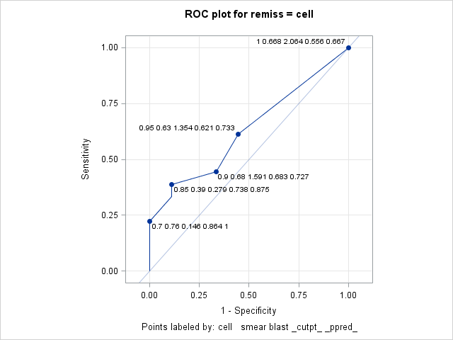
      data Remission;
       input remiss cell smear infil li blast temp;
       datalines;
      1   .8   .83  .66  1.9  1.1     .996
      1   .9   .36  .32  1.4   .74    .992
      0   .8   .88  .7    .8   .176   .982
      0  1     .87  .87   .7  1.053   .986
      1   .9   .75  .68  1.3   .519   .98
      0  1     .65  .65   .6   .519   .982
      1   .95  .97  .92  1    1.23    .992
      0   .95  .87  .83  1.9  1.354  1.02
      0  1     .45  .45   .8   .322   .999
      0   .95  .36  .34   .5  0      1.038
      0   .85  .39  .33   .7   .279   .988
      0   .7   .76  .53  1.2   .146   .982
      0   .8   .46  .37   .4   .38   1.006
      0   .2   .39  .08   .8   .114   .99
      0  1     .9   .9   1.1  1.037   .99
      1  1     .84  .84  1.9  2.064  1.02
      0   .65  .42  .27   .5   .114  1.014
      0  1     .75  .75  1    1.322  1.004
      0   .5   .44  .22   .6   .114   .99
      1  1     .63  .63  1.1  1.072   .986
      0  1     .33  .33   .4   .176  1.01
      0   .9   .93  .84   .6  1.591  1.02
      1  1     .58  .58  1     .531  1.002
      0   .95  .32  .3   1.6   .886   .988
      1  1     .6   .6   1.7   .964   .99
      1  1     .69  .69   .9   .398   .986
      0  1     .73  .73   .7   .398   .986
      ;

      proc logistic data=Remission;
         model remiss = cell / outroc=roc;
         output out=outp p=p;
         run;
The ROC plot produced by the following ROCPLOT macro call labels the cutpoints with the median of the predictor (CELL) values, the mean of SMEAR, and the maximum value of BLAST. Each label also includes the cutpoint and positive predictive value. Since CELL is the only predictor in the model, there is one predicted probability and therefore one cutpoint for each value of CELL. But there can be one or more observations at any given value of CELL as can be seen in these results from PROC MEANS.
      proc means data=outp mean max;
         class cell;
         var smear blast;
         run;
CELL N Obs Variable Mean Maximum 0.2 1 SMEAR BLAST 0.3900000 0.1140000 0.3900000 0.1140000 0.5 1 SMEAR BLAST 0.4400000 0.1140000 0.4400000 0.1140000 0.65 1 SMEAR BLAST 0.4200000 0.1140000 0.4200000 0.1140000 0.7 1 SMEAR BLAST 0.7600000 0.1460000 0.7600000 0.1460000 0.8 3 SMEAR BLAST 0.7233333 0.5520000 0.8800000 1.1000000 0.85 1 SMEAR BLAST 0.3900000 0.2790000 0.3900000 0.2790000 0.9 3 SMEAR BLAST 0.6800000 0.9500000 0.9300000 1.5910000 0.95 4 SMEAR BLAST 0.6300000 0.8675000 0.9700000 1.3540000 1 12 SMEAR BLAST 0.6683333 0.8213333 0.9000000 2.0640000 In the following call of the ROCPLOT macro, the IDSTAT= option is used to specify the statistics to be computed for each variable from the input data set (CELL, SMEAR, and BLAST). The statistics are computed over the set of observations corresponding to each cutpoint. The THINY=0 option allows all cutpoints above the diagonal to be labeled if they also meet the default THINSENS=0.05 requirement. Adding this option labels the CELL=0.9 cutpoint whose height above the diagonal does not exceed the default THINY=0.5 requirement.
      title  "ROC plot for remiss = cell";
      title2 " ";
      %rocplot(inroc = roc, inpred = outp, p = p,
                  id = cell   smear blast _cutpt_ _ppred_ ,
              idstat = median mean  max   .       .       ,
               thiny = 0)
The labeled plot shows that sensitivity increases as CELL increases. However, the positive predictive value decreases as CELL increases. The labels also show the mean SMEAR and maximum BLAST values at each cutpoint matching the results seen in the PROC MEANS results above.
- EXAMPLE 5: Changing plot appearance
-
The following data and model appear in the example titled "Logistic Modeling with Categorical Predictors" in the PROC LOGISTIC documentation. These statements create the input data and fit a logistic model to the probability of no pain.
      data Neuralgia;
         input Treatment $ Sex $ Age Duration Pain $ @@;
         datalines;
      Placebo  Female  68   1  No       TrtA     Female  69  12  No
      Placebo  Male    66  26  Yes      TrtB     Male    67  23  No
      TrtA     Female  71  12  No       TrtB     Male    77   1  Yes
      TrtA     Male    71  17  Yes      Placebo  Female  65  29  No
      TrtB     Female  66  12  No       TrtB     Male    75  21  Yes
      TrtA     Female  64  17  No       Placebo  Female  70  13  Yes
      Placebo  Male    70   1  Yes      Placebo  Female  68  27  Yes
      TrtA     Female  64  30  No       TrtB     Male    70  22  No
      TrtB     Female  78   1  No       TrtA     Male    67  10  No
      TrtB     Male    75  30  Yes      TrtB     Male    80  21  Yes
      TrtA     Male    70  12  No       Placebo  Female  67  30  No
      TrtB     Male    70   1  No       TrtB     Female  77  16  No
      Placebo  Male    78  12  Yes      TrtB     Female  76   9  Yes
      Placebo  Male    66   4  Yes      TrtA     Female  69  18  Yes
      TrtA     Male    78  15  Yes      Placebo  Female  64   1  Yes
      Placebo  Female  72  27  No       TrtA     Female  72  25  No
      TrtB     Female  65   7  No       TrtB     Male    59  29  No
      Placebo  Male    67  17  Yes      TrtA     Male    69   1  No
      Placebo  Female  67   1  Yes      TrtB     Female  69  42  No
      TrtA     Female  74   1  No       Placebo  Female  79  20  Yes
      TrtB     Male    74  16  No       TrtB     Female  65  14  No
      TrtB     Female  67  28  No       TrtA     Male    76  25  Yes
      TrtB     Female  72  50  No       TrtB     Female  69  24  No
      TrtA     Female  63  27  No       Placebo  Male    60  26  Yes
      TrtA     Male    62  42  No       TrtA     Female  67  11  No
      Placebo  Male    74   4  No       TrtA     Male    75   6  Yes
      TrtB     Male    66  19  No       Placebo  Male    68  11  Yes
      TrtA     Male    70  28  No       TrtA     Male    65  15  No
      Placebo  Male    83   1  Yes      Placebo  Female  72  11  Yes
      Placebo  Male    77  29  Yes      TrtA     Female  69   3  No
      ;

      proc logistic data=Neuralgia;
         class Treatment Sex;
         model Pain(event="No") = Treatment Sex Treatment*Sex Age Duration / outroc=NeurOR;
         output out=NeurProbs p=pNoPain;
         run;
This call of the ROCPLOT macro produces an ROC plot of the fitted model using the default appearance. The THINSENS=0 option allows cutpoints to be labeled even if there is no vertical separation (sensitivity). Notice that the default CHARLEN=5 option truncates the character values in the labels to the first five characters. Similarly, the default FORMAT=BEST5. option presents numeric values in the labels with a width of five.
      %rocplot(inpred = NeurProbs, inroc = NeurOR, p = pNoPain,
               id = Treatment Sex Age Duration,
               thinsens = 0)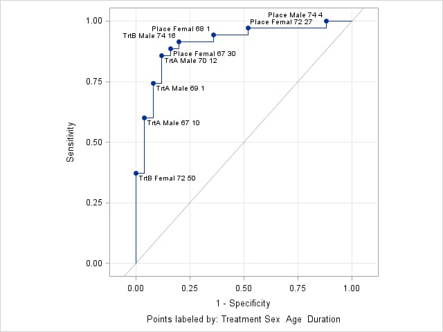
The following ROCPLOT call alters the plot appearance by limiting the length of the values of the character variables (Treatment and Sex) to 4, separating values in the label with a comma, making the label text bold, blue, and 10 pixels in size, using green, filled stars as cutpoint marker symbols, and using a red, dotted line that is 3 pixels thick. The THINSENS=0 option is removed to reduce crowding of labels.
      %rocplot(inpred = NeurProbs, inroc = NeurOR, p = pNoPain,
               id = Treatment Sex Age Duration,
               charlen = 4, split = %str(,),
               labelstyle = color=blue size=10 weight=bold,
               marker = starfilled, markerstyle = color=green,
               linestyle = color=red thickness=2 pattern=3)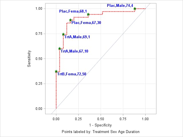
- EXAMPLE 6: ROC curve for a validation data set
-
In this example, data on plants were gathered from four blocks. Data set TRAIN contains the data from the first three blocks and is used as the training data set. Data set VALID contains data from the fourth block and is used as the validation data set.
           data train valid;
              input block entry lat lng n r @@;
              if block < 4 then output train;
              else output valid;
              datalines;
              1 14 1 1  8 2    1 16 1 2  9 1
              1  7 1 3 13 9    1  6 1 4  9 9
              1 13 2 1  9 2    1 15 2 2 14 7
              1  8 2 3  8 6    1  5 2 4 11 8
              1 11 3 1 12 7    1 12 3 2 11 8
              1  2 3 3 10 8    1  3 3 4 12 5
              1 10 4 1  9 7    1  9 4 2 15 8
              1  4 4 3 19 6    1  1 4 4  8 7
              2 15 5 1 15 6    2  3 5 2 11 9
              2 10 5 3 12 5    2  2 5 4  9 9
              2 11 6 1 20 10   2  7 6 2 10 8
              2 14 6 3 12 4    2  6 6 4 10 7
              2  5 7 1  8 8    2 13 7 2  6 0
              2 12 7 3  9 2    2 16 7 4  9 0
              2  9 8 1 14 9    2  1 8 2 13 12
              2  8 8 3 12 3    2  4 8 4 14 7
              3  7 1 5  7 7    3 13 1 6  7 0
              3  8 1 7 13 3    3 14 1 8  9 0
              3  4 2 5 15 11   3 10 2 6  9 7
              3  3 2 7 15 11   3  9 2 8 13 5
              3  6 3 5 16 9    3  1 3 6  8 8
              3 15 3 7  7 0    3 12 3 8 12 8
              3 11 4 5  8 1    3 16 4 6 15 1
              3  5 4 7 12 7    3  2 4 8 16 12
              4  9 5 5 15 8    4  4 5 6 10 6
              4 12 5 7 13 5    4  1 5 8 15 9
              4 15 6 5 17 6    4  6 6 6  8 2
              4 14 6 7 12 5    4  7 6 8 15 8
              4 13 7 5 13 2    4  8 7 6 13 9
              4  3 7 7  9 9    4 10 7 8  6 6
              4  2 8 5 12 8    4 11 8 6  9 7
              4  5 8 7 11 10   4 16 8 8 15 7
            ;
These statements fit the logistic model with three predictors. The OUTROC= option in both the MODEL and SCORE statements causes PROC LOGISTIC to display ROC curves for the TRAIN and VALID data sets.
      proc logistic data=train;
        model r/n = entry lat lng / outroc=troc;
        score data=valid out=valpred outroc=vroc;
        run;
The following ROCPLOT macro call plots the ROC curve for the validation data set and labels the cutpoints with the predictor values at each cutpoint as well as the correct classification rate (_CORRECT_). The THINY= and THINSENS= options allow all cutpoints above the diagonal to be labeled provided that they are separated vertically by at least 0.01 in sensitivity. The ALTAXISLABEL=YES option is specified to relabel the axes as True Positive Rate and False Positive Rate. The cutpoint label text is made larger and colored dark blue by the LABELSTYLE= option.
The cutpoint that is closest to the "perfect" point at the upper-left corner of the ROC plot is found by specifying the OPTCRIT=DIST option. This point is identified on the ROC plot by the symbol, D. This symbol is colored red and made larger and bolder by the OPTSYMBOLSTYLE= option. By including _OPTCORR_ in the ID= option, the cutpoint with maximum correct classification rate is also identified in the ROC plot by adding the symbol, C, in that cutpoint's label.
      %rocplot(inpred = valpred, inroc = vroc, p = p_event,
               id = entry lat lng _correct_ _optcorr_,
               thiny = 0, thinsens = 0.01,
               altaxislabel = yes, labelstyle = size=10 color=darkblue,
               optcrit = dist, optsymbolstyle = size=13 color=red weight=bold)
The results show that the cutpoint at ENTRY=10, LAT=7, LNG=8 maximizes the correct classification rate (0.658) and also minimizes the distance to the "perfect" point (0.531). This cutpoint has predicted probability 0.219 and is identified by the red "D" symbol on the ROC curve and by "C" in its label.
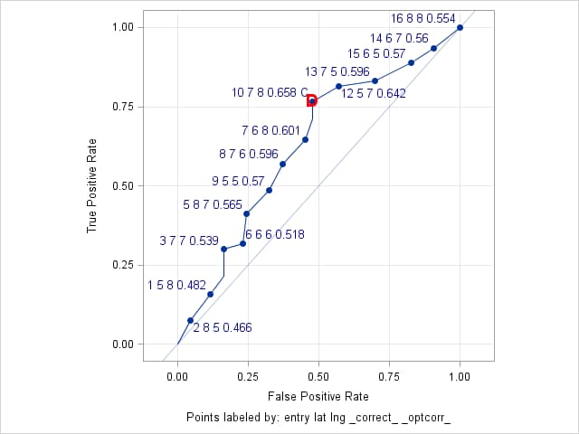
Optimal Cutpoints
Criterion Symbol Cutpoint Label Value Correct C 0.21939 10 7 8 0.658 C 0.65803 Dist To 0,1 D 0.21939 10 7 8 0.658 C 0.53092
Points labeled by: entry lat lng _correct_ _optcorr_ - EXAMPLE 7: ROC curve for a logistic generalized additive model
-
The data for the following appears in the example titled "Generalized Additive Model with Binary Data" in the PROC GAM documentation. These statements fit the same logistic generalized additive model as shown in the PROC GAM example. The OUTPUT statement is added to save the predicted probabilities from the model. By default, the variable containing the predicted probabilities is named P_KYPHOSIS by PROC GAM.
     proc gam data=kyphosis;
         model Kyphosis (event="1") = spline(Age      ,df=3)
                                      spline(StartVert,df=3)
                                      spline(NumVert  ,df=3) / dist=binomial;
         output out=gamout predicted;
         run;
When the model is fit by a procedure other than PROC LOGISTIC, it is necessary to use the predicted probabilities from the fitted model in the PRED= option in the ROC statement of PROC LOGISTIC. No predictors need to be specified in the MODEL statement. The PROC LOGISTIC statements that follow use the OUTROC= option to save ROC information from the model specified in the MODEL statement (in this case, an intercept-only model) and from the generalized additive model. A WHERE clause is needed to retain only the ROC information from the generalized additive model. The value used in the WHERE clause ("gam") should be the same as the label in the ROC statement.
     proc logistic data=gamout;
         model Kyphosis (event="1") = / outroc=groc(where=(_source_="gam"));
         roc "gam" pred=P_Kyphosis;
         run;
This call to the ROCPLOT macro plots the ROC curve and labels the points using the predicted probabilities (the cutpoint values) and Age values.
%rocplot(inpred=gamout, inroc=groc, p=P_Kyphosis, id=_cutpt_ age)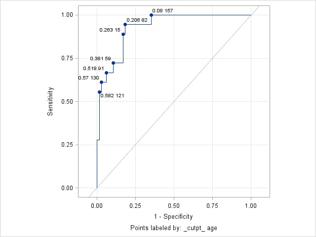
Right-click on the link below and select Save to save the ROCPLOT macro definition to a file. It is recommended that you name the file rocplot.sas.
| Type: | Sample |
| Topic: | SAS Reference ==> Procedures ==> LOGISTIC Analytics ==> Categorical Data Analysis Analytics ==> Regression SAS Reference ==> Procedures ==> ADAPTIVEREG SAS Reference ==> Procedures ==> GAM SAS Reference ==> Procedures ==> GEE SAS Reference ==> Procedures ==> GENMOD SAS Reference ==> Procedures ==> GLIMMIX SAS Reference ==> Procedures ==> HPGENSELECT SAS Reference ==> Procedures ==> PROBIT SAS Reference ==> Procedures ==> SURVEYLOGISTIC |
| Date Modified: | 2026-04-21 14:03:12 |
| Date Created: | 2005-01-13 15:03:46 |
Operating System and Release Information
| Product Family | Product | Host | SAS Release | |
| Starting | Ending | |||
| SAS System | SAS/STAT | z/OS | 9.3 TS1M0 | |
| Microsoft® Windows® for x64 | 9.3 TS1M0 | |||
| 64-bit Enabled HP-UX | 9.3 TS1M0 | |||
| Windows 7 Enterprise 32 bit | 9.3 TS1M0 | |||
| Windows 7 Enterprise x64 | 9.3 TS1M0 | |||
| Windows 7 Home Premium 32 bit | 9.3 TS1M0 | |||
| Windows 7 Home Premium x64 | 9.3 TS1M0 | |||
| Windows 7 Professional 32 bit | 9.3 TS1M0 | |||
| Windows 7 Professional x64 | 9.3 TS1M0 | |||
| Windows 7 Ultimate 32 bit | 9.3 TS1M0 | |||
| Windows 7 Ultimate x64 | 9.3 TS1M0 | |||
| Windows Vista | 9.3 TS1M0 | |||
| Windows Vista for x64 | 9.3 TS1M0 | |||
| 64-bit Enabled AIX | 9.3 TS1M0 | |||
| Microsoft Windows XP Professional | 9.3 TS1M0 | |||
| Microsoft Windows Server 2008 for x64 | 9.3 TS1M0 | |||
| Microsoft Windows Server 2008 R2 | 9.3 TS1M0 | |||
| Microsoft Windows Server 2008 | 9.3 TS1M0 | |||
| Microsoft Windows Server 2003 for x64 | 9.3 TS1M0 | |||
| Microsoft Windows Server 2003 Standard Edition | 9.3 TS1M0 | |||
| Microsoft Windows Server 2003 Enterprise Edition | 9.3 TS1M0 | |||
| Microsoft Windows Server 2003 Datacenter Edition | 9.3 TS1M0 | |||
| 64-bit Enabled Solaris | 9.3 TS1M0 | |||
| HP-UX IPF | 9.3 TS1M0 | |||
| Linux | 9.3 TS1M0 | |||
| Linux for x64 | 9.3 TS1M0 | |||
| Solaris for x64 | 9.3 TS1M0 | |||