| Exploring Data in Three Dimensions |
Example
In this example you examine three variables in the Climate data set. You explore the functional relationship between the elevationFeet variable and the latitude, and longitude variables. The elevationFeet variable gives the elevation in feet above mean sea level for each of 40 cities in the continental United States.
None of the variables in this example have missing values. If an observation has a missing value for any of the three variables in the contour plot, that observation is not plotted.
| Open the Climate data set. |
| Select Graph |
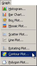
|
Figure 7.14: Selecting a Contour Plot
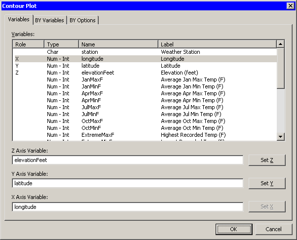
A dialog box appears as in Figure 7.15.
| Select the elevationFeet variable, and click Set Z. |
| Select the latitude variable, and click Set Y. |
| Select the longitude variable, and click Set X. |
| Click OK. |
|
Figure 7.15: A Contour Plot Dialog Box
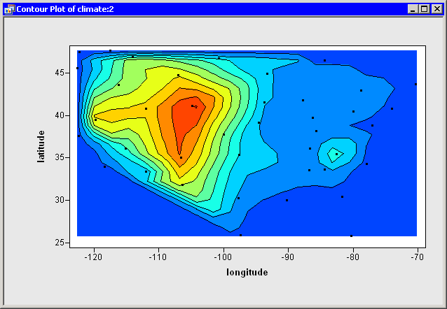
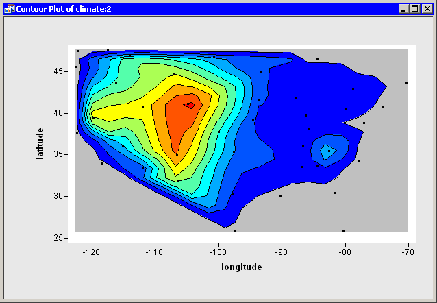
A contour plot appears (Figure 7.16), showing a scatter
plot of the longitude and latitude variables. Contours of
the elevationFeet variable are shown overlaid on the scatter
plot.
|
Figure 7.16: A Contour Plot
You can double-click on an observation to display the variable values
associated with that observation. (See
the section "The Observation Inspector" for further details.) In this
way, you can identify cities and find out their exact elevations.
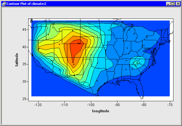
It is somewhat difficult to guess where the state boundaries are in
Figure 7.16, so Figure 7.17
overlays the outline of the continental United States onto the
contour plot. The figure was created by using the DrawPolygonsByGroups
module, which is documented in the Stat Studio online Help
chapter titled "IMLPlus Module Reference."
|
Figure 7.17: A Contour Plot
Caution:
You can create a contour plot of any three continuous variables, but you should
first determine whether it is appropriate to do so. Contour plots might
not be appropriate for data with replicated measurements or for data
with highly correlated X and Y variables.
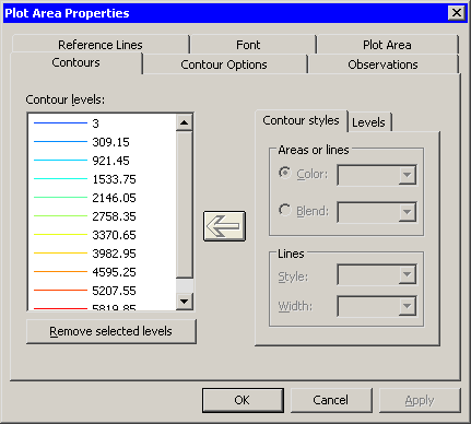
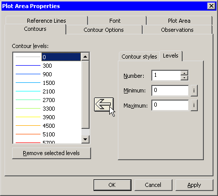
If you display the contour plot property dialog box, you can examine
the values associated with each contour. (To display plot properties,
right-click near the center of a plot, and select Plot Area
Properties from the pop-up menu.) Figure 7.18
shows that there are 10 evenly spaced contours in the range of the
elevationFeet variable. The minimum and maximum values of
elevationFeet are 3 and 6126.
|
Figure 7.18: Default Contours
Changing the Contours and Colors
The default contours are usually adequate for obtaining a qualitative feel for the response surface. However, sometimes you might want to manually specify the levels of the contours. You might need to conform to some standard (for example, 50-meter contour intervals) or include a critical level (for example, a control limit).
Suppose you decide that you want the contour levels of elevationFeet to be "round numbers," such as multiples of 100. You can change the set of contours by doing the following:
- Remove the old contours.
- Add new contours.
- Color the new contours.
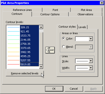
To remove the old contours, do the following:
| Select the first contour (labeled "3"). Scroll the Contour Levels list to the last contour. Hold down the SHIFT key while clicking on the last contour (labeled "5819.85") to select all contours in the list. |
| Click Remove selected levels, as shown in Figure 7.19. |
|
Figure 7.19: Removing Contours
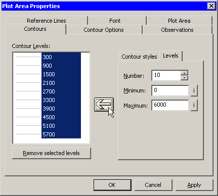
To add a new set of uniformly spaced contours, do the following:
| Click the Levels subtab. |
| Type 10 in the Number field. |
| Type 0 in the Minimum field. |
The value for this field is typically a "round number" near the minimum value of the Z variable.
| Type 6000 in the Maximum field. |
The value for this field is typically a "round number" near the maximum value of the Z variable.
| Click the large left arrow ( |
|
Figure 7.20: Adding Evenly Spaced Contours
The Contour Levels list is filled with the values ![]() . These values do not include the minimum
and maximum specified values (0 and 6000), because contours at
the extreme values are often degenerate.
. These values do not include the minimum
and maximum specified values (0 and 6000), because contours at
the extreme values are often degenerate.
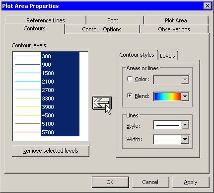
By default, the region between the new contours is gray. You can change the colors of contours by doing the following:
| Click the Contour Styles subtab. |
| Select a gradient colormap from the Blend list. |
| Click the large left arrow ( |
|
Figure 7.21: Coloring Contours
| Click Apply to update the contour plot. |
You can also add individual contours for specific levels. For example,
some investigators might want to see the "sea level" contour,
![]() . Adding an individual contour is similar to adding a set of contours:
. Adding an individual contour is similar to adding a set of contours:
| Click the Levels subtab. |
| Type 1 in the Number field. |
| Type 0 in the Minimum field. |
| Type 0 in the Maximum field. |
If the minimum and maximum values are the same, then a single contour is created at the common value.
| Click the large left arrow ( |
|
Figure 7.22: Adding a Single Contour
| Click OK to apply the changes. |
The contour plot looks like the plot in Figure 7.23.
Note that the contour plot has not qualitatively changed from
Figure 7.16. The new contour values are within a few
hundred feet of their previous values, so the new contour curves are
close to the previous contours. The primary change is that the new
contours correspond to "round numbers" of
elevationFeet. The colors are also slightly different.
|
Figure 7.23: A Plot with Custom Contours
Caution:
In this example you added a single contour at ![]() . While Stat Studio
permits you to add contours at any level of the Z variable, you should
usually choose evenly spaced levels. A standard usage of
contour maps is to locate regions in which the contours are densely
packed. These regions correspond to places where the gradient of
Z is large; that is, the function is changing rapidly in these
regions. If you add contours that are not evenly spaced in the range
of Z, then you risk creating contours that are close together even though
the gradient of Z is not large.
. While Stat Studio
permits you to add contours at any level of the Z variable, you should
usually choose evenly spaced levels. A standard usage of
contour maps is to locate regions in which the contours are densely
packed. These regions correspond to places where the gradient of
Z is large; that is, the function is changing rapidly in these
regions. If you add contours that are not evenly spaced in the range
of Z, then you risk creating contours that are close together even though
the gradient of Z is not large.
Copyright © 2008 by SAS Institute Inc., Cary, NC, USA. All rights reserved.