| General Plot Properties |
Example
| Open the GPA data set, and create a scatter plot of satm versus satv. |
The scatter plot appears in Figure 9.2. You can use color to visualize the grade point average (GPA) for each student.
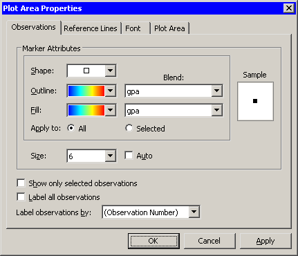
| Right-click near the center of the plot, and select Plot Area Properties from the pop-up menu. |
A dialog box appears, as shown in Figure 9.6. You can use the
Observations tab to change marker shapes, colors, and sizes.
The section "Scatter Plot Properties" gives a complete description of the
options available on the Observations tab.
|
Figure 9.6: The Observation Tab
| Select gpa from the Outline: Blend and Fill: Blend lists. Select a gradient color map (the same one) from the Outline and Fill lists. |
Make sure that Apply to is set to All.
| Select 6 from the Size list. |
Note that the Size list is not in the same group box as Apply to. All markers in a plot have a common scale; size differences are used to distinguish between selected and unselected observations.
| Click OK. |
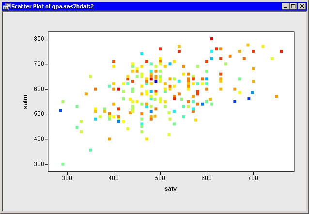
The scatter plot updates, as shown in Figure 9.7. These
data do not seem to indicate a strong relationship between a student's
college grade point average and SAT scores.
|
Figure 9.7: Using Color to Indicate Grade Point Average
Copyright © 2008 by SAS Institute Inc., Cary, NC, USA. All rights reserved.