| General Plot Properties |
Example
In this example, you use a bar chart of a categorical variable to select observations, and you change the marker shape of the selected observations.
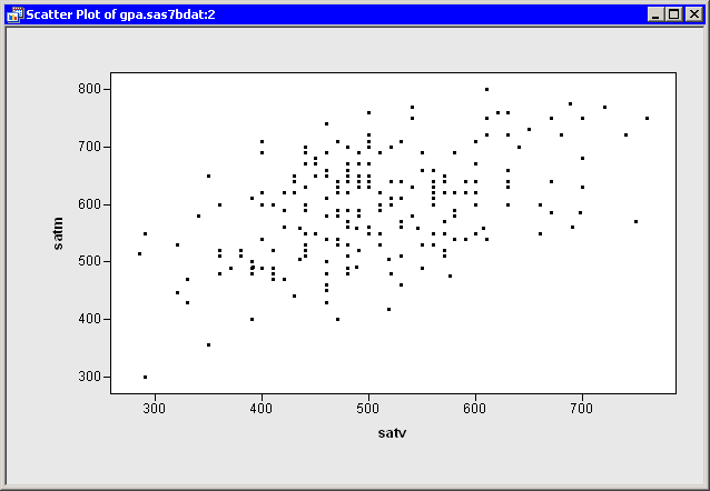
| Open the GPA data set, and create a scatter plot of satm versus satv. |
The scatter plot appears in Figure 9.2.
|
Figure 9.2: A Scatter Plot
Each observation in this data set represents a student. You can
use marker shape to indicate each student's gender.
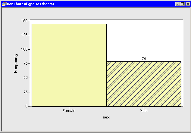
| Create a bar chart of the sex variable. |
If necessary, move the bar chart so that it does not overlap the scatter plot.
| Select all the male students in the bar chart, as shown in Figure 9.3. |
|
Figure 9.3: A Bar Chart with Male Students Selected
While the bar chart is convenient for selecting all the male students,
you need to return to the scatter plot in order to change the marker
shapes of the selected observations.
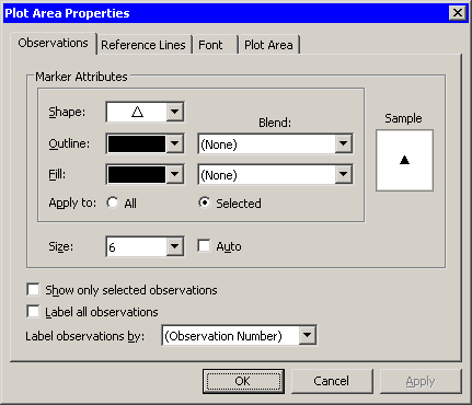
| Right-click near the center of the scatter plot, and select Plot Area Properties from the pop-up menu. |
A dialog box appears, as shown in Figure 9.4. You can use the
Observations tab to change marker shapes, colors, and sizes.
The section "Scatter Plot Properties" gives a complete description of the
options available on the Observations tab.
|
Figure 9.4: The Observations Tab
| Select a triangle ( |
Note that Apply to defaults to Selected whenever there are selected observations. This means that the Shape, Outline, and Fill options are applied only to the selected observations. (You can, of course, override this default and apply changes to all observations.)
| Select 6 from the Size list. |
Note that the Size list is not in the same group box as Apply to. All markers in a plot have a common scale; size differences are used to distinguish between selected and unselected observations. When a plot is active, you can increase the size difference between selected and unselected markers by pressing the UP ARROW key while holding down the ALT key.
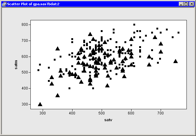
| Click OK. |
The scatter plot updates, as shown in Figure 9.5. The
SAT scores of male students are represented by triangles; scores of
female students are represented by squares.
|
Figure 9.5: Using Marker Shape to Indicate Gender
Copyright © 2008 by SAS Institute Inc., Cary, NC, USA. All rights reserved.