| Plotting Subsets of Data |
A Simple Example
Suppose that you are interested in visualizing the location of tropical cyclones for each month (irrespective of the year). That is, you want to examine a scatter plot showing the location of all April cyclones, another showing the locations of May cyclones, etc. There are at least two methods to accomplish this.
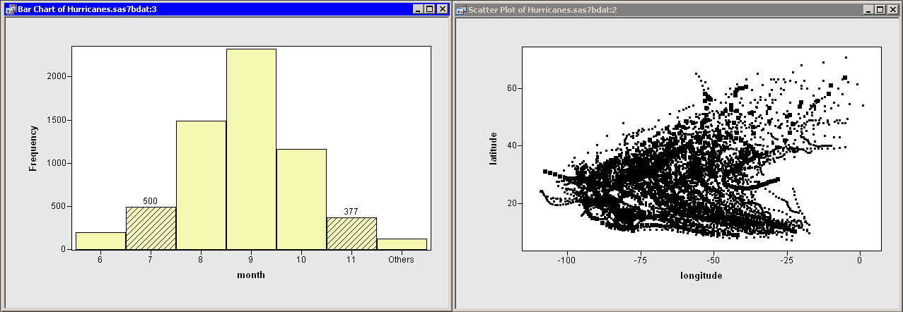
One approach is to create a bar chart of months, select a bar
(that is, a particular month) in the bar chart, and look at the
selected observations in a scatter plot of wind_kts versus
latitude. This technique is illustrated in Figure 12.2.
|
Figure 12.2: Selecting Cyclones in Certain Months
This works well for many data sets. However, the selected
observations might not be visible when the scatter plot suffers from
overplotting (like Figure 12.2), or when the number of selected
observations is small relative to the total number
of observations.
A variation of this technique is to show only the
selected observations.
See the "Displaying Only Selected Observations" section for a
complete example illustrating this approach.
Overplotting can also make it difficult to compare features of the data across months. For example, in Figure 12.2, do early-summer cyclones originate in the same regions as autumn cyclones? Does the general shape of cyclone trajectories vary by month?
A second visualization approach, known as BY-group processing, attempts to circumvent these problems by abandoning the concept of viewing all of the data in one plot. The idea behind BY group processing is simple: instead of using a single scatter plot linked to a bar chart, you subset the data into mutually exclusive BY groups and make a scatter plot for each subset. This enables you to see each month's data in isolation, rather than superimposed on a single plot.
In this section you create scatter plots of the latitude and longitude variables of the Hurricanes data set. The scatter plots are made for subsets of the hurricane data corresponding to the nine values of the month variable. (The data set does not contain any cyclones for January, February, or March.)
| Open the Hurricanes data set. |
| Select Graph |
A dialog box appears as in Figure 12.3.
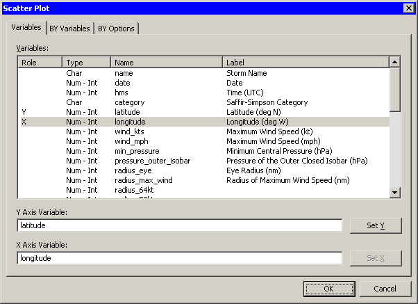
|
Figure 12.3: Selecting Scatter Plot Variables
| Select the latitude variable and click Set Y. Select the longitude variable and click Set X. |
| Click the BY Variables tab. |
The BY Variables tab is shown in Figure 12.4.
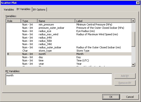
|
Figure 12.4: Selecting BY Variables
| Scroll down in the list of variables and select the month variable. Click Add BY. |
| Click the BY Options tab. |
The BY Options tab is shown in Figure 12.5.
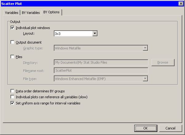
|
Figure 12.5: Subsetting Data and Plotting BY Groups
| Select 3x3 for the Layout option. Click OK. |
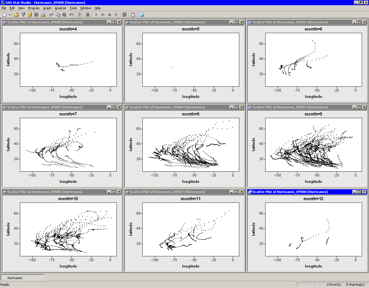
Nine scatter plots appear, one for each month 4 - 12, as shown
in Figure 12.13.
|
Figure 12.6: Scatter Plots of Location by Month
Note that the X and Y axes are all set to a common range. This makes it easier to compare data characteristics across BY groups. If you want each plot to scale its axes independently, you can deselect Set uniform axis range for interval variables in the BY Options tab.
A few features of the data are apparent.
- Many tropical cyclones occur in September (month=9).
- There is no apparent relationship between month and the shape of cyclone trajectories.
It is not clear from this display whether the origin of cyclones varies with the month. Perhaps storms in May (month=6) originate farther west than September storms (month=9), but more investigation is needed. The next example continues this investigation.
Copyright © 2008 by SAS Institute Inc., Cary, NC, USA. All rights reserved.